Moroccan design has rich, natural elements that make it a favorite living room decor style. Earthy tones of brown and beige, paired with metallic accents, are the perfect backdrop for a modern take on the Moroccan-style living room. In addition, furniture and accessories are beautiful expressions of the history and culture of the country. If you need tips on how to decorate your Moroccan-style living room, use these as a guide:
Start With an Arrangement That Makes Sense
Moroccan interiors are characterized by an array of hand-painted details and ornate carved pieces. Distinctive furniture and unique accessories make an impression on the observer and should be used to create a visually impressive living room. Your Moroccan-style living room will be more than just a space to relax; it will be a showcase for your creative assets.
Pair Moroccan Accent Pieces With Earthy Colors
To achieve the laid-back atmosphere you desire, opt for bolder shades of brown and beige for your walls, flooring, and furniture. If you wish to add an extra Moroccan touch to your living room, choose a wall treatment in a color that contrasts the flooring.
Moroccan furniture and accessories, which often feature intricate details, should be kept to a minimum to prevent an overly busy space. Instead, choose a few quality pieces and make them the centerpiece of your living room design.
Remember that while Moroccan-style furniture and accessories make an impact, it’s essential that they work well with your home. To guarantee a cohesive look, use the same color palette that you have chosen for the rest of your living room furniture.
Use the Elements of Nature in Your Living Room
Moroccan design is rooted in the culture’s love of nature, which is why natural elements should play an important role. For example, you can use potted plants and baskets to display photos and decorative items. Plants also help bring color and texture to your design and allow you to add a little greenery to the room.
Add Rustic Elements for a Grander Effect
To emphasize the earthy accents found in Moroccan furniture and accessories, add a rustic element to the living room. Moroccan-style benches, the perfect place to sit and relax after a long day, are elegant and timeless. Accent tables with intricate details are a vintage-inspired way to add Moroccan touches to your living room. In addition, you can add a more rustic element by using dark wood flooring or sandstone wall tiles to bring out the natural earth tones in the room.
Accessorize With Moroccan-Style Accents
When it comes to Moroccan-style living rooms, accessories are sure to make a statement. Authentic Moroccan design features intricate details and hand-painted patterns. Their traditional lighting is also a rich addition to a living room, giving off a romantic ambiance and a warm glow. If you like to entertain, accessories, such as Moroccan pillows, lanterns, and rugs, are just a few ways you can add an exotic touch to your home.
Conclusion
From a traditional Moroccan-style living room to a modern take on the decor, this timeless design looks as great today as it did centuries ago. Moroccan accessories bring the feel of their country directly into your home, and with gorgeous designs, you’re sure to find a piece that is as beautiful as a work of art.
For a collection ofauthentic Moroccan rugs, check out Atlas Weavers. We are a fair trade artisan project and a premier supplier of authentic Moroccan decorative rugs. Shop today!
I have a bit of a history when it comes to waiting “too long” to hang curtains. For some reason, I don’t prioritize them (as long as privacy isn’t an issue) and I’ve learned that’s ALWAYS a mistake. I am never not instantly taken aback by how much they change a room for the better. I’m talking INSTANT elevation, INSTANT coziness, INSTANT “I look like I have my life together”. But I know that depending on how many windows are in need of dressing, it can really add up. I’m sure this news is news to no one. So unless you have windows that require a custom route, let’s get into some window treatments that will take it easier on your wallet.
First, let’s start with a very fun fact. The curtains in the opening photo, the photo above (my old apartment), and the two side-by-side photos below all have different curtains from IKEA. Look at how they all frame and bring a calming softness to each room. I doubt anyone would guess that they were from IKEA and for that we are IKEA neutral-colored curtain fans at EHD for lyfe.
Another reason why these look higher end is because of how they are hung. The rod is hung at 2/3 the distance between the window and ceiling. AKA GO HIGH! Unless you have a special situation where your rod must be hung closer to the top of the window, it will always look better and make your ceiling feel taller. We promise. Here is a post dedicated to how to hang curtains if you want some more guidance:)
Now, let’s get into why a neutral curtain color might be best for you.
It’s a great option if you want to keep things soft and minimal. A no-fail tone if you will.
It’s also great if you want to play with bolder colors in your furniture and decor but don’t want to go all out in the color department.
It’s Timeless. Never goes out of style.
But remember that “white” isn’t your only neutral-toned option. You can go with more of a cream or tan or taupe to add some visual depth (like Rosa did in her bedroom above). You can even go with a soft gray to cool things down. So just because “neutral” isn’t as flashy as something “colorful” doesn’t mean it’s boring. Here are a few of our top picks!
One thing I will say about neutral curtains is that you need to be aware of the “see-throughness” of it all. Look, you might not need privacy so a curtain on the sheerer side might be perfect. Also, the sheerer typically equals less expensive so keep that in mind as you shop. If you are someone who wants light-colored curtains but needs to block out the morning sun, something like #5 is a great option!
I figured I’d start with my living room/office since “pre pink curtains” I was a white curtain gal through and through. So while my pink curtains are custom by Decorview (because of my beautiful but not in the least bit standard turret window), I think the journey to choose a colorful solid color might be helpful for those on the fence. Basically, my initial instinct was to go white or slightly off-white. That way I could bring in any color I wanted and wouldn’t have to worry about clashing with a color or pattern. But when I hung my IKEA curtains up temporarily, they looked sad and visual got lost in the turret. So I needed a color that popped more and made the room feel happier. That’s why I chose the pink. It’s still slightly neutral but brings a ton of life to the space.
But let’s say you want to go bolder! More color! More contrast! Let me reintroduce you to Sarah Zachary’s design. Those saturated golden rust-colored curtains are STUNNING! I love that bold warm contrast to the green wallpaper and bright blue sofa but then look how they complement the wood tones. So good. And while these are also custom you can easily take this idea and implement it with a more budget-friendly option.
Now choosing a colorful curtain doesn’t mean you automatically want a bunch of colors in one room. Maybe you want to go for a tonal design like William Hunter Collective wanted in the photo above. So if you want color but for it to still be calm for the ole eyeballs, this is a cool and fun option.
I love all of these colors. I know that Arlyn has #1 and loves them. #2 is very close to my curtain color so clearly, I’m a fan. Oh and look at how similar in color #5 is to Sarah’s design?!
Another EHD tip is to stay away from grommet curtains. You know the ones with the metal ring around where the rod goes. Look, if you already own them there is nothing wrong with them. But if you are in the market, pocket rod curtains or curtains you can hang rings with tend to look less readymade and more custom.
So maybe you want a neutral curtain but a neutral curtain with a dash of fun on the side. I’ve got you. Now, you always have the option for a fun and easy DIY like Ginny did with the white curtains with the black pom trim above. Those are actually plain white IKEA curtains (told you we were fans) with an iron-on black pom trim. Had the curtains remained plain white they would have gotten lost against that big beautiful window. So it was a genius idea to add the trim for some contrast and playfulness!
But if you are NOT a DIYer then fear not because there are a ton of great options (like Erik’s curtains above) to give you that neutral look with a twist. Come and see!
Some are playful with a printed pattern like #1, #5, and #7 while with others, the fabric itself is a pattern like #2 and #4. But I love love the subtle pop of color on #6 and the color/pattern combo of #8🙂
Another fun (or maybe not so fun depending on your design preference) fact, EHD isn’t known for our use of patterned curtains…trust me I looked and there were only a few. I think it comes from being more of wallpaper/colorful paint people. That’s not to say you can’t be a patterned curtain/wallpaper/colorful paint person! Many are and it’s awesome. Plus, the beauty of readymade patterned curtains is that you can return them if they end up not working out. Not as easy when you go the custom route…
Now, above is an awesome example of great readymade patterned curtains. They are old Target that Emily’s used to decorate her kid’s nanny, Sylvia’s, home back in 2016. I love how the pattern brings movement to the room and that it’s also the main pattern in the space. It’s not fighting for attention:) But it’s also nicely balanced out by the blue half wall! A perfect example of how to use a patterned curtain.
However, you don’t need to paint your walls to match your curtains. Take Rosa Beltran’s stunning and delicately patterned curtains. They add just the right amount of pattern to add interest and warmth while not taking over the room visually. I doubt these are readymade considering she’s the queen of custom (if you don’t know her business, Clad Home, go now!) but there are definitely similar affordable options out there.
Wanting to have a patterned curtain doesn’t mean you need to go “all-out”. Options like #1, #2, and #3 are still patterned but not “in your face” patterned. If that’s more of what you want then #5, #6, and #9 are fun and pack a big ole design punch!
Sometimes a curtain doesn’t work or look right. Sometimes you need a shade instead and we are also big fans, as proven by the multitude of rooms we’ve designed over the years. Readymade shades can be a little trickier if you don’t have a standard-sized window but not impossible. The white ones in the above photo come in a ton of sizes.
Here is an example of when shades were a better option than curtains. First off, choosing a roman shade made it so the wallpaper was the real star of the show. Then with the two windows being fairly close together and the bed/nightstand being against that wall, curtains would have looked heavy and cramped behind everything. So these shades add a subtle pop of color as well as make the room feel lighter.
Here’s another example of when a roman shade was a better functional option. Since this is a smaller room, real estate is precious and the furniture is pretty close to the walls. This again makes installing curtains hard because they would either be cramped next to or awkwardly squished behind a piece of furniture. Shade to the rescue!
Fabric roman shades aren’t your only option! We love the texture of a woven shade like Jayma and Adam used in their bedroom. Some are better for privacy than others but it’s such a great and easy way to add texture to our room!
For this section, I decided to stick with the neutral options since they are the most popular:)
I honestly love all of these and it’s really up to you and the style of your home as to which one is best for you!
I hope this was helpful and if you were already shopping for affordable window treatments, I hope your search is now over:) And if anyone else has a great affordable resource or specific curtain they love, drop it in the comments!
Today y’all are going to see how we customized the vanity in our bathroom to create a pretty unique piece that I’m honestly IN LOVE with. It was kinda piecemealed, likely not the most efficient or economical but the result is awesome (and always fun to show you the process).
render of the vanity with a basic leg added
We knew we didn’t want floating, and there aren’t that many really long vanities on the market. So as we were working with our cabinet company, Unique Kitchen & Baths, we designed the custom vanity with them, knowing that we also really wanted to work with a local maker on the custom legs. I could have just had the entire piece made by a local maker but at the time I was pretty overwhelmed and Unique Kitchen & Baths is so easy to work with. We also hadn’t even started looking for this person and we needed to get the cabinet order in STAT, so we figured we’d lock the cabinet/body part down (8 months ago), then as we got closer we’d figure out the base. Unique Kitchen & Baths was giving us a press discount so I figured I’d just take it and figure the rest out later.
The Inspiration
I knew that I wanted the body of the piece to be pretty simple, with the legs designed with pretty joinery. I found the first image from the internet (sorry! I’m not sure who to credit!) and the image on the bottom is our current dining table’s legs. As you can see it’s constructed, or joined, to look like the wood itself is keeping it all together. I’m VERY into this look, obviously, and was willing to pay a maker to do our version of it.
So 6 weeks ago, I found my person, Nate from Dinihanian Design Build, a local maker here in Portland that was recommended by my friend Max Humphrey. With the inspiration image in hand, as well as these schematics, the ideation began. Then after we triple-checked the measurements he took it from there. Here’s the information we could give him:
He came back with a couple of options – both great (and hard to tell apart).
Option #1 has the base flush with the side of the vanity.
Option #2 has the base inset a bit. Honestly, both looked good to me but Brian liked the first one more and right now I’m pro anyone else making a firm decision right now (I’m passed my decision curfew). Besides, there were some more details that needed to be ironed out…
The Shape Of The Dowel…
The inspiration joinery image included a round dowel, but we decided that having a more elongated piece would work more with the design. Nate agreed and tweaked it.
For all those who love to nerd out over the woodworking process…this is for you. It’s pretty incredible to see the craftsmanship.
Nate was awesome to rush it (for a fee, which is normal) and 2 weeks later we had it on-site, ready to be installed.
So pretty, right? It’s so simple and perfect. Unique but nothing too crazy. Super high quality, well made, in the exact wood species (white oak), and the same sealant (clear matte). Nate charged $2100 which included a $300 rush fee and a $325 clear finish (which he subbed out). The vanity itself was probably around $3500 even with our discount so yes, it added up. I am glad to say that both companies, Unique Kitchen & Baths and Dinihanian Design Build, do very good, high-quality work and are small businesses that are growing. I feel good about giving them my business. And unless you DIY things yourself, any custom woodwork will cost you a lot more than readymade, as the overhead to be able to build (equipment, shop space, etc) is a lot.
SO GOOD. Now obviously we are missing the draw fronts and no, those sinks won’t be sitting at the bottom – they were just resting in there.
That white oak is SO PRETTY. Unique Kitchen & Baths did such an amazing job on the body of the vanity and those legs took it really next level.
Ready for some more sneak peeks?? Below is where it’s now FINALLY living (in the actual bathroom)…we finished tiling since I took this photo but I don’t want to show you the ENTIRE bathroom, just a little update…
OKAY, here’s an even more exciting sneak peek:) I can’t stop staring at the tile/grout/vanity mix.
Right now, I think I can safely say that this bathroom is my favorite room in the house (but that’s because it’s the closest to being done). There have been a few hiccups, which of course I’ll tell you about, but the vanity is not one of them. Despite using two makers to pull it off, the end result is exactly what we wanted.
BUCKLE UP, Y’ALL. It’s (almost) Christmas in July. Today, I’m sharing one of my favorite no-fail color combinations – yeah, seriously – and making an impassioned case for the mixing and matching of (you may have guessed it by now) RED AND GREEN. That’s right, gang – you can (or maybe even should?) be employing this fresh, warm, cozy color combination in your home. I’ve compiled a few of my all-time favorite examples of Christmas colors done right (as in “livable,” “will be enjoyable for a long time,” and “will not make you feel like you’re living inside a Santa set up at the mall”) and I’m SO excited to share. From farmhouse to full glam, from English countryside to 90s revival, from quick DIYs that’ll add a little personality to your home to full-blown red and green kitchens (two of them, actually!) – there’s something for everyone here. I’m going to ease you in with my favorite trick – just adding a pop of red or green to an existing space – but by the end, we’ll be going ALL OUT. ARE YOU READY? (Can you tell I’m ready? Can you also tell I drank a lot of caffeine before writing this introduction? Like, HEY, HAPPY TUESDAY! Let’s look at some inspiration, friends!)
We’re easing our way into it with some nice, desaturated tones. There’s something inherently comforting and home-y about this palette, right? Brick reds, olives, and sea-foam greens – it’s a nice mix of sturdy and soothing. I love a red stripe or plaid paired with a tiny hit of green – if you’re looking to add some color without adding a ton of fuss, this is a really livable option.
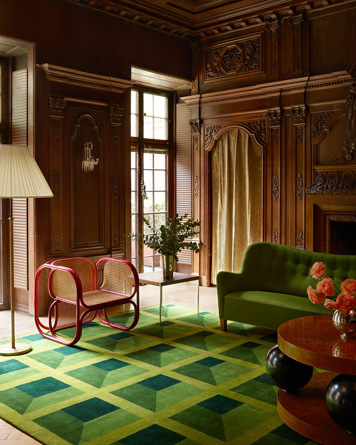
Turning the saturation up a little (or, uh, a lot) here with this next space! OBSESSED with the super punchy Bočan chair against a sea of green furnishings (here’s the rug), warm woods, and ornate detailing. Red is such a powerful accent color (remember when Em added that balloon chair to her old living room?) – adding a single piece in a contrasting color is an awesome way to make a high-impact design statement without splurging on a ton of stuff. (And if you wanna learn more about these chairs…well, baby, I GOT YA.)
Two sets of stripes, two VERY different looks. I love the room on the left – who knew that olive, kelly green, and coral could all live so happily together? There are a lot of traditional elements (the stripe, the piping, the tufted headboard, and embroidered shams), but the unexpected color palette leaves it all feeling fresh and youthful. On the right, those terra-cotta cushions speak to the rich wood credenza. The rattan definitely warms up the space, too – no one’s thinking “winter” or “Christmas” when they see a giant peacock chair.
CAN I VISIT? The hand-painted mural is to die for, but first: this is the kind of magazine-worthy styling that I love, y’all. Like, yeah, just chilling in my ::checks notes:: extremely red kitchen with my ::checks notes:: pile of apples and ::checks notes:: tray filled with rose petals. You know. LIKE WE ALL DO. Photos like this are the reason I still subscribe to magazines – it’s SO FUN to see things that are so inspiring and escapist. Second: let this live as proof that candy apple red and kelly green can, in fact, live in harmony.
No-fail design hack: add a bright red pendant. It’s the simplest finishing touch – and it’s pretty easy to install if you have some DIY chops! – but it makes ALL the difference, don’t you think? It really brings the quiet, muted palette on the left to life while bringing a really nice balance to the bold, more saturated palette on the right.
My first thought when I saw this home: “the person who lives here is fun and vibrant and welcoming!” One thought noticeably absent from my brain: “red and green are usually billed as the be-all and end-all of Christmas colors!” That’s due in large part to the other primary colors featured here, which brings me to my next favorite tip for making this palette work in your home…
The mix-and-match here is SO good – I looooove these ornate, lacquered Chinoiserie chairs paired with such graphic, colorful, modern art. (The walls are great, too. Obsessed with this paint job – the variation in finishes just gives it a little something extra, right? It feels extra special and thoughtful and considered.)
Who knew that such bold, bright colors could feel so grown up? In the room on the left, we have no lack of pattern – the pillows! The blankets! The rug! The wallpaper! The curtains! The art! – but it all feels balanced by the sweet, playful mix of red, green, yellow, and blue. The room on the left is the opposite – not a pattern in sight! – but again, the hard lines are softened by the fun and vibrant soft surfaces.
Weekly reminder: PRETTY LOOKS GOOD NEXT TO PRETTY. The blue art, the yellow frame; the yellow lamp with green accents; the chalkboard-colored walls and vibrant upholstery (those tigers are lined in green, too!)…it’s all such a masterclass in building an eclectic, cohesive space. If you wanna take it to the next level, though, there are a few options…
WOAH. Tone-wise, these are VERY different. Commitment-wise, though, these are VERY much the same – these two homeowners will be working in these red and green wonderlands for a WHILE. I’m obsessed with the cabinets on the left – the profile, color, and finish are all ::chef’s kiss:: – and I also love that hit of yellow. The kitchen on the right is a “modern-day interpretation of when the 90s referenced the 70s” but I love thinking of it as a 2022 take on a 90s sitcom kitchen. You know, like…it’s livable and relatable, but the color palette is turned up to the MAX. (And those cabinet pulls? So good.)
DREAMY OFFICE SETUP. (I mean, that coffee table under the desk and the plant light fixture? ARE YOU JOKING? Like, yes, I would love to work from here, thank you!!!) This artichoke shade on the built-in bookshelves makes for a great, neutral background – committing to color on permanent fixtures really allows the other decor pieces (like say, the red curtains) in the room shine, don’t you think?
GO BIG OR GO HOME. That red seating on the left makes such a statement – it wouldn’t have been my first instinct (probably why I’m a partnerships person and occasional blog post writer and not, you know, a professional interior designer in a magazine) but MAN, I don’t think anything else would have had as much of an impact. It’s luxe, isn’t it? And the entire apartment on the right is worth a tour – the ENTIRE HOME is decked in shades of red and green and it’s UNBELIEVABLE.
Last but not least – everything kinda goes with those sweet and timeless red clay tiles, right? I’m especially taken by how thoughtful the placement is – that diamond motif combined with the timeless stripe leaves the tile on the floor and the tile in the shower feeling SUPER cohesive, despite the difference in finish and color. That actually brings us to our next tip (my personal favorite – you ready to see some INCREDIBLE spaces?)…
I mean, like, would I really write a post without including a bunch of photos of wallpapered spaces? I THINK NOT. I’ve long been taken by the bathroom on the left – I once pitched a post exclusively about that mirror after seeing it in so many rooms! – but the room on the right is a new favorite of mine. Do you see how the paint color in both (the trim on the left; the mantle on the right) is SUPER similar, but how the surrounding elements totally change the feel of the color? It’s incredible how much personality we can bring into our homes while working under the same constraints, you know? I’M GETTIN’ EMOTIONAL, GUYS.
I love someone who just GOES FOR IT. There’s something so unapologetic and personal and special about this room, don’t you think? The striped rug on top of the carpet; the painted rattan console (right next to an end table and a bookshelf – who else woulda thought to put another surface in there? It’s brilliant!); the frames of the gallery wall…it all just sings. Weirdly, I don’t think any other color console would have felt nearly as cohesive – it’s just really special and intentional.
SPOILER: I LOVE THIS HOUSE. The whole place is done in variations of this restrained palette and it’s IMPRESSIVE. The printed headboard against those green walls and the green door into the patterned bathroom…swoooooon. Highly recommend checking out the full tour as it’s SUCH great inspiration for those looking to keep each room feeling connected but still different.
LET’S ALL GO ON A TRIP. (Because this is a hotel, in case the crisp bedding and beautiful symmetry didn’t tip you off.) That striped headboard? Those terra cotta-colored lamps (are those shades leather?!)? The sweet red fringe on the pillows? That WALLPAPER? ADD IT ALL TO CART. (Most interesting, though: did you clock all the light sources here? We’ve got picks for DAYS.) This is the perfect mix of playful AND restful, which is such a hard balance to strike.
When in doubt, GO ALL OUT. (If that’s not an idiom yet, it ABSOLUTELY should be.) I wanted to show you two super classic examples of red and green first – that’s the entrance of the Beverly Hills Hotel on the left and a suite at the Greenbrier on the right (if you’re not familiar with the latter, it’s worth learning about – such SICK design history!). Before it was a ~Christmas~ commodity, red and green were SUPER CHIC. Lemme show you how to translate this super glam look for your everyday life…
WELL. For someone’s everyday life, at least. First: look at the modern shape of that mantle juxtaposed with that classic commode. INCREDIBLE. Second: while every piece here is incredible in its own rite, it’s the mix of upholstered pieces that take this room into the freakin’ stratosphere. A room with black chairs would have been beautiful, but a room with these deep salmon-colored chairs is SHOWSTOPPING. The tension is what brings it to the next level, you know?
But hey – maybe you WANT more classic, full-glam maximalism…and in that case, THIS IS FOR YOU. Can you believe the impact that these full-scale pieces (the chandelier; the art) make in such a tiny space? And the sconce above the bar – it’s all so thoughtful. I DIE. I don’t think I have the willpower to stick to such a tight palette (believe me, I’m trying – it’s hard!) but the impact is unmatched. Like, how can we continue to shove this color pairing in the “Christmas” barrel when beautiful spaces like this exist?
This is where I leave you for now – WHAT SAY YOU??? Yay/nay on the red and green? (It’s okay if it’s not for you – I know that color isn’t everyone’s jam.) Anyone inspired to add a pop of color? Anyone realize that they’re already rockin’ this color palette in their own home? (I’ve realized that there’s lots of deep reds and olives in my childhood home – probably why I’m so drawn to it, I think.) LET’S CHAT, OK? xx