Wednesday, 4 January 2023

11 Kitchen Trends 2023 Will See A Lot Of…And We’re Pretty Excited About Them

What can I say? We’re feeling good, hopeful even. It’s a new year, we’ve got an incredible January planned for you all and we are kicking off this first week of 2023 with one of our favorite posts…kitchen trends. This year, in particular, the trends just feel good, like there’s truly something for everyone. Or better yet, there might be something that opens up your mind to a style or feature you might have originally cast off as “not my style” if you’d only heard about it. Honestly, that’s my favorite part about trend posts and is really the point of them. We know that when most people hear the word “trend,” especially when it comes to an expensive room to renovate like a kitchen, there’s an almost involuntary repulsion. Why? Well, “trends” typically have a shelf life, right? But we know that when executed well, shelves can hold up for many many years:) And from last year’s predictions, metal cabinetry, double islands, frosted glass cabinet doors, and statement pot racks haven’t gone anywhere. So I hope you’re ready to get heavily inspired as well as be introduced to some incredible talent.

Colorful Monochrome Kitchens

design by homme boys | photo by adam ports

How could I not start with the Homme Boys, Austin and Alex? Maybe it’s this happy yet not overly bright yellow kitchen that is infusing my brain with hope for a good 2023. I think if someone was to propose a saturated monochrome yellow kitchen, I would be hesitant to immediately get on board. But in the right hands (like with these designers) it’s somehow both energizing and soothing at the same time. That, I believe, is the direct result of going monochrome. Your eye is able to rest and gently bounce around to all the special details – the tile, the geometric shape of the hood and space above the cabinetry on the left, that picture window (and the view!). I asked them if they had any tips for someone who might also want to design a colorful monochrome kitchen and here’s what they said”

“We think the monochromatic look is done best when you fully immerse the room in the chosen color but change things up with a complimentary neutral and varying textures. For this kitchen, we complimented the bold yellow with a bright white and brought it through in cabinetry details, the countertop, plumbing fixtures, and hardware. On the reverse side of things, we chose the use of yellow in two ways- through the use of the color Dylan from Portola Paints saturating the cabinetry and geometric walls and the cadmium zellige from Zia Tile that has a color story all on its own.”

design by joy williams | photo by robert white

Next up is a kitchen the wonderful Joy Williams designed for the Southeastern Showhouse. Joy took this pretty blue and instead of using tile to get the monochromatic look like the Homme Boys did, she chose wallpaper. Not only is it a pretty option in and of itself, it’s a great affordable alternative if you love the statement of say, a bold marble but don’t quite have “a bold marble” budget. I also really love how she balanced the busyness of the wallpaper pattern with the lightly veined stone countertop and backsplash. This way your eye isn’t overwhelmed and is actually drawn upward.

design by the design atelier | architecture by harrison design | build by the berndsen company | millwork by kingdom woodworks | styled by eleanor roper | photo by emily followill

For my last offering in this category, here is this stunning kitchen by The Design Atelier. What I love about this version is that it’s not entirely monochrome. The wood accents create just enough contrast to add depth but not steal the show. However, with that jaw-dropping blue stone slab, I’m not sure if anything could distract from it. I also love how this kitchen shows how even if you have a more traditional style, you can still get achieve this look. It’s playful yet wildly elegant.

The New Cabinet Cutouts

Sweet little cabinet cutouts are not a 2023 idea but they are having a moment and some people are going for a newish version…

design by emily henderson | photo by kaitlin green

Take Emily’s new beautiful farmhouse kitchen. She used cabinet cutouts to add that “farm/English” countryside vibe. But what’s extra special about her design is that without being overt, they are little H’s for Henderson. I love this almost secret personalization and stamp on this kitchen.

design by meta coleman | photo by chauntรฉ vaughn

For a more classic take, designer Meta Coleman added them to all of the top upper cream cabinets. Not only do they add visual interest but they draw your eye up, helping you take the full space.

I also just love that tile and island color. This whole kitchen feels so welcoming.

But here’s where things get a little wild. Look at these incredible oversized versions by Colombe Studio and Charlotte Harris Lucas. Still a classic design but in such a fun, modern style! Cutouts never fail at adding sweetness to a kitchen in the best way. I think we’ll be seeing lots of new versions this year.

Dark Metals (We’re Not Talking Matte Black)

We love brass and we love stainless steel but starting last year I was noticing more and more the use of dark bronze and blackened steel. I have to say I’ve been loving this new direction and now it’s really making a statement in kitchens.

design by kosa design | photo by read mckendree

I mean look at this kitchen designed by Kosa Design! Those metal cabinets are the perfect moody contrast to those natural warm wood cabinets and ridiculously pretty views. But notice how the metal has a ton of movement. It makes them feel connected in the space given everything else has a lot of movement (ie. the wood and the stone…and that view:)).

I asked the designer, Luke Ferran, if he had any tips if someone is considering metal cabinetry, and here’s what he said:

“It’s important to consider the weight of the metal and that’s why we opted to wrap wood doors in a lightweight steel. The steel was chemically etched and treated until we found the *just right* finish.”

design by a1000xbetter | photo by virtually here studios

But if you aren’t renovating but love the idea of adding a darker metal then take a page out of a1000xbetter‘s book and get something like a pendant! You could even just get some kitchen decor in a dark bronze or blackened steel for an even easier accent. Can we also just take a minute and look at how beautiful this kitchen is??

Mixed Counter Edges

As someone whose never renovated a kitchen, there are some things that don’t think too much about. One of those things is countertop edges and if they should all be the same…

design by amber lewis design

But if Amber Lewis says, “hell no!” mix up those edges then I saw “hell, yes!” FYI she didn’t literally say that. I just get that vibe when looking at this photo of a recent kitchen she designed. I feel like choosing the same counter edges is a quiet “rule” that I’m happy to see is loudly being broken. Aren’t you? Think of the possibilities!

Now, I think there are a few reasons why this is a good option. 1. It is likely cost-effective. Say you love the look of an ogee edge but don’t have the budget to do your full kitchen – maybe then just do the island like Amber did. 2. It’s a great way to mix styles in a kitchen…again like Amber did. This is a fairly modern kitchen. So by adding a detailed edge to the island, it softens the design and brings in extra character.

Now, Rachael Wilshaw designed this beautiful kitchen with two special edges! I love how these more classically traditional stone edges contrast with the rectangular tile around the range. There are almost too many special elements in this kitchen to point all of them out. But please note the mix of stone and wood open shelves. So good:)

“Handpainted” Florals Or Naturescapes

Let’s get decorative! Because people tend to be VERY careful in their decorative choices in their kitchens sometimes a beautiful choice, like a handpainted mural, is avoided. Hopefully, that ends this year.

design by colombe studio | photo by depasquale + maffini

I think this kitchen by Colombe Studio is pretty convincing. While every choice in this kitchen is a knockout (I see you tile floor), everything is in service of the gorgeous mural. I’m not sure if it’s actually handpainted or wallpaper but regardless it makes this kitchen. And if you ask me it feels pretty timeless.

design sophie dow donelson and celia bryson design | styled by patrick biller | photo by darina bellini studio

However, if you don’t have the space or budget for a big nature art moment, you can always add it in an unconventional way! In this kitchen by Sophie Dow Donelson and Celia Bryson Design, that floral textile(?) hung on the end of the cabinetry is such a fun addition that’s totally unexpected (in placement and material). You don’t always need a big piece to make an impactful statement.

Large Scale Tiles

While small-scale tiles really hit the design scene in a big way last year, this year is more “go big or go home” which I appreciate in design and in life. And look, small scale is not out, marble is also NOT out, but it’s time to make a little room for these large scale tiles:)

design by heidi caillier | photo by haris kenjar

Heidi Caillier can do no wrong in our book! When you look at this kitchen, there are so many special things happening – the lighting, that moody navy color, the stone, those stools! But what helps ground the whole space are those large sale stone tiles. Given that there are so many wonderful lines in the cabinetry and beadboard backsplash, having fewer lines in the flooring (with either smaller-scale tiles or skinny wood planks) helps to balance and ground the whole space.

This next kitchen by Hamran is a knockout. What a gorgeous modern, minimalist kitchen that’s only enhanced by those large-scale tiles on the backsplash. This kitchen and the one before prove that this “trend” works for any style. Also how great and unexpected are those blue pegs!

design by ysg studio | photo by prue ruscoe

Large-scale tiles aren’t just for floors and walls…they work for counters and islands too. To be fair this blue stone used by YSG Studio is INSANELY cool because of the color (duh) but also the wonderful movement. I think that’s the key to why it works so well. You almost have to double-take to make sure that it’s not a single slab. Oh, and see how great the large-scale tile contrasts with the small-scale wall tile (in size, color, and texture). Just perfect.

Pill-Shaped Islands

Now let’s talk about THE kitchen island of 2023 – The Pill-Shaped Island. It’s modern in nature but can easily work in a more traditional kitchen with the right materials, of course. I think it’s just a pretty option, especially when you want to break up the shapes in your kitchen design.
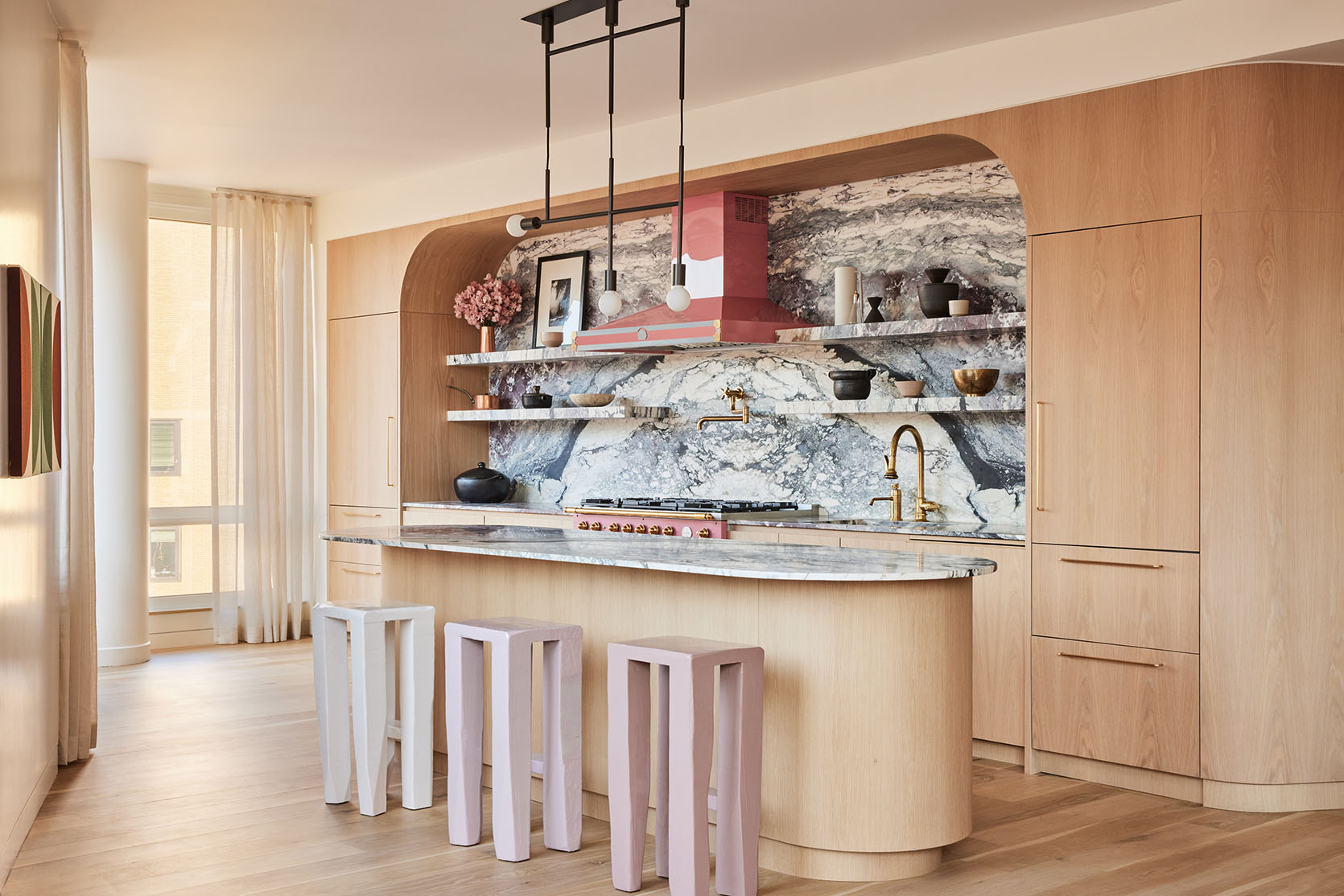
design by le whit | photo by nicole franzen

This kitchen by Le Whit is extremely special and that island is a big part of that fact. While there are a few other curves within the design, the rounded ends of the island help to really give a nice flow to the space. And how cool are those ombre stools?

design by jean stoffer design | photo by john stoffer

Even the son and daughter-in-law of famed designer Jean Stoffer, John and Maura, decided a pill-shaped island in their serene and chic kitchen was perfect for them. Here’s what John said when I asked why they went with the pill shape:

“We went for the rounded island to help with the flow of the room. We moved our kitchen into a small room that used to be a formal dining room. In order to have the island length we wanted, rounded off the edges helped with flow around the space. And for obvious aesthetic reasons :)”

The choice clearly paid off!

Antiqued Mirrored Accents

Are you surprised?? I clocked this trend a few months ago and now am wholeheartedly convinced that antiqued mirrors will but huge in 2023. Given that “antiqued” is literally in the name, this is another “trend” that’s not new and when done well, can stand the test of time.

design by dhd architecture & interior design | photo by david mitchell

Are you in love because I am? This kitchen by DHD Architecture & Interior Design from their Flatiron Triplex Penthouse project is pretty special. I think the use of the mirrors in the uppers is so beautiful and undoubtedly makes this space feel bigger but also textured. Please note the dark bronze hood;)

design by alessia zanchi loffredo | photo by ryan mcdonald

This use of antiqued mirrors is much more of a statement and wonderfully contrasts the more traditional design of the cabinetry. Now I know that when you hear “antiqued mirrors” you think traditional right? But here they look wonderfully modern in how designer Alessia Zanchi Loffredo decided to install them. These mirrors give you options people!

The New Neutral

This might be the biggest trend of 2023. Why? Well because if you are renovating it’s the most accessible since it’s really just a paint color. Yep, the new neutral says goodbye to a bright white or a cool light beige – this is more of an earthy, soft yellow/green. WAIT! Stay with me. Once you see these photos I think you’ll be convinced (even if it’s not what you would pick for your own kitchen).
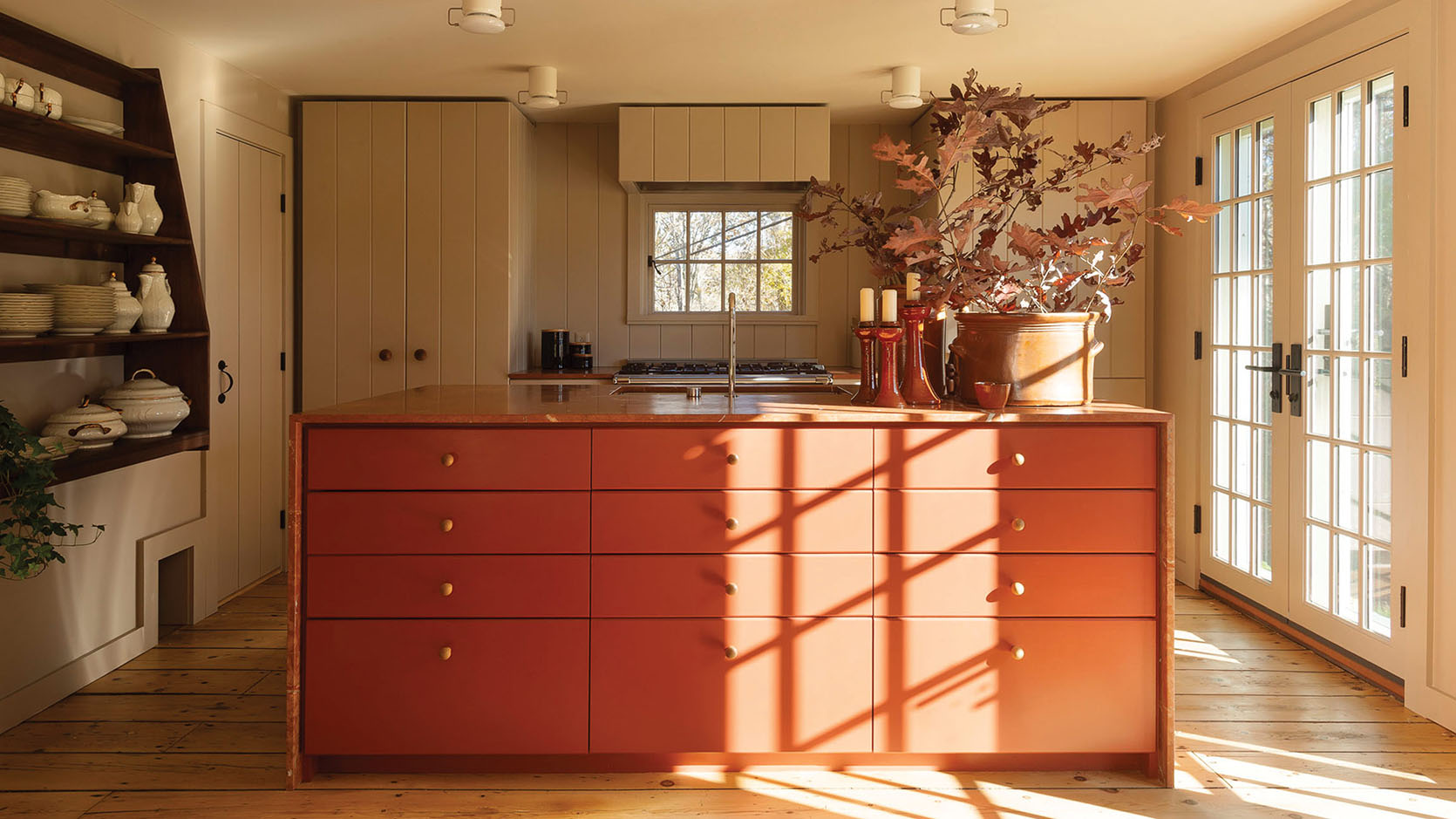
design by workstead | photo by matthew williams

Workstead is an EHD favorite lighting brand and design firm and I think you can see why. Their design walks the line between modern and classic, yet so so inviting and unpretentious. This kitchen is the perfect example of that with its warm taupe-y cabinet color. It’s neutral, a little moody, but still easy to work with a variety of other colors…like an orangey rust-colored island.

I also would like to call the pink and red stone trend now. It’s not on this list but it is on my other “watch list” ๐Ÿ™‚

design and photo by devol kitchens

Maybe another way of looking at this is a “muted” neutral. deVOL kitchens know how to use color and this cabinet color (that to be fair leans more yellow) still falls in this category. It’s not taupe but it’s also not a true yellow.

design and photo by devol kitchens

It’s just a beautiful muted neutral that still feels happy to look at. But then again this whole kitchen makes me feel happy to look at.

design by sarah sherman samuel | photo by nicole franzen

Have you seen Sarah Sherman Samuel’s new show, Inspired Interiors?? Well, that’s where I saw this great kitchen she designed for one of her employee’s new homes. They wanted a California vibe in their new Michigan home and that’s exactly what they got.

design by sarah sherman samuel | photo by nicole franzen

This cabinet color has much more brown in it but still has the yellow/green undertone that this “new neutral” is all about. If you are looking for an earthy color this could be perfect.

design by studio bka architects | photo by jacqueline marque

Let’s go even darker and saturated. Now, this cabinet color is still in the same family but far more green and is so pretty. It feels modern but really grounded. The whole mix of a modern subway tile, a vintage-inspired range, and modern traditional cabinetry is so beautifully balanced. Studio BKA Architects nailed it.

So as you can see there’s a range in tones with this color trend but they all give the same vibe and feeling. Would you paint your cabinets one of these colors?

Two-Toned Colorful Cabinets

For my neutral-averse friends, fear not. This next one is all about color! And more than one…in the same room. We all love a white and black, white and wood, white and navy two-toned cabinet combo. But this year is all about taking a chance on color. Wanna see?

design by charlie ferrer | photo by jared kuzia

Can you believe how beautiful this kitchen is by Charlie Ferrer?? And by two-toned I really mean multi-toned. I love that they chose to go for a soft blue for the uppers and they go really saturated for the bottom cabinetry. Then to really up the happy dial, a mustard yellow island. I think because the top half of the room is visually very calm that this doesn’t feel overwhelming. It’s just awesome. I also will never not love a diamond-patterned floor (especially painted on top of wood).

design sophie dow donelson and celia bryson design | styled by patrick biller | photo by darina bellini studio

Surprise! A double-trend kitchen by the talented Sophie Dow Donelson and Celia Bryson Design. First the “handpainted” naturescape detail and now the two-toned colorful kitchen. This one could actually almost work for the colorful monochrome trend too with all the purples. However, despite falling into these trend categories, I don’t look at this kitchen and think “this is a trendy kitchen.” Instead, I think this is a joyful, colorful kitchen with both wonderful traditional and modern elements. Also, look at the eggplant color and blue color. They both live in the same tonal world which is why they work so well together.

Whimsical/Design Your Kitchen For Just You

Ok, this trend may actually be my favorite because this trend is all about creating the exact kitchen you want, not worrying about what a future buyer might want or dislike. Life is short so why not have the kitchen of YOUR dreams right??

Bri Emery‘s INCREDIBLE new kitchen in her Upstate New York home is a breath of fresh air. There’s a chance if she would have described her design plan that you might be worried about resale value, right? But look how it turned out! It’s so special, full of joy, and in her sweet A-Frame I think this kitchen is an incredible one-of-a-kind gift to anyone who might own this home should Bri and her husband sell. But for now, they just get to enjoy it fully.

design by hannah polskin | photo by emily sudlow

For this next kitchen, artist Hannah Polskin wanted to put her beautiful mark on her minimalist kitchen. Naturally, she decided to customize her kitchen island. With her unique design, this kitchen now has so much movement and joy. I love how free it feels and also what a statement it makes! Step aside marble island:)

design by catherine earp

Lastly, we have this boldly sweet and colorful kitchen designed by Catherine Earp. It is one of two luxury huts called Aller Dorset, located in the Dorset countryside of England. So while this isn’t anyone’s full-time kitchen, it is a great source of inspiration, showing that bold colors, patterns, and sweet details are worth going for if that’s what you are drawn to. How could you not smile every time you walked into a kitchen that looked like this? Impossible.

Ok, the 2023 kitchen trends have been called! We promise to keep you updated as the year progresses:) So what do you think? Any favorites?

Love you, mean it.

Opening Image Credits: Design by Workstead | Photo by Matthew Williams

The post 11 Kitchen Trends 2023 Will See A Lot Of…And We’re Pretty Excited About Them appeared first on Emily Henderson.


from Emily Henderson https://stylebyemilyhenderson.com/blog/11-kitchen-trends-2023-will-see-a-lot-of

Tuesday, 3 January 2023

The Farmhouse Kid’s Bathroom – Bringing You Up To Speed On The (At The Time) Painful Process

HERE WE GO. Welcome to 2023 and with it some natural shifts around here. After much debate, I’ve decided to bring you along the process of fixing some mistakes and showing you rooms that aren’t ready for their birthday party but are pretty darn close. I wanted to wait to show you the kids’ bath when it was fixed, perfect, etc – but things are taking longer than I had intended and I’m wanting to shift the blog this year (now that I have a wonderful team up here to help me) and really bringing you in on every part of the process – not just construction and reveal. That should have always been the intent but this last year, transitioning the company and my family up here, I was so underwater renovating that I couldn’t physically do more than 1-2 blog posts a week, without a team to help. And honestly, it was just such a construction zone for so long that it was really hard to understand what was happening visually. That’s all to say that with my small and mighty team up here and in LA, and my willingness to show you my mistakes/regrets/changes, we’ll be doing more quick process posts in hopes that you’ll still come back for the final reveal. Can I get a collective pinky swear?? Ok great. Here we go…

Where Is The Kids’ Bath?

The kids’ bath is on the second floor, exactly where it was originally (I think it was the original primary bath) and with almost the same footprint (it was a good layout and we attempted to save some money here by not moving the plumbing).

Before – The Mid-90s Renovation

This was the only bathroom that felt like we could leave as-is (beyond updating paint and light fixtures) and we almost did. Now, this bathroom wasn’t original to the house, it was redone in the 90s in a really sweet way and now that it’s almost 35 years ago, it was pretty run down. Once ARCIFORM came over they were concerned about how it was remodeled and pointed out a lot of oddities/flaws. They advised us that we would ultimately be bummed that this bathroom was left as-is, while the rest of the house was a more fresh, high-quality remodel. I’m obviously so glad now that we made that call. Had this been a “doing this over time” situation we would have kept it and waited til the end, but this was more of an “all at once” renovation which is more painful at the time, which obviously means less long-term construction. Had the house been more livable downstairs and not needed full electrical and asbestos/mold removed everywhere we would have done that – I’m only saying that so that you have full information in case you are in that predicament. Slower is better – over time is the wise way to do it if you can. But often you can’t.

I do kinda miss that toilet (although I love our new one and I don’t think I’ve ever said that before). All the plumbing, lighting, and medicine cabinets were given to the ReBuilding Center and sold to those remodeling on a budget. Now that I’m looking at these “before” photos I’m hoping that we have the train rack shelf thing (below) in the garage as it will work so well in the guest bath!!

So yes, it was all demoed out and new plumbing and electrical were done (in the same location. Then we added drywall, tile, and our beautiful new fixtures. It wasn’t quite the snap of your fingers that I’m suggesting and you can read about the design process HERE. And if you want to see a quick video update check it out here! (just wait for the ad to play…THANK YOU!)

Where We Are Today

I love so much about it – the green and white tile, the lighting, the plumbing fixtures, the light switches, the shower door – the whole vibe is super special. That tub nook is so cute, and so is the vanity – a lot to love here.

BUT… MY BIGGEST REGRET/PROBLEM

Welcome back to the nightmare situation of publicly dealing with my very own mess up – the “too cool white”. Now when we chose this color there was some confusion on my end when deciding between Pure White (which we chose for the exterior and love) and Extra White (which we love in the rooms and has a lot of blue in it). It was a dumb and very expensive mix-up. And honestly Pure White might have been too cool for this tile anyway. But we chose this white when the bathroom was all covered in plastic and the tile was seemingly a pure white. Y’all, this was the wrong white. I wanted to repaint before I showed you, embarrassed of my own mistake. But it’s taken a while to choose the right “white” and then we have to book a painter, it’s a 3-4 day job with prep and dry times (and the walls and trim are two different finishes – satin and semi-gloss). The whole thing sucks, but now that I’ve had some distance from the initial nausea. I’m accepting of it and have transitioned into problem-solving mode. As I tell my kids “every problem has a solution” and now I’m ready to show my friends:)

As you can see the paint color makes the tile look yellow and THE TILE IS NOT YELLOW. So many lessons learned. I’m not going to harp on it too much here because there are so many other pretty things to talk about. But yes, I messed up and have felt a lot of anger and frustration with myself (ARCIFORM wasn’t involved in paint decisions due to scheduling and needing to make some decisions really quickly – I was like, “I got this!” *hand in face emoji*). I haven’t even let Anne come over yet to see it because I’m too embarrassed. It’s all so dumb. Anyway, I have my strengths – one of them is styling and the other is admitting fault then solving problems.

So as you can see we have three different Sherwin-Williams whites that we are choosing from. Rene from Some Kinda Landscape came over and helped pull the whites that she thought would work (she painted our prop closet and part of her service is color consultancy so I figured I’d get someone else to weigh in on this with me). Above we have these three colors – all of which look identical to each other and are creamier, but as we have all very well learned in this process – all whites are very very different.

Faucet | Stone

Ugh. How pretty is that faucet? I’ll be talking more about the plumbing and lighting in the final reveal – all from Rejuvenation, but will certainly link up everything at the end of this post. This is the faucet that made me want to reach out to Rejuvenation on partnering on the plumbing – It’s from their Conner line and is just so beautiful.

Switchplates

The Vintage Dresser Turned Vanity

Vanity Base (vintage)

I love that vanity so much. I found the dresser at a flea market a few years ago in LA and up until now, the kids have used it for clothes. But when we were designing this bathroom I wanted something that felt special and soulful (and wanted to save some money). There are a million beautiful vanities on the market, but when you want something unique, your options tend to be vintage or custom…and anything custom is always like thousands of dollars. So Jamie retrofitted this (cut out the plumbing in the drawer) so that we could still have storage. The keyholes just kill me, in a good way.

Anne and Stephyn helped draw this backsplash design that I had referenced for like a year and it was a lot more to do it (and we had a tile backsplash so it wasn’t necessary) but now that it’s done we LOVE it.

Regarding the backsplash – the countertop and backsplash were supposed to be a white Thasos – a creamy white marble. But after spending some time this summer at the mountain house where we have Thasos in the kids’ bathroom, I was reminded how annoying it can be for kids (on honed Thasos you can see all toothpaste or soap marks, and they often stain for months). So I stopped that and went stone shopping. At the same time, the kitchen and main bath stone (a beautiful Carerra) was picked up from Bedrosians and dropped off for fabrication. They had enough to do this bathroom (the vanity and the shower jamb). So my options were to keep shopping and see what I could find that works with the green/white that wasn’t a full slab or just literally give them the green light to fabricate this as well out of the same stone. I chose the latter (mostly out of ease) knowing that this stone is beautiful and more forgiving than Thasos (Thasos is so white that it almost doesn’t even look like a real stone and you may as well get a Quartz IMHO). That’s all to say that the stone is also cooler than the tile so when choosing the new white color for the walls I need to make sure that it shares the undertones of the stone as well. This is hard for someone who I’ve come to realize sees colors differently than other people – not saying I have any sort of color-blindness, but the number of times I’ve gotten in debates with people over what color something is, is A LOT.

The Tub/Shower Area

Tile | Hook

Should we talk tile here??? I wanted to do something unexpected but not crazy busy so I brought the floor tile up the wall, mixing the different shapes (and mixing the grout on the wall). It’s pretty darn fun if you ask me. The tile is from Pratt + Larson and install was by Level Plane Tile and Stone. On the other side of the room, we have the shower “room” and tub nook. I like the shower room versus one that is more open with glass so we did this twice in this house.

Shower Door (custom) | Shower Set | Shower Head

At first, I thought that the shower door came in short, but then realized its likely for venting. I’ve gotten used to it and it’s not something we are going to redo but wish that we had put a venting transom above it. Not a big deal though at all. I love the brass around the glass and the little knob (all per ARCIFORM’s recommendation).

Tub | Facuet

The clawfoot tub was something that Brian specifically wanted to keep from day one. We didn’t keep the one that was in there because I wanted to give my partner Rejuvenation rooms with 100% of their product (if they sell it). So we donated the tub to the ReBuilding Center and it’s in someone else’s house now ๐Ÿ™‚ We do like that this one is double-sided and allowed us to do the faucet behind it and have perfect symmetry in this nook.

Towel Bar

The Tweaks And What We Are Adding

Sconce

We want to change out the white shades to glass shades so we don’t obstruct the future mirror too much.

Mirrors (vintage)

Add a mirror over the vanity:) And yes, we wanted an inset medicine cabinet but I don’t totally remember why we couldn’t. It was due to framing/electrical I think…it’s definitely something we could have had if we planned better for it, but I think it would have had to be really small between framing (or we would have had to reframe). Near the end, I just wanted to move in so no, we weren’t going to re-frame (it’s the kids’ bath after all).

Changes/Ideas For The Tub Wall Side

Changes/Ideas For The Vanity Wall

Looking at these photos while writing this post, not at the house (on vacation) makes me so excited. I can more objectively see the potential with one final layer and a couple of tweaks. Oh, one more thing I want to call out that someone recently said. Ahem, “Ooh the tile looks like grass,” which wasn’t exactly what we were going for by bringing it up the wall but of course, I can see it. I thought about it for a while and was like, “Does it look like grass? Would blue or pink have been better?” But then I reframed it quickly, as I do, reminding myself that we love grass and actually moved back to Oregon so that our kids could have grass instead of concrete to play on at recess (something missing in most LA schools). Anyway, so if you are thinking “that tile looks like grass” you aren’t alone, and yet we are still very into it ๐Ÿ™‚

Bathroom Resources:

Plumbing Fixtures: Rejuvenation
Switchplates and Hardware: Rejuvenation
Elongated Picket Tile: Pratt and Larsen
1×4 Herringbone Tile: Pratt and Larsen
Clawfoot Tub: Rejuvenation

Sconce: Rejuvenation
Semi-Flush: Rejuvenation
Vanity and Mirror: Vintage
Toilet: Kohler
Shower Door: Custom/Local
Tile Install: Level Plane Tile and Stone
Stone Fabrication: Alphaworks
Renovation and Carpentry: ARCIFORM

*Photos by Kaitlin Green

The post The Farmhouse Kid’s Bathroom – Bringing You Up To Speed On The (At The Time) Painful Process appeared first on Emily Henderson.


from Emily Henderson https://stylebyemilyhenderson.com/blog/the-farmhouse-kids-bathroom-update

Sunday, 1 January 2023

The Link Up: The $24 Cozy Jumpsuit Em’s Kids Won’t Take Off, Mal’s Chic Coup Glasses, And Our Favorite Pants

Happy New Year!!!! We hope you all had a wonderful celebration and are taking it as easy as possible today. We are officially back in the office Tuesday and we can’t wait to see each other’s sweet faces on Zoom. Right, ladies?? Ha. So since it’s only day one of 2023 let’s keep this brief and drive right into the first link up of the year!

This week’s home tour is in fact a TikTok famous apartment in Melbourne, Australia designed by Josh Jessup and Matt Moss. As you can imagine it’s full of bright colors, wild pieces, and SO much creativity. We think that this apartment is a great lesson in having fun with your interiors because your home should make you smile and maybe even laugh, right? Is that our 2023 motto? Check out the whole place on The Design Files.

From Emily: The $24 coziest velour sweatsuit our kids are living in, like all day every day. Brian does most of the shopping for the kids and he came back with these sets that are micro fleece and stupidly soft. They love them so much that they beg to wear them to school which I have a problem saying no to (as someone who also likes to live in comfortable clothes). They sleep in them, spend all day in them, and even change from school clothes into them when they get home. Charlie likes the camo set (top + the bottoms are just gray) and Birdie has the hot pink (top + bottoms). We are actually going to buy another set to last us through the end of winter. They are sold separately btw.

From Mallory: I finally got these CB2 coupe glasses that I’ve been eyeing forever and I am in love with them! I got them as a gift and they are perfect (also hint hint if you need a good gift idea, consider these for the martini/coupe glass lover!) Hot Tip: I keep them in the freezer and pull them out when I’m ready to serve my famous dirty martini. They feel so fancy and luxurious. Could not love them more:)

Also From Mallory: It’s time to introduce you to my new favorite hot sauce brand, Tia Lupita. It’s UNREAL good and the ingredients are so clean. I love the salsa verde and habanero flavors so much. If you’re in need of some hot sauces or if you’ll be enjoying Christmas tamales, grab these (they’re in most grocery stores!)

From Ryann: These flare leg pants are my new party pants. I bought them in-store on a whim a month ago and had no idea how much I would end up wearing them. I’ve already worn them to many a dinner, a concert, to parties, and I am definitely planning on wearing them on Christmas Eve with a small heel and a cute top. They are very flattering, COMFORTABLE, and slimming if you are into that and go with pretty much everything I own. And only $18! Run don’t walk!!

so many fun colors!

From Caitlin: I just discovered Shiny By Nature, which is an affordable AND sustainable clothing brand that’s specially designed for women with big hips and butts!!! (I KNOW. UNREAL.) I grabbed a few pairs of their wide-legged corduroy pants on sale back in December – the colors are so fun and vibrant! – and now I’m absolutely obsessed. If you’re on the hunt for great, cheery basics, I EMPHATICALLY recommend checking them out. I really can’t wait to wear these all year round!

From Albie: Two years later and I am still dining table shopping — can you believe it? Now to be fair, I haven’t been dining table shopping this entire time…mainly because we have one…it’s just not a very good one. Our current dining table arrived damaged two years ago, with a hole right in the tabletop. Since it’s still functional, I’ve just always thrown a runner over it & called it good. I recently resumed my search, however, and fell in love with the Cross Fixed Table from DWR. It’s about a foot longer than we’d like, however, I am obsessed with this beauty. Since I can’t have the table I desire, I do plan on tablescaping & styling it for the season. You know the saying… dress for the table you want lol. 

From Jess: If you are looking for soft leggings for activities like yoga, pilates, reading, or watching TV, I HIGHLY recommend these from Girlfriend Collective (my favorite leggings company). I originally got these on Black Friday and have been living in them since they arrived. I normally go for their high-waisted compression leggings, which I still love, but wanted to try something different. Also, I DIG the red color! I wore them with this bright red hoodie to my friend’s house and everyone loved them. 10/10

Ok, now go enjoy the rest of your day and see you all Tuesday!! xx

Opening Image Credits: Design by Ben Medansky | Styled Velinda Hellen and Erik Kenneth Staalberg | Photo Sara Ligorria-Tramp | From: The New Design Rules

The post The Link Up: The $24 Cozy Jumpsuit Em’s Kids Won’t Take Off, Mal’s Chic Coup Glasses, And Our Favorite Pants appeared first on Emily Henderson.


from Emily Henderson https://stylebyemilyhenderson.com/blog/kids-cozy-jumpsuit

Our Back Patio Reveal! (+ How Everything’s Held Up To 6 Months Of Portland Weather)

The light at the end of the construction tunnel is getting bigger and brighter every day – we are hoping to be fully blinded by June. So i...