Thursday, 28 July 2022

Designing With My Very Involved Daughter – And The One And Only Wallpaper We BOTH Love!!!

I walked into this room design process fully willing to let Birdie’s creativity lead. I would NOT try to control her effervescent light. But much like Halloween costumes, you can only impose your wants for so long before their “youthful” choices and tantrums dominate. The first few years you dress them in a costume that makes you and your friends laugh, like Mario Batali, “Weekend At Bernie’s”, or Dolly Parton (true stories). But around age 4-5 they want to be Elsa and Spiderman and you swallow your disappointment, embrace their generic choice, feign enthusiasm, and “Ok! ELSA IT IS!!” Again!! Big kid rooms are the same, unfortunately, but different because a dumb $18 one-night-a-year costume has far less implications than a full room design. As I wrote about last week, Birdie is extremely enthusiastic about design and color, she feels confident she will be an artist when she grows up, she wants a room that is full of her personality and will not settle. Not sure where she gets it from:) It’s exhilarating to be her mom. So I sat down with her, innocently, on Pinterest ready to find the “jumping-off point” when she said, “let’s just google unicorn wallpaper”. Against my better judgment, I typed that death wish on the keyboard and it all went off the rails.

She squealed and screamed, “I want that! THAT!!!!”. These aren’t even “wallpapers” for your wall, they are digital art for your computer (mostly) but they are full of incredible energy and color and, y’all, that’s what she wanted. OOF. ROOKIE MISTAKE. I did my best “cool” mom act and said, “oh yeah, that’s so fun…but what if it was more like …” and then I plugged in “Scandinavian pink girls room”. Here’s what came up:

She responded in the most adorable voice on the planet, “Oh no thanks, mama. That is what you like. That’s not enough color. I want ALL the bright colors. ALL of them.” and then the kicker, “even orange and purple…”. I was quick to stammer, “of course, sweetie, it’s your room and I want you to love it,” while I panicked inside.

Then over the next few weeks, I used my brain and more developed manipulation skills and pulled up only sites where I loved all the options. i.e. House of Hackney, Schumacher, Hygge & West, Minted, etc. She made me pin every single one that she loved which was 99% of them with strong saturated bright colors. I tried my hardest Oscar-winning performance to show them all equal enthusiasm, while I obviously had my preferences.

Meanwhile, we were working on her dollhouse together. I told her that she could be the lead designer and that I would be her assistant. She could design it HOWEVER she wanted. We went to the craft store and bought “wallpaper” full of donuts, ice cream, unicorns, and 10 different flower patterns. She chose the paint colors and gems for all the furniture and I went to town making them all. I matched her enthusiasm at every turn because honestly, it was SO MUCH FUN doing this with her. As I in Tuesday’s post, cultivating a shared interest is an extremely important thing to me as I can see the potential for decades of fun, together (if I don’t mess it up).

She would scream with delight, so excited when the donut wallpaper went up in her dollhouse bedroom. She wanted to hang paper butterflies in the corner like a mobile and I helped her figure out how to do it. Here and there I would try to teach her about focal points, balance, “restraint” (ahem), etc, and she changed some things but I honestly tried to bite my tongue and let her lead. I’m SO GLAD that I did. I feel like if we hadn’t had that dollhouse experience/experiment I wouldn’t know the extremes of joy that her own creativity induced in her. SCREAMS OF JOY. She was having the same reaction as I did to the pantry vintage windows and there was NO WAY I was going to deny her and myself that joy in her future, real bedroom. Lesson learned. This room is hers and we are going ALL OUT.

But at the same time, we talk a lot about waste and landfills in this house. They know that we won’t support buying anything that doesn’t have longevity. Not that we have to keep everything forever, but it can’t be plastic $8 LED unicorn lamps from Amazon that would break or that she’d hate next year. Further research and exploration were necessary:

So we listed what she loves and they were as follows:

  1. Unicorns. (fine, for now – we can bring them in…. somehow)
  2. Flowers (!!!!!))))
  3. Butterflies (!!)
  4. Birds (and all animals really) (!!!!)
  5. Hearts 🙂
  6. Candy/sweets

For colors she wanted the following:

  1. Pink
  2. Purple
  3. Teal
  4. Blue
  5. Green
  6. “All the colors in the rainbow mama, except gray”.

It gave me a great jumping-off point. I pitched an idea, that for her real bedroom I would be the designer and she would be my client. I walked her through the process, how I would present her ideas and she would get to choose. To be clear, she is super opinionated but also strangely reasonable and can compromise. She loves so many different things, I could easily convince her of the next thing if I felt like it didn’t work. Sometimes it’s like looking in a mirror. Maybe she trusted me because of the dollhouse experiment? She agreed to our arrangement so I narrowed down the wallpaper choices that I really hoped she would love.

As I was shopping I thought about the following:

  1. It HAD to be very very colorful and fun, or she would just say “No, mama”. Note taken.
  2. It had to last for a decade. Nothing too silly or young (like unicorns or donuts) and nothing cheap or too trendy.
  3. It had to work relatively well with the rest of the house and the other bedrooms upstairs. Nothing too cartoony, dark, random, or crazy busy.

1. Queen’s Flight Panel Set | 2. Butterflies Wallpaper | 3. Simons Äng White | 4. Rabarber | 5. Midsummer Eve | 6. Garden Party Trellis Wallpaper | 7. ARTEMIS Wallpaper | 8. Exotic Butterfly | 9. Millefleurs

I felt pretty good about presenting all of the above to her. Just like a designer, I had my favorites, for sure. As much as I love busy patterns in photos, I don’t love living with them as much. So I was hoping that she wasn’t adamant about a few of them.

She nixed some immediately (for not being bright enough). She considered the unicorn wallpaper (oops not shown) but agreed that she didn’t know if she would still love them in 3 years (one of her formerly unicorn-obsessed best friends is 9 and no longer as into them). I may have stacked the cards a bit because the only physical sample that I bought at the time was the Butterfly Baudin from Schumacher because that is the one that I wanted. I felt that it checked the boxes that I wanted. Proof of said boxes:

  1. Light, bright and airy – it had a decent amount of negative space that kept it from being too dark, heavy and busy. While I love so many dark patterns, for these three bedrooms on the landing I want it to flow relatively cohesively.
  2. It’s feels kinda vintage-y and classic/traditional (versus a more contemporary butterfly or animal pattern).
  3. It’s full of so many wonderful colors. This girl wants everything in the room to be a bright color. So we have been collecting vintage/thrifted dressers to paint. While she loves neon and some lime green, etc, with this paper as our guide she has a ton of colors to choose from – all approved by her designer (me).
  4. The flora and fauna vibe still feels “Oregon farmhouse” appropriate.
  5. I loved how the pattern would interact with the diamond pattern of the original windows. while some graphic patterns could have worked I liked the juxtaposition of this more organic pattern next to the straighter diamond pattern.
  6. I could picture it from the landing and it just made sense with the house. Walking up the stairs and seeing through those light blue doors just makes me so happy and feels right.

For me, the colorway was a no-brainer, but I put it on social media and the all-pink version was the winner. Not us. The “Never Bright Enough Henderson” team wanted the teal/yellow and pink version. I tried my best to conceal that it was my favorite until she made the decision herself. It was SO enthusiastic. I think she feels really proud that her choice was the one that a professional designer would have chosen. And it was a shared celebration that we had found the most perfect wallpaper (and WE ARE STICKING TO IT!!).

So we are off with an incredible jumping-off point that is making the room feel very clear and cohesive to me as her designer, and so wild and fun for her, my adorably involved and totally spoiled/sweet client. I had zero intention of even thinking about the kid’s rooms yet but she was so excited about the design and talked about it all the time. It’s such a fun way to spend time together. So y’all we are doing it. WE HAVE OUR JUMPING-OFF POINT!!!

Opening Image Credits: Design by Julie Rose for EHD | Photos by Sara Ligorria-Tramp | From: A Little One’s Mid-Century Magical Bedroom Reveal

Photo of Emily and Birdie by Kaitlin Green

The post Designing With My Very Involved Daughter – And The One And Only Wallpaper We BOTH Love!!! appeared first on Emily Henderson.


from Emily Henderson https://stylebyemilyhenderson.com/blog/kid-and-parent-approved-wallpaper

Wednesday, 27 July 2022

Is Organic Brutalism The Next Big Design Trend?? We Think So – Here’s The Deep Dive

The first time I heard the term “brutalist” by way of interior design was the first year I started at EHD (2016). I thought to myself “Ooo intense and very cool.” And I was right. The expressions and examples I saw back then were primarily bold, dark, raw, and lots of concrete and metals. If that’s your exact style, that’s great. At the time, it mostly wasn’t for me. But I’ve since changed my tune because now what I’ve been seeing develop and come into the mainstream are still those raw, bold chunky, geometric shapes but in warm, inviting materials…mainly natural woods with texture that really draws you in. It’s no surprise to me that it’s now a trend because while it’s not for everyone, it’s undeniably awesome. I also think that adding some kind of brutalist piece into your home makes it feel intentionally designed and honestly a little aspirational. “But Jess, I want to feel cozy in my home. I don’t need to feel ‘inspired’ while I’m hanging on my sofa.” True! However, I think having a piece…or two…or three that bring some bold visual tension can give a room that spark a lot of us are searching for. So let’s dive into a BUNCH of really cool examples, talk about why they are awesome, and then end with a little lite shopping. Sound like a plan? Great.

via lulu and georgia

Let’s start with what actually inspired this post…this masterpiece of a dresser from the new arrivals at Lulu and Georgia. I was stopped in my tracks when I saw it and was immediately figuring out if there’s a way it could work in my bedroom (but also I’m not allowed to start designing that yet…one room at a time, Bunge). Actually, if you read my DIY cabinet post you’re probably realizing that I have a cabinet type:) But truly, after seeing this photo it hit me that this style was now a trend.

design by vince skelly | via sightunseen

After doing some light research and talking to some design pals, brutalist architecture primarily started after WWII and focused on blocky geometric, monolithic-like shapes. And as I said before, raw concrete was maybe the biggest material used. Now in 2022, artists are taking an inspired approach, like Vince Skelly. As you can see in some of his recent work above they are indeed “blocky geometric, monolithic-like shapes” but in the most organic-looking form. They make you feel something when you look at them. Imagine the impact even one of these pieces could have in your home. For me, it would be an instant feeling of happiness.

design by hauvette & madani | photo by cerruti draime | via sightunseen

So “organic” doesn’t always have to mean without refinement or uniform. Take these incredible stools. They meet all the “brutalism” criteria in shape but the beautiful, near joyful celebration of the natural grain feels wonderfully organic, right? I guess even the term “organic brutalism” has tension in and of itself. Yikes, those stools are cool.

design by brady tolbert

I would be remiss if I didn’t talk about the organic brutalist himself, Brady Tolbert (EHD alum for those who started reading after his time). My love for this style is directly due to being introduced to it by him. Brady loves a neutral color palette and a bold shape. His office is a perfect example of that. Take the desk he designed, the shapes and textures of the vase and lamp, and of course those wooden wall pieces. In another material, they might feel cold and harsh all in the same space. It would still look cool, but maybe not be somewhere you would feel comfortable hanging in all day. But because they are almost all in different types of wood, it’s a very chic “welcome in”:)

via bradley duncan studio

Now, I need to talk more about those wall art pieces. When I saw them on Brady’s Instagram I thought, “WHERE DID HE GET THOSE AND WHAT PERFECT HUMAN MADE THEM?!” That perfect human (and artist) is Bradley Duncan. His pieces are both visually simple but so so impactful. I truly could stare at them for days. He does play with color and non-wood materials but they are all incredible and still perfectly fit this style.

Now let me introduce you to another incredible artist (if you don’t know them already) that brings his culture into this style, Andrés Gutiérrez. When I went to Mexico City this past April, my friend and I happened to stumble upon Originario, a design store and were blown away. The whole space is amazing, featuring many other Mexican designers, but his work really took my breath away. As you can see above, his pieces are bold and geometric but also playful and deeply represent who he is. It goes to show you that there is always room to make something your own. I hope one day to have that table in my home!

design by piedrafuego

Speaking of making something your own, Piedrafuego also embodies that. While working with wood, they also work with stone (a classic brutalist material). Their bold shapes and perfectly imperfect patterns, give me the same organic brutalist energy. I love all three of these pieces.

design by simone bodmer-turner | photo by annie schlechter | via curbed

Ok now let’s look at some pretty rooms, huh? This living/dining room belongs to artist, Simone Bodmer-Turner. Her work most definitely falls into the organic brutalist category but far more on the organic side. See for yourself:

But what I want to talk about right now is the subtle organic brutalism shown in the benches pictured above and below. They both feature these medium chunky slats and very simple yet geometric legs. I know it doesn’t scream “brutalism” and you may think they look like something you’ve seen before, but take a closer look. The top slats in Simone’s home sit flush with the base frame. It just has a different feel to it and doesn’t look comfortable without some kind of cushion. I think that’s another element of brutalism that I haven’t touched on. This style, which visually stunning and welcoming via the material’s character, isn’t meant to look comfortable. It’s in the name…brutal!

Then there’s this bench, sitting in the lobby of the new Nine Orchard I visited in NY a couple of weeks ago. I’m so bummed I didn’t get a better picture of it because it was so special in person and awesomely contrasted the elegant, almost antique style of the hotel. With this piece, the slats have varied widths and a metal base. Then adding that thick, happy yellow cushion on top connects the whole piece together with the rest of the space. That cool floor lamp also has some brutalist vibes, no?

Now, it’s not just about furniture. Look at these incredible hotels. As you can see on the left, it’s not a surprise that this style originated in the 1950s. This beautiful wooden wall is very much “new mid-century modern”. There’s just enough randomness in the pattern to make it feel fresh and not a copycat of something you would have seen in a Mad Men episode. Actually, Rashida might be cooking something in this world up so stay tuned for that:)

Then to your right, you have a staircase by the post-modern, brutalist-loving gal herself, Kelly Wearstler. Notice the mix of the stacking blocks on the left side of the stairs and the exposed rise and run on the right. Both are super geometric and together look so unexpected and grand.

design by kelly wearstler | photo by the ingalls | via design milk

Let’s now go on a furniture adventure because I couldn’t stop pinning and these aren’t even all of them. This first one is also by Kelly Wearstler. It’s not wood, but the color is strikingly happy and the shape is bold yet soft. I think it’s very cool and if you have a chance to visit The Proper Hotel in DTLA, do it.

design by kelly wearstler | photo by the ingalls | via design milk

Here is a room at that same hotel. I wanted to point out that sweet, sorry, I mean “brutal” nightstand. It looks like fairly simple until you see the inner angle of the legs. That detail! It doesn’t have to be visually dominating to still nod to the trend. Dipping your toe if you will.

via city furniture

With this cabinet, we are getting a little louder. Love the blackened raw wood and LOVE the concave squares with circles. 10/10.

A little bit louder now (shout). Ha. But seriously, these credenzas are bold and textured and actually might lean a little classic brutalism if that’s more your style.

design by l.a. studio | via 1stdibs

This stunner really does it for me visually! Look at those angles, look at that wood grain and medium tone! I might personally prefer it without the glass top but regardless it’s awesome.

Geometric patterns for days. On the left is a vintage piece and on the right is a modern version. I have a soft spot for the vintage piece and the more pronounced negative space in the pattern. If you are handy you could probably DIY something in the same world.

Here’s another subtle version but those legs and dot detail are incredible.

For a more affordable but equally as stylish option, may I remind you of Carmeon Hamilton’s line from Tov Furniture. I love that it toes the line between postmodern and organic brutalism. That white dresser could work with any style and add a perfectly bold moment.

design by loïc bard | via radnor

I just couldn’t not add this masterpiece. “To me, you are perfect”. All shape, all material, all emotional (me, not the credenza).

So while a lot of these pieces I just talked about are available for purchase, here are some more options I found:

1. Ventura Notched Tall OakBookshelf (not totally organic brutalism but great for a little taste) | 2. Plinth Wood Legs Buffet (a hint of MCM in the most organic version) | 3. TriAngle Stool (very simple, very modern, very cute) | 4. Albie Oak Wood Console Table (the definition of organic brutalism and I love how the two pieces fit together) | 5. Huron Nightstand (love that shape and wood tone) | 6. Knot Rustic Sideboard (another subtle option that’s super versatile)

Ok, so I know those weren’t the most affordable. Honestly, you will likely need to hit the flea markets, thrift shops, and online secondhand options for budget-friendly options. BUT don’t forget about decor! Smaller, less financial commitment, and more affordable. I wish this style/trend was cheaper!

1. Willa Black Woven Leather Baskets (love the unexpected black leather and woven pattern) | 2. Marble Dish (I’ve almost hit add to cart 4 times! this is SO good) | 3. Cassius Compotes (cool, earthy, and chic) | 4. Floor Lamp (subtle but so pretty) | 5. Racco Wall Decor (Set of 2) (love the 3-D dimension and these would add so much character to a wall) | 6. Cyril Decorative Sconce (very cool and sexy).

So. Whadda think? Again, I know this will not be for everyone and by no means do we think everyone must incorporate this style/trend into their home. BUT if it doesn’t intrigue you go for it! Talking about/being introduced to new designs is fun and that’s what we are here for.

Love you, mean it.

Opening Image Credit: Design by Simone Bodmer-Turner | Photo by Annie Schlechter | via Curbed

The post Is Organic Brutalism The Next Big Design Trend?? We Think So – Here’s The Deep Dive appeared first on Emily Henderson.


from Emily Henderson https://stylebyemilyhenderson.com/blog/design-trend-organic-brutalism

Tuesday, 26 July 2022

How I’m Designing Our Kid’s Rooms Differently This Time (Things Have Changed…)

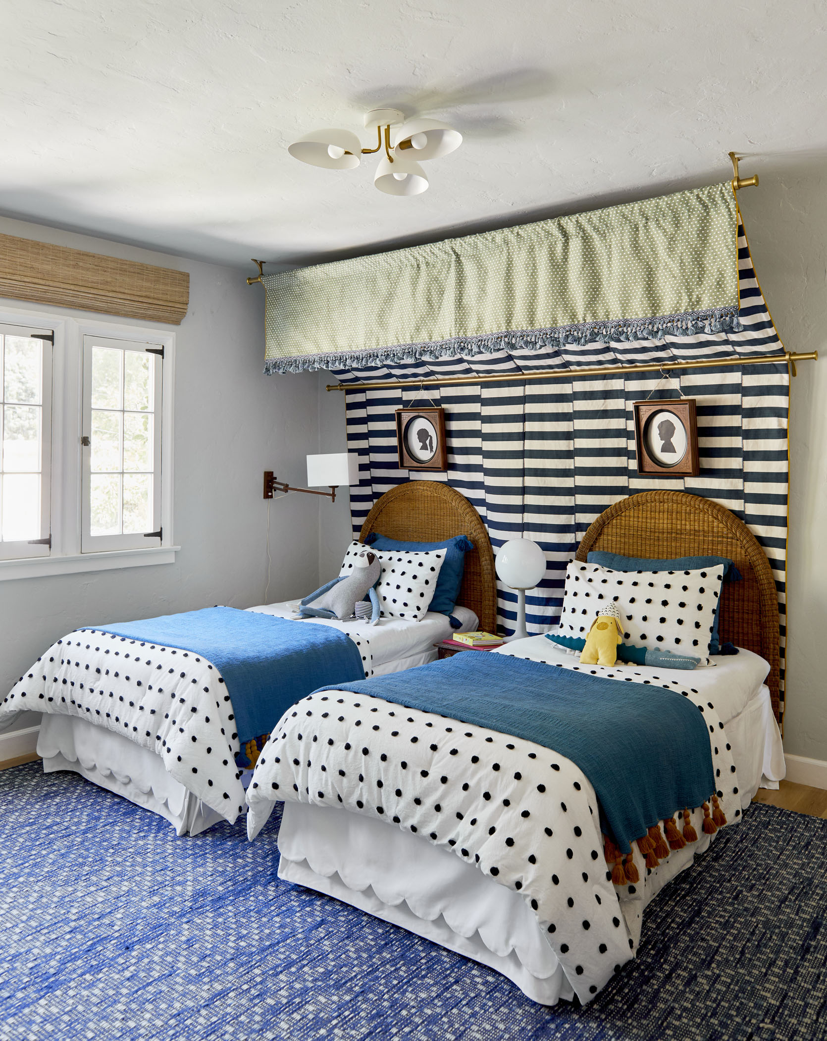
One of the occupational hazards of my job is that our kids have gotten spoiled with stupidly cute Pinterest-perfect rooms since the day they were born. They just popped into the world with animals wallpapered all over their rooms and carefully curated gallery walls. So easy! We are all EXTREMELY lucky and privileged, and while it’s not their fault, our kids have NO idea how much work, time, and money it takes to pull together a room. Before the pandemic it was different. I was so busy and had a team of designers that helped me with my own house. Emily Bowser and Julie Rose created the tent bed at the mountain house. Shade installed the rock climbing wall. Julie drew and executed the blue and white canopy in their last shared room. I remember crying in the shower, reaching a breaking point thinking “I don’t have time to even decorate my own kids’ rooms”. And yet there was immense pressure both internally and externally to have their rooms done, perfect, styled, shot, published, and praised. I was so embarrassed that they were both sleeping on mattresses on the floor for a couple of years that I stopped inviting anyone over that wasn’t a very, very, very close friend. I was so sick of apologizing. I actually didn’t mind showing you all on the internet, but if friends of friends came over I would have anxiety due to the expectation. The pressure was real and just so dumb (and trust me, people did judge and I don’t blame them). Even if it had been just me designing their rooms they were young, in school, and never really saw the hard work that it took to make a room beautiful. They were 3 and 5 then and now they are close to 7 and 9. Things are different. And I’m in such a different place physically and mentally.

photo by tessa neustadt | from: elliot’s nursery update

Recently we watched the show Get Out Of My Room where siblings design each other’s rooms with the help of a team, and surprise! A new totally dialed-in room. It’s pretty darn fun for the whole family and the designs were super cute – if not totally far out. Afterward, they both had a massive list of ideas and design elements that they wanted for their rooms. Once again TV has made things look so easy and attainable. “Oh really??!!!,” I said. “And who is going to do all of this, and how are we going to pay for it?!!!” I think we all know how they would have answered, “Uh, you” but they were smart enough to not answer. As a mom who grew up not financially privileged, knowing that I’m responsible for their entitlement is a real bummer and has forced a change in how we do life.

I honestly haven’t really thought about their rooms at the farmhouse until now because I was too swamped with the renovation to think about decoration. We weren’t sure if they were sharing or not and still aren’t. During the day they both want their own rooms, but at bedtime, they say “we aren’t ready”. Right now they want to start with two full beds in one room, knowing that within the year once they get used to the house (and get over the fact that our room is so far away) they’ll separate. Another reason that I haven’t started their rooms is because I want to take my time and enjoy the process with them. Imagine that! And now that we are getting closer to moving in, our kids are talking about their rooms more which is what I needed to get excited. So here is how we are going to do it this time:

Find A Jumping-Off Point We BOTH Love

photo by tessa neustadt | from: a baby girl’s blush and green nursery

Now you don’t always have to have a “Jumping-Off Point” but with kids (and those of us who are ADHD), they can be all over the place and change their minds constantly with the newest shiny thing. I get it. Finding one thing, whether it’s a piece of furniture, a pattern, or a theme and then trying to keep everyone aligned with what we originally all loved I think helps. For Birdie, it was her wallpaper (which you’ll see this week) full of tons of colors for us to pull from. Such a relief. For Charlie, it was his vintage “net” chair, again full of colors and a vibe that gave us both good ideas for his 80s concept. I’m not going to be strict about it or anything, but knowing that they love these two design elements a lot gives me a sense of where we are headed, and then I can show them how to pull colors for the rest of the room to work with what they have chosen. Almost like the now restricted color palette was their idea.

Ask Them Their Opinions And Ideas Away From The Internet

I’ll write about it later this week but because of how ads have taken over every. single. platform, if you put in any theme for a room, even on Pinterest, it’s all product or moving videos. So guess what they want? New stuff and to watch annoying ad videos. So yes, I’m asking them all the questions and getting answers like “glow in the dark”, “boom box tech”, “disco sparkles”, etc. But then I’m going to find the good versions of those ideas and pitch them back to them. Otherwise, they see a lot of garbage and want it.

Curate Before You Show And Tell

photo by tessa neustadt | from: charlie’s big boy room reveal

I’ve made this mistake so many times thinking somehow we are aligned in our likes and dislikes. WE ARE NOT. Their ideas aren’t bad, but I’ve found that naturally, they choose the loudest versions of them, which I don’t think have longevity. When I gave them the whole paint deck to choose colors they somehow both found the colors that hurt my eyes. I’m not a monster and want them to have those colors, but there is a “good” version of every color, even neon green and bright purple (I hope, dear God, I hope). So now I show them curated chips instead of the whole fan deck – especially when we are talking about painting Birdie’s bed. Kids are the opposite of refined – as they should be! And I don’t want them to dislike something in a year as they grow. I think it’s ok to think about longevity and not dive too deep into colors, themes, or characters they may not love in a few years. Finding that balance between fostering and forcing is hard 🙂 Also, I’m not going to show them every option – I found this dope vintage architectural white metal lamp on Etsy the other day and showed Charlie, and he loved it. If I had shown him all the vintage lamps on Etsy he might have liked other ones more, and frankly, until it’s their money I’m only buying things that I know will go in our house well and for a long time. He’s happy and I’m happy.

My Secret Strategy For Family “Treasure Hunting” (Thrifting)

photo by tessa neustadt | from: our boy/girl, 2-twin bed shared kids room

Ok. I know I started this post talking about how I have spoiled them but here’s my rationale for this: Kids don’t like the act of “shopping” without buying and I get that. But thrifting/vintage shopping is my favorite thing to do and I really, really want to do it with them. I tried telling them to bring their own money but understandably they don’t want to use their car wash dough on “old stuff”. So, for my birthday last year, I took Birdie to Aurora to go shopping for her dollhouse (Kinder wasn’t in school yet, Charlie was), offering to buy her antique dollhouse furniture. Once she knew that she was going to be able to walk away with something, she LOVED going in and shopping. It’s just getting them in the door that is hard. In order to cultivate shared interest they need to feel the whole experience and at least have the potential to walk away with something. Brian buys them tickets to professional soccer games and Dodgers games, spoiling them with cotton candy and soda because he wants to have that experience with his kids. He wants them to love sports so he can do that with them. This is the same thing. The whole experience basically serves as a bribe for them to enjoy it. And gosh darn it, it’s working. So yes now I either give them $5 or $10 (depending if we are at a thrift store, garage sale, or antique shop) so they actually have fun. Or if we are talking about their room then they know that if there is a lamp, pillow, or furniture that I also like and is a good deal (which is hard to explain), I’ll buy it for them. I am planning a future dream Paris flea market trip with Birdie – I need her to LOVE antiquing. Charlie was harder because he picked up Brian’s not-so-subtle opinion of antiquing, thinking that it’s a “lady mom” thing. But Brian shifted his outward opinion, I rebranded it as “treasure hunting” and it’s been much more fun ever since. Charlie has found old binoculars, pocket knives, and that cool basketball net chair I was talking about earlier. He’s still not as into it as Birdie is, but he doesn’t mind going. I also give them my phone and tell them to take pictures of everything they love, knowing that we likely won’t buy any of it but it gives me a good idea of what they like. This keeps them VERY engaged and feeling seen/heard and part of the design process.

Buy Used When Possible So They Start Getting Into That Habit And Understanding Waste + Budget

photo by tessa neustadt | from: elliot’s nursery update

We mostly go to antique malls in Oregon because the thrift stores are honestly so overpriced and picked over. Recently we went garage sale-ing, which was SO FUN but as you can imagine they came home with 10 pretty disgusting stuffies each (people were just giving them away but I didn’t want to say “no” because we were having so much fun). Not everything can be “used” (like bedding and towels) but we are shopping vintage and second-hand first for this house and I’m just not really showing them anything new unless we can’t find it vintage. Also, if you try this, lower your expectations. It’s not perfect, they won’t last long shopping and there still might be arguments. But to me, it’s absolutely worth it to share my favorite hobby with my favorite people. Plus we are teaching about how much better it is for the planet, how much further our dollar goes.

Have Them Help DIY Their Own Art, Textiles, & Accessories

photo by sara ligorria-tramp | from: our boy/girl, 2-twin bed shared kids room

I have a whole post planned on what I want to DIY with them because I figure the only way for them to understand how much goes into making things is for them to start making things themselves. Their concept of money is hilarious and understandably they think we can just spend anything on anything. Again, I know this is my fault. So my hope is to engage them in a lot of DIY projects together (upholstering headboards, making art) and obviously that will be SO fun for me. I also totally recognize that most moms don’t have this kind of time, but I can set it aside because it’s still “work” and of course, I’ll be documenting them. So please don’t feel bad if you don’t have time to do these DIYs with your kids.

They’ll Help Paint Used Furniture In Their Bold Colors

photo by sara ligorria-tramp | from: our boy/girl, 2-twin bed shared kids room

They both want super bright bold colors which I think is VERY fun. I was Charlie’s age when I started 4-H and refinished my first piece of furniture. So if they are interested in using crazy bright colors that I don’t know if they’ll love in 5 years then they’ll help paint used pieces of furniture. I’m definitely not paying someone to paint neon dressers. That we will do ourselves. I have no idea if they are ready for the patience and hard work that comes with refinishing, and this plan might totally fail, but I think I can get them to engage enough to help (even if I might finish). I also know I am being super naive here and things aren’t going to always go well. But this is my intention 🙂

Foster Their Creativity, Not My Ego

from: our kids attic playroom update

I let go of the idea that their bedrooms would be in my “Scandinavian shaker farmhouse” concept months ago. Their bedrooms aren’t “mine”, and it’s so exciting to see them engaged in wanting their personality in their room. I really, really want that for them. While I love how our mountain house has a really cohesive concept, they just don’t want it. They want loud, bright, and messy and I get that! I did, too!!! This is why the DIY part of it will be important because even if it doesn’t turn out well, at least there was some learning and bonding along the way. So I’m literally just trying to say “yes” as much as possible and then tweak and supplement where needed.

I’m Keeping My Expectations Low And Flexibility High

photo by sara ligorria-tramp | from: our boy/girl, 2-twin bed shared kids room

This is likely not going to turn out as well as I want it to – not the rooms. The rooms will likely be great, but this whole experiment of heavily involving them won’t be easy. I’m sure there will be some battles. I’m not naive to that. We’ll both have to be flexible and compromise. They understand that this is my job and my job pays for everything in their life, so if they want to buy a $9 Frozen Elsa lamp, they will have to spend their own money on it. But it’s hard! I want them to express themselves creatively without battling with me, and not creating waste. That might sound harsh if you don’t have kids but if you do, you know that between their concept of money (zero. zip.) and what they like (everything branded and tacky), you have to edit them a bit in order to not contribute to waste in money and landfill. That’s why not giving them the option of the internet or new stores so at least it curbs that a bit. For now. But also y’all, this is my first rodeo doing this with them and I’m going to make a million mistakes. My goals go in this order: A. Have fun together, B. Foster their creativity, C. Create rooms full of good ideas that might help you, and D. Subtly teach them the value of hard work, longevity in design and money. I think I can say what you are all thinking real quick: GOOD LUCK, EMILY!!!!

Opener Image Credit: Photo by Sara Ligorria-Tramp | From: Mountain House: The Kids’ Room Reveal!!

The post How I’m Designing Our Kid’s Rooms Differently This Time (Things Have Changed…) appeared first on Emily Henderson.


from Emily Henderson https://stylebyemilyhenderson.com/blog/designing-rooms-with-kids

Our Back Patio Reveal! (+ How Everything’s Held Up To 6 Months Of Portland Weather)

The light at the end of the construction tunnel is getting bigger and brighter every day – we are hoping to be fully blinded by June. So i...