
Emily here – today’s post is really special, both because we get to see a great before/after full of great design and real raw humanness from Keyanna, but also as her mentor, we/I feel super happy that our partner on this job, KILZ, supported this and trusted that this was going to be a great opportunity for everyone involved. A room makeover on your own is so much work, I know that first hand. Not only doing the painting labor (thank goodness KILZ made priming and painting over the darker paint so easy) but concepting, pitching, shopping, pivoting when things don’t arrive, styling, shooting, editing, filming IGTVs and all the social, linking, crediting, writing and promoting. We all make it look easy, but IT’S A JOB. Creating high-quality content, beautiful photos, and engaging words when a big publisher (us) and a great partner (KILZ) are involved just takes real talent. Key, you nailed it – a powerhouse content creator. So without further ado, Keyanna’s first sponsored makeover with KILZ…
Hey guys, Key here! The day has come for the final FIRST reveal of my home office makeover! Yup, you read right, my first-final reveal. No, this isn’t some sneaky way for me to extend my mentorship with EHD…or perhaps it is (insert villain laugh), but rather, this is a lesson of style evolution and the patient discovery of one’s true design identity.
Let me explain…
When I first announced my office makeover, I was bright-eyed and bushy-tailed and ready to turn this blue and yellow, oil-based painted nightmare of a room into a beautiful, multi-purpose space. Once everything was solidified with my gracious sponsor, KILZ, I had about 2 months to pull off this makeover. Had I ever designed a space from concept to completion in 60 days? Nope! But I was up for the challenge.


And oh what a challenge it turned out to be. Not in regards to external factors like out-of-stock products and furniture delays (although there were those), but rather an internal struggle of identity… design identity.
Again, let me explain…
THE PROCESS

If you read my last post, then you know I’ve been having an identity crisis when it comes to my design style and recently came out as design-poly (ie. lover of multiple design styles). Finally embracing my love for both minimalist and maximalist, neutral and colorful aesthetics was liberating, and I set out on a creative journey to menage a trois these styles into one beautifully mixed design baby that I named “Understated Organic Coastal Maximalist Cottage”.
I’m the type of person who likes to sit in the room that I’m designing for a few hours and brainstorm ideas for the space. That was NOT the case for this room. I couldn’t see past the BLUE, and the agony of having to do all that prep work to paint over the oil-based trim was stopping my creative juices from flowing.


KILZ 3(R) Premium Primer was legit my saving grace. The quality and the coverage was so good that it cut my painting time in half. Which in turn saved my sanity. And perhaps even my marriage. Thank you KILZ!

Once the room was primed, I had a blank slate to work with. I sat on the floor with my sketch pad in hand and started drafting up ideas.
Designing this space was like concocting a recipe… except I don’t really consider myself a chef (read: designer). I’m more of a foodie (read: design enthusiast). But I threw all the ingredients into the bowl:
1 cup Leanne Ford (white foundation), 3 tbsp Justina blakey (boho vibes), 2 tsp Amber Lewis (collected feel), and a pinch of Em Henderson (layered styling). Does anyone even know how to accurately measure a “pinch”?
Mix. Mix. Mix.
Bake at 325 degrees.
And voila! Here she is! Understated Organic Coastal Maximalist Cottage. Let’s explore all her features…
THE REVEAL

First, let’s talk about her most obvious and perhaps most controversial trait, her color. She’s white! Are you shocked? Surprised? Disappointed?
Initially, when it came to selecting a paint color, I was adamant about cladding the walls in color. I already have three white rooms in my house and I felt like it was time to step outside my comfort zone and try something different. Many of you agreed that color on the walls would make the room feel much more unique and interesting, and expressed sentiments that white rooms were “boring and generic”. However, after staring for hours and even days at the pretty, peachy-pink-hued swatches on the wall, something just didn’t feel right. I would close my eyes for five seconds and then quickly open them and see which swatch my eyes landed on, as if it was some instinctive way for my gut to lead me to the hue that was right for me. And still, I just couldn’t commit to a color.

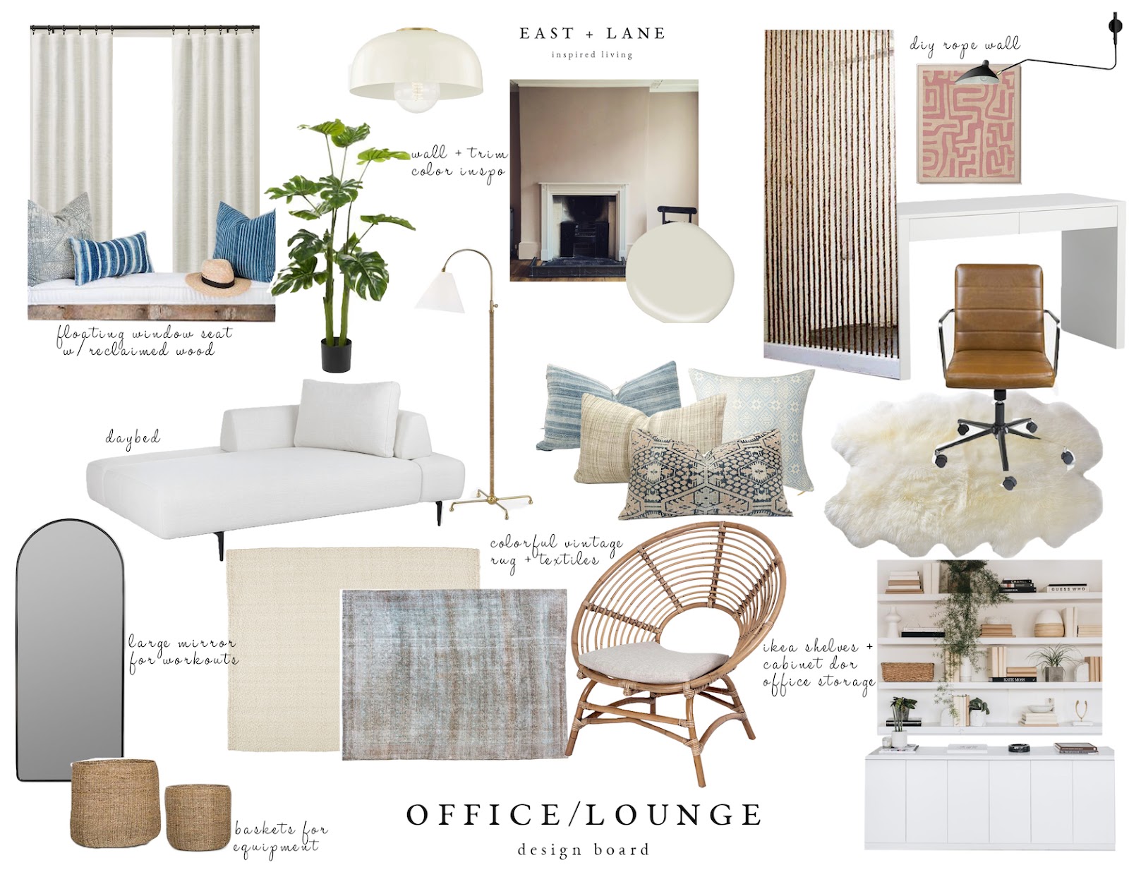
Lantern | Daybed | Lumbar Pillow | Throw Blanket (home sense) | Bookshelves | Drapes and Rod | Woven Shade | Ottoman (similar) | Blue Bud Vase | Chair | Vintage Rug | Wall Color
“Just do it! The EHD community will love that you listened to them. Your mom (a lover of color) would be so proud of you. PAINT THE WALLS PINK, KEYANNA!”, my inner voice yelled.
But if there’s one thing I’m learning in this season of style discovery, is that there is a difference between stepping outside your comfort zone, and forcing yourself to be something you’re not.
I was forcing it.
So I said, screw what everybody else thinks, I’m painting the walls white! And once I came to that discussion, I felt a sigh of relief. And that was when I learned a lesson in OWNING your (design) identity. Even if people think it’s “boring.”

Emily recently talked about her personal revelation with color palettes and embracing what makes you happy even if it’s predictable and basic (here). Sometimes there’s so much emphasis put on taking risks and stepping outside your comfort zone when it comes to design. But one of the points that Em makes is that what we actually need most in our homes these days is…comfort!
That’s the tough thing about being design-poly, when you embrace one style, you feel like you are cheating on the other. But even though my design love-child isn’t pink, her complexion is flawless!
The wall color is White Wing from KILZ. It’s a soft and creamy white. Not too stark. And because I primed the walls first, it only took two topcoats. I know for a fact it would have taken more coats if I didn’t use KILZ 3(R) Premium Primer. I recently painted our bedroom white (it was originally bright yellow) and I didn’t use a primer. It took 3 coats of paint to conceal and there are still a few areas where I can see the bright yellow subtly coming through, ugh! Again, thank you KILZ for saving me time, sanity, and marriage…and money!

Black Vase (home goods) | White Planter (similar) | Bud Vases | Wire Bin | Burlwood Boxes | Art on Shelf | Woven Rug | Vintage Rug
Overall, I’m happy with my decision to paint the walls white. It became the perfect backdrop for me to incorporate color with art and textiles, which I’ll get to later. But first, let’s talk about this daybed!


I knew from the start that I wanted a daybed for this space versus a pull-out sofa, but I really struggled with finding one that didn’t look too juvenile. Until I stumbled across this one from Article. Its sleek and modern silhouette feels mature and sophisticated. Honestly, I have never seen anything like it when it comes to daybed designs. The two backrests can be repositioned and/or removed, so you can set it up to function as a sofa, a chaise, or bed. It’s basically a 3-in-1! WIN-WIN-WIN!
Lumbar Pillow | Shibori Pillow (vintage but same shop) | Striped Tassel Pillow (same shop)
There were a few furniture delays, so this woven chair is currently on loan from my favorite local furniture store, Mitchell’s Interiors. But how cute is she! It adds so much texture and definitely brings in that coastal vibe that I love so much.
Since the room is mostly white, it was all about adding color and pattern with textiles and decor. I’ve always been a fan of St.Frank fabrics and this oversized lumbar is so beautiful. It adds a nice pop of pink and mixes in perfectly with the other vintage pillows I had.

Again, it was all about mixing in some color and pattern with textiles to add some visual interest to this all white space, without overwhelming me — I’m still leaning into my colorful side, so just a little bit of pop here and there will do for now.

Like most, I have a big obsession when it comes to vintage decor and that extends to vintage rugs. They add so much soul and character to a space. Passerine Home is my go-to shop for the most beautifully curated selection of vintage rugs. This beauty is the creme de la creme. It’s a 1920s antique washed Persian Malayer rug. I think anytime you have items in your home from a different culture it’s so important to know its history, meaning, how it’s made, etc, and to honor and respect it as more than just a pretty decor piece. Georgia, the owner of Passerine Home, is so knowledgeable about each and every rug she sells and is always giving educational tips on her Instagram. So if you’re a lover of vintage rugs, be sure to follow her.

Cane Wrapped Vase | Floor Mirror
From the day we moved into this house I wanted to put a window seat in this dormer and now it finally has one! Needless to say, it’s my favorite spot in the house. Although I can’t take credit for building it (my dad built it for me), it’s very easy to make. Just 2x4s and plywood cut to size. And funny enough, my mom (who is a pro at sewing), made the french cushion. It’s nice to have a little touch of my parents in here. Mom and dad, I dedicate this nook to you. Without you, it wouldn’t have been possible!

Woven Shade (in seashell) | Sconce | Pillow | Seat Cushion (custom by mom) | Throw | Basket | Stool | Vase (no longer available) | Stamped by Jason Reynolds and Ibram X Kendi | Atomic Habits by James Clear
The woven shades and the linen drapery are from Everhem. I partnered with them on my living room makeover and fell in love with the quality of their product and how easy they’ve made it for everyday people like you and me to order custom window coverings. I knew I wanted to work with them again on this project, and they were gracious enough to partner again. When I first started putting the room together, the walls/room felt very flat and lacked dimension. But once I added the window coverings it added so much more dimension and texture to the walls and was that the finishing touch/layer that it needed.
I added in some color and pattern with another St. Frank pillow and this beautiful indigo throw blanket from Jayson Home, and now it feels so cozy! And this wood stump side table from The Citizenry brings in a nice organic element and the perfect size for the space.


The window nook would not be complete without this sconce from Schoolhouse. But here’s a little secret, it’s not hardwired in! You all may have seen the hack circulating around the interwebs where you use a puck light in a sconce. It’s the perfect solution for renters. I got the kind that comes with a remote, so I can easily turn it on and off. Now I have a functioning sconce without having to hire an electrician/get permission from my landlord.

Another way I tried to incorporate more color into this space is with artwork. Although I didn’t paint the entire room pink, this big beautiful pink canvas from Minted satisfies that desire, for now. And the ocean print in my office nook is also from Minted.


One of the things I really needed in this room was more storage, and these bookshelves solved that problem. Most of these accessories are things I use for styling shoots and design projects. Before, I had all these items stored in an old trunk and it was so cumbersome to access. Now, I can easily see/access props and supplies.
A BIG part of maximalist design is lots and lots of accessorizing. To be honest, I still have a lot to learn (a whole lot more tchotchkes to buy) when it comes to styling in a more maximalist way. But these bookshelves are more about function over form, so I’m okay with them not being curated to perfection.

Also, do you notice the vintage wood ice bucket on the fourth shelf? A few years ago, before the EHD Design Blog School was even a thought in Em’s mind, she did a giveaway on her Instagram. I typically never enter giveaways, because I never win, but I just so happened to enter this one, and I ended up winning! This vintage wood ice bucket was my prize. Little did I know that a few years later I would become the first EHD mentee. Crazy, right?! It was only fitting that I incorporate the ice bucket into this makeover 


Desk | Sconce | Floor Basket | Rug | Chair | Throw | Kuba Cloth Art | Framed Ocean Art | Cabinet | Cabinet Baskets | Table Lamp | Lucite Boxes
Now, let’s head over to the office nook. Although I love that the room has wood floors, I hate their orangey color and they’re in pretty rough shape, so I wanted to conceal them as much as possible with pretty area rugs. This fur one from Article pairs nicely with the vintage, as well as adds another layer of texture to the space. And I already know what you guys are thinking… won’t the chair wheels get stuck in the fur? Nope! The chair rolls around just fine! Plus, I pretty much stay put in the same spot, so not much chair moving is needed
You may recall that I was considering making a DIY rope partition to give this area some privacy. I’m still thinking about doing that, but I want to live in the space for a little bit and see how it feels without one first.

Table Lamp | Brass Letter Holder (vintage)

It’s amazing how just by adding a pinboard (that I wrapped in linen fabric) and a few office accessories makes this area function so much better. I also love these lucite storage boxes from Target and the mushroom-shaped lamp is another score from Schoolhouse.

Kuba Cloth Art | Indigo Dishes | Woven Vase (no longer available)
I finally have a real, grown-up desk and not a makeshift one! I like to keep my workstation as clean and clutter-free as possible, but I love the little pop of color and pattern (and function) these indigo dishes add. And if the textile artwork over the desk looks familiar it’s because I used it on my Understated Maximalist moodboard. I saw a room wallpapered in this pattern and it was a big reason why I fell in love with maximalist design. Although I’m not ready to deck out the whole room in patterned wallpaper, this framed St.Frank Kuba cloth is my nod to the inspiration that sparked this style evolution.

I also now have a real office chair. I sit at my computer for hours on end editing photos, so comfort was top priority when finding an office chair, but obviously, I also wanted it to be stylish. This desk chair from Lulu and Georgia checked both boxes. The sconce is also from Lulu and Georgia and plugs into the wall, so no puck light hack necessary.

Speaking of lighting… I got my paper lantern, y’all! If you follow me on IG then you know how much I’ve been wanting one, even though some of you felt a ceiling fan would be better suited for the space (to keep me cool while working out). But, I went against the rules of design and chose form over function #SorryNotSorry. You guys CANNOT tell me this light isn’t better than a ceiling fan! She’s magical!

And last but not least, my little workout station. The goal was to not make this room feel like a gym, but have it function as one when needed. So I wanted stylish storage solutions that could serve the dual purpose of organizing my equipment, but also be pretty bedroom decor. I love using this peg rail to organize my exercise gear, but also be a place where guests can hang their coats, hats etc, when this space is being used as a guestroom. And this large woven basket from Jayson Home is perfect for holding my yoga mat and other equipment, while still looking like a beautiful decor piece.
And how awesome is this Lulu and Georgia floor mirror? Great for workouts. Great for fashion posts. Great for guests to use. And it reflects so much light that it makes the room feel bigger!
O and here are the before and afters because how could I not include them?!


And that’s a wrap! I cannot tell you how good it feels to finally have a space that I enjoy being in and that serves all my many needs. And I love that this space has a completely different vibe than the rest of the house. It’s much more fun, and playful, and I can’t help but smile when I walk through the door– perfect for a creative space! But here’s the thing, remember when I said this is the “first-final” reveal? Well, this is just the first iteration of this space.
You see, when I was concocting that design love-child recipe, I forgot one key ingredient. I poured in Leanne, added some Justina seasoning, and garnished with a little bit of Emily, but I forgot to add the most important ingredient of them all… Keyanna Bowen. What I realized through this process, is how much my design identity is wrapped up in other people’s signature styles. But what is my “signature?” What is my unique style contribution that I can throw in the mix? I often wonder, if there was no Instagram, no Pinterest, no design tv to influence me, what would my design style be/look like? I truly believe that within all of us is a signature design DNA that will make a space feel unique to you. But sometimes we can become so influenced by mainstream design culture, that we fail to uncover our true design identity.
That is the journey I am currently on — finding my unique “voice” in the world of design. I know that I have so much more inside of me in terms of design and creativity waiting to be unleashed. And as I slowly discover what a “Keyanna Bowen” space looks like, my true design identity, this room will continue to evolve.
So although this technically concludes my office makeover for EHD, I will continue to document all future iterations over on my blog, so I hope you’ll continue to follow along on East & Lane. It’s been such a blast sharing this experience with you guys. Thank you so much for all your support, guidance, and even criticism  on this project. I still have a few more “semesters” left in EHD Blog School, so I’ll still be around
Of course, I cannot end this post without giving a HUGE thanks to KILZ again! Without you this makeover would not have been possible, and this room would still be blue and yellow. So thank you! Thank you! Thank you! And sincere thanks to all the partners who worked with me on this space.
I love you all so much!
Xx,
Key
It’s Emily again and there you have it – a room makeover that we’re so proud and honored to share with you. A million “thank yous” to KILZ for teaming up with us on this one – these people are gracious and kind and we’re so lucky to work with brands that we truly love, both for their functionality (such great coverage and a smooth base!) and for the folks working hard behind the scenes. If you’re painting…just don’t skip the primer. It’s worth it, we promise. And thank you again to Keyanna for taking the leap with us and for going above and beyond to bring this space to life without a staff on hand – she’s incredible, you guys. And lastly, thank you to you, our readers, for supporting the brands who support EHD and for joining us on this three-part saga. We wouldn’t be able to do it without you. Now – let’s congratulate Key on her first partnership and talk about this room! xx
**Design and Photos by Keyanna Bowen
The post Blue Walls Be GONE! Key’s Totally Transformed Office Reveal – Maybe The Most Dramatic Before & After Ever (?) appeared first on Emily Henderson.
from Emily Henderson https://stylebyemilyhenderson.com/blog/keys-office-reveal-with-kilz-best-paint-primer


No comments:
Post a Comment