
When I typed out this title a real big, “God Jess, you are dramatic and you overthink EVERYTHING, it’s a just freaking color!” voice came to me. But I have a strange emotional block with using pink in my home in a big statement-y way (I do realize I just bought a neon pink swimsuit very much on purpose). So when it comes to planning and decorating, using pink as a “statement color” feels somehow personally unacceptable. For some reason, I can and do love it from afar but in my home, I feel like it exposes me as “too girly” or “juvenile” or “basic” or even “weak” which is the dumbest one of all. That thought doesn’t even cross my mind when seeing pink in beautiful spaces on the internet. However, my inner misogynist is telling me that if I use too much pink then the world will somehow write me off as “not a serious person” (something that I desperately wanted as a kid and clearly still do). WHAT A WILD AND STUPID STATEMENT. Also, I do know that pink was not always associated with uber femininity but for all my life it was so here we are. I feel like Gen Z is saving us. Fingers crossed.
This whole “pink decor fear” thing isn’t new for me, but it recently reared its ugly head when I was choosing my curtains a few weeks ago. As you may have seen from my past posts about my new apartment, I have three incredible curved windows in a turret. Those window frames and their glass are curved which is apparently not done anymore because it’s real expensive (and why I have been told I can’t open them because they are too fragile). But maybe in the early 1900s, it was super affordable? Who knows? So while I wouldn’t trade them for the world, they do require custom drapery hardware because of their shape/rarity (or at least the kind of hardware I want). Coooool.
Naturally, I asked Decorview if they might consider helping me with this design agony. They agreed, which I was over the moon about, BUT that meant this indecisive Libra needed to pick a curtain color fast… I mean have you seen these lead times? I need this reveal to go up in 2021!

Here’s the thing about my living room. It actually doesn’t get a ton of direct natural light because of the beautiful trees outside. I am honestly SO grateful for them because on a couple of 91 degree weather days we recently had, I was pretty ok without an air conditioner. Pop the champagne! However, this does mean that it’s not the brightest of rooms (but totally bright enough for me). So when it came to choosing a curtain color, I was afraid of going too dark and making the room feel too moody. I work in here so I need “happy”. But a white color was also a no-go as proven by my white-ish IKEA curtains that I have been using. They completely get visually lost in the walls and also look kinda sad. What’s a gal to do?? Dare she go pink????????
Why not, right? So much of what I pin, bookmark, and like on the internet have an element of pink in it. Pink can be so freaking chic and is just a really happy color that apparently makes me happy to look at. For instance, I can’t imagine Malcolm’s bedroom without that mauve blanket or not wanting to cozy up in the most fun and pink Mountian House bunk room ever. So what is this existential color crisis? I want to break free from what is likely just patriarchal BS. I shouldn’t worry that if I have a guy I’m dating over, that he will somehow make assumptions that don’t actually represent who I am (not a big but slight anxiety I have… HARD face to palm emoji). Will pink curtains tell someone that I’m high maintenance “girly-girl”? ANOTHER VERY STUPID STATEMENT. For example, Caitlin is the chillest, low-maintenance, fun person I know and she’s got pink all over her place. Also, there is nothing wrong with being a “girly-girl”! Ay yai yai, Bunge.
Colors are emotional. (Ha. As if this entire post doesn’t prove exactly that). And it’s important to choose intentionally. Emily is being very intentional with the farmhouse colors because while blues and grays make her and her family happy (see this post on comfort color palettes), Portland is rainy and gray so some warmer pops of color are going to be incorporated to bring in “more life”. And you know what?? More life is what I want in my shady living room. I keep telling myself that pink curtains are going to be chic AND make me happy every time I step into this room. Pushing myself outside of my weird emotional color block is oddly a real growth moment for me (even though it felt like I did enough “growing” for 5 decades this past year).
So I thought we could kick this therapy session up a notch and look at some beautiful spaces that didn’t shy away from pink that I love and continue to hype me up for incorporating a little more pink. And hey, if you want, do a little shopping if you are in need of some “happy pink” in your home too. This is now a Pink Appreciation Post so let’s get into it and maybe I’ll be fixed by the end. Anything is possible, right??

This room came on the scene years ago but I have never stopped loving it. It’s warm, calm, sweet, and yet chic. The tonal palette and minimalism are the reasons why it’s so effortless but it really gets me on that muted pink train. How about you?

This is another oldie but goodie and was also a big initial inspo for my last apartment (even though I used white curtains because I was scared). Think if those curtains were white…. it would still be a pretty room but the pink brings it to life!
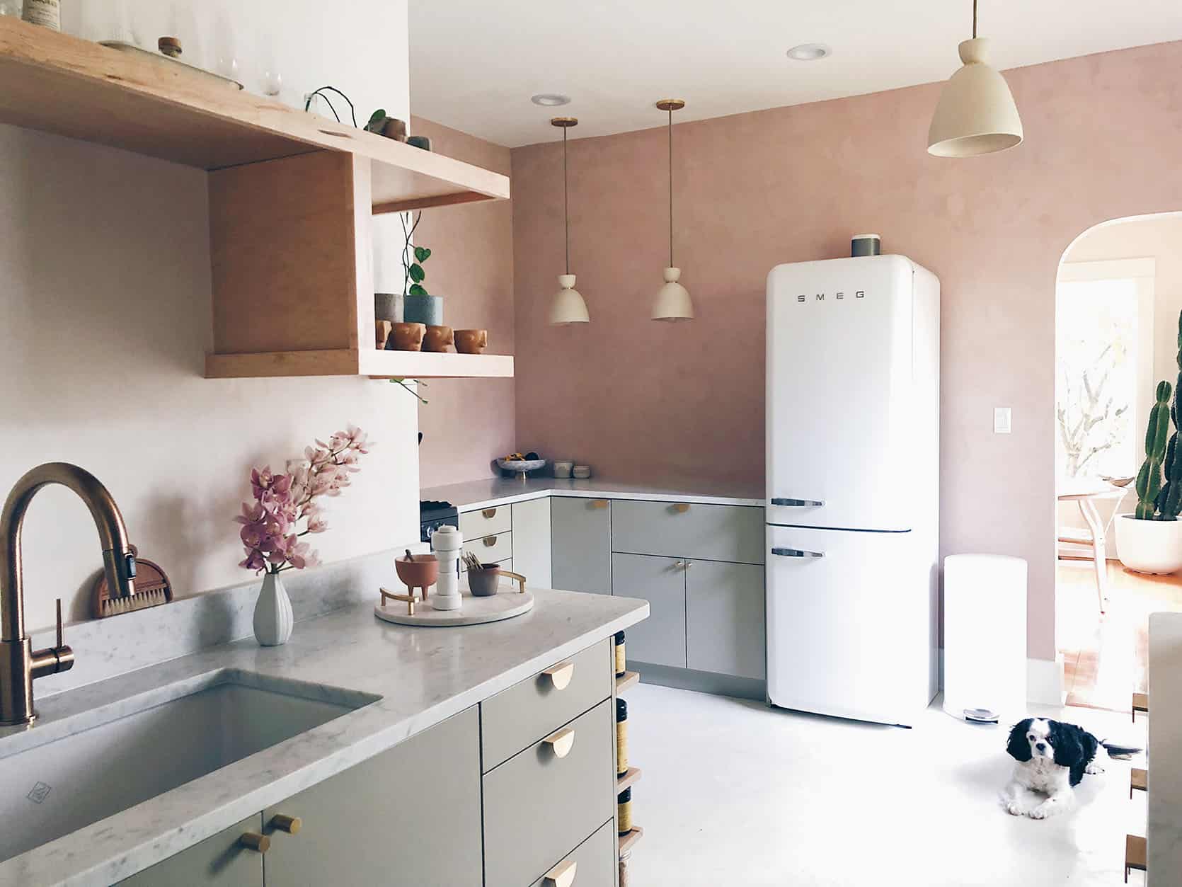
These textured pink walls are BEAUTIFUL and very much made me want a pink kitchen when I first saw this space years ago.
You also might be catching on that “my pink” is more soft, sandy pink (and sometimes a saturated mauve), not the bubble gums or hot pinks of the rainbow. This makes make “hang up” even sillier. IT’S NOT EVEN THAT PINK.
So yes I prefer a more soft pink if I’m going big but I don’t mind going a little more saturated when it’s in small decor pieces or art. If you need some pink in your life too, I have taken to the internet and found some pretty great options for you to either continue indulging in your love for pink or get over your issues with it like me:) Also there’s A LOT more inspiration!
Curtains


Not everyone needs to go custom because of vintage windows from the early 1900s. So if you want pink curtains too, I love these ones:

1. European Flax Linen Curtain | 2. Dusty Pink Stonewashed Linen Curtain | 3. Luxe Linen Blend Curtain | 4. Velvet Dusty Orchid Curtain Panel | 5. Cotton Canvas Fragmented Lines Curtains | 6. Heathered Thermal Room Darkening Curtain Panel
Paint


I may not by painting my walls pink but all of these rooms prove that it is a REALLY cool choice. Here are my favorite options:

1. Odessa Pink | 2. Setting Plaster | 3. Fairest Pink | 4. Rachel Pink | 5. Tissue Pink | 6. Middleton Pink
Tile

Pink tile is a real commitment but also a has huge payoff when done right… like in the photo above. That kitchen makes me smile every time I look at it. Don’t you want the coolest kitchen or bathroom in your neighborhood???

1. Zellige Blushing Mistress | 2. Dawn | 3. Cement Arc White + Mocha Square | 4. Imperial Pink Gloss Ceramic Subway Wall Tile | 5. Zellige Vintage Rose Square | 6. Beaded by Barbara Barry Field Tile
Decor
Art

I plan on having plenty of art with pink accents because a. it will help to balance the curtain color with the other side of the room and b. it will be a subtle but fun way to punch up my wall’s style. So if you want to bring in some pink without painting the entire wall, just start with a piece of art like one of these:

1. Sunday by Mary Ketch | 2. Death Valley Mountain #21 by Jordan Sullivan | 3. Abstract Tapestry Wall Art | 4. The Self Love Art Print by João Incerti | 5. Cotton Candy Leftovers by Cathy Sunu | 6. Urban Desert Series 1 by Lisa Sundin
Fun Miscellaneous

Wall art is good but so are unexpected pink pieces of decor! A lamp is awesome but so is a taper candle… or a velvet lampshade:)

1. Joy Clay Table Lamp | 2. Pauline Candle Holder | 3. Simple Wood Candle Holder | 4. Picnic Geo Candle | 6. Bedside Carafe
Vases

Vases needed their own category because they can be both functional pieces for flowers AND sculptures. Plus all of these are just really cool and that’s also why they got their own special section.

1. Berry Budvase | 2. MoMA Raawii Strom Ceramic Large Vase | 3. Mid-Century Ceramic Vase | 4. Eda Vase | 5. The Pink Collection | 6. Cecillia Small Pink Glass Vase | 7. Linne Carafe | 8. Willow Decorative Vase | 9. Ceramic Stoneware Vase Pink
Textiles

Lastly, we have the “curl up with your pink decor” section. I didn’t talk about it before but for most people (like Emily), pink is basically a neutral now. A really happy, soft neutral. So adding a pink throw or pillow to your sofa or bed will only add to your color palette in a quiet yet unexpected way.

1. Pink Waffle Throw | 2. Handmade Wool Shag Pillow | 3. Pink Stitched Lumbar Pillow | 4. Leah Singh Daphne Pillow Cover | 5. D’Abord Cushion Cover | 6. Cotton Canvas Round Pouf | 7. Mongolian Lamb Pillow Cover | 8. Linen Throw Pillow | 9. Windowpane Throw
Despite the fact that my curtain color was finalized last Friday and I really love it! I also actually do feel better after writing this post. I guess that’s why journaling is so effective. Writing down your thoughts and feelings, as well as searching the internet for beautiful pink rooms and products, WILL show you that you are an overthinker that just needs to choose what YOU love. Designing to push yourself creatively is one thing. Designing out of fear and weird old hangups is another.
I’m curious. Do any of you have any outdated or useless hangups when it comes to designing or decorating your homes? Colors, materials, shapes, etc? Let the group therapy session begin:)
Love you, mean it.
Opening Image Credits: Design by Rachel Castle | Photo by Caitlin Mills | Styling by Annie Portelli | via The Design Files
The post How Jess Is Overcoming Her “Basic B” Bias Against A Personal Pink Decor Statement – An Existential Color Crisis About Curtains appeared first on Emily Henderson.
from Emily Henderson https://stylebyemilyhenderson.com/blog/pink-home-decor-design-statements


No comments:
Post a Comment