
Here’s what I’m going for – tile sooo quiet and special that like a good actor, you can’t even see them acting – they just are so good that you just engrossed by them. I sound like a broken record but I here I go again – designing and renovating an older house to be unique yet timeless in a MINIMAL way is my creative challenge on this house. Achieving my “simple but special” goal takes more time and brain space than you’d possibly think, but I’m honestly enjoying every second of it. If you have a contemporary style or post-modern home you have fewer rules – you are beholden to less architectural moments. But if you are working within a classic style of house (like a craftsman farmhouse built during the Victorian Era for instance) it’s my opinion that you should use more classic hard finishes. Of course, what “classic” means to you could be totally different than me and yes there are a BILLION exceptions (we are putting wall-to-wall carpet in the kid’s room for instance). Also, ANYONE can break the rules when done RIGHT. But for this house I want my hard finishes – I’m talking flooring, tile, countertop material, and cabinetry – to feel like a fresh twist on “classic”. Listen, these SHOULD be permanent once installed and IMHO should look like they belong to the home and to you. I want quiet but not expected. Fresh but not trendy. Full of life, but not busy. High quality but not ostentatious or “fancy”.
Most importantly not boring. Interesting. I write about this in my next book ad nauseam but once you know the rules (which is the first half of the book) you HAVE to break at least a few of them to have an interesting home that reflects your creativity and personality. With the tile for the farm, we are working with Pratt + Larson who manufactures everything in Portland and has ENDLESS customization options. Like endless. They are wonderful. But I don’t want to do something WACKY with the tile, I want to do something quietly impactful and special. I almsost don’t want you to even notice it at first – which if you aren’t obsessed with design woud seem like an odd thing to obsess over – something people barely notice. But for the vibe of this house that’s what I want. Where you know you are somewhere special, but your eyes aren’t freaking out trying to understand it. The first step is working with high-quality material… after that, the challenge begins.
So here is a brain dump of all the ideas I have to do this with tile. If you want into my creative process, today’s post is for you 
Search For Vintage Uses Of Tile – To Rethink What Is “Normal”

I secretly hate sharing this image (above) because once I found it (which took HOURS of digging) I caught my breath and knew that I needed to recreate a version of it. Especially with a house that goes a bit old world you can lean into some Victorian elements like this and still do it in a quiet way. Of course, this tile doesn’t exist so we have to literally build the pattern but it was a huge sense of inspiration to me.

It’s EXTREMELY hard to find vintage kitchens and baths on the internet because most of them were “before photography” or considered “dated” so were not photographed before they were ripped out. I found way more success looking up hotels in Europe and just staring at what they did in their kitchens and baths and more importantly how they did it. While you might look at that kitchen and scream how dated it is, look past that and instead note what they actually did and brainstorm how you can do a fresh version of it. That tiny little tile border around the window is unexpected and cool. I’m considering just mixing it in around our windows in the same finish and color as the field tile to just give it a TINY unexpected detail that you don’t notice until you are up close.
Go High Impact With One Simple Tile But Like A LOT OF IT – EVERYWHERE

Sure, these bathrooms have different tiles on the floor but the sheer impact of the one tile on all of the walls – floor to ceiling and wall to wall is enough to make this EXTREMELY special. Heidi Caillier is a design goddess and specializes in modern vintage soul – she is SO GOOD. Of course this look is a LOT more expensive than you’d think but doable if you are doing it yourself. We wanted to tile the ceiling of our main bathroom but ARCIFORM thinks it will be $3 – $5k just for the ceiling labor. We came up with a different solution that still feels VERY special but reduces the amount of tile and labor. Stay tuned But the point is you don’t have to do something super detailed or wacky, you can instead just do a LOT of tile everywhere.

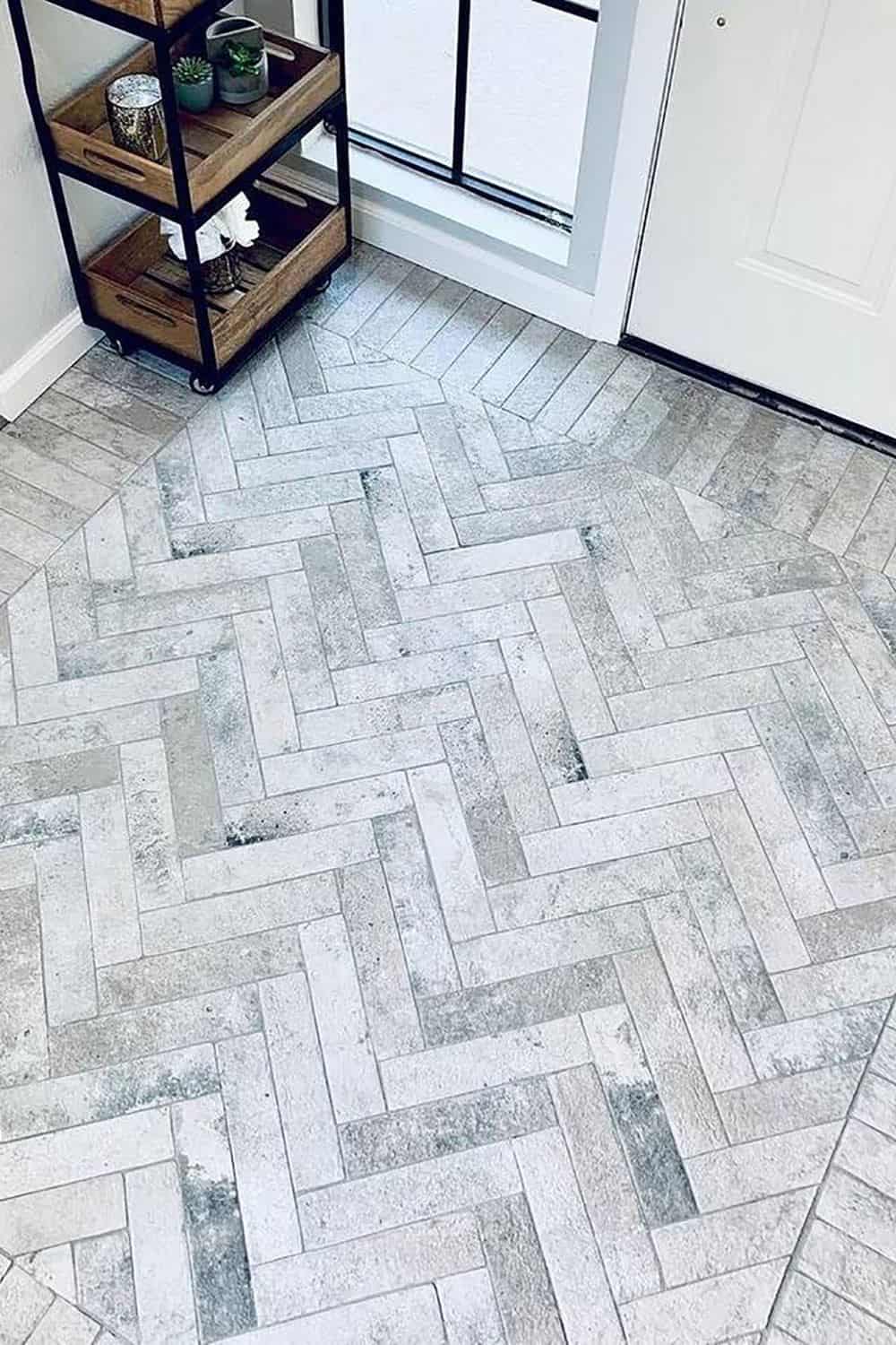
I love the simplicity of this bathroom, too and it’s a big inspiration for our bathroom. Herringbone on the floor (I’ll add a border) in an interesting scale (stay tuned) and just a TON of simple tile on the all walls.

Jessica Helgerson tiled every wall in her farmhouse kitchen and (notice even around the door and hood) and it’s just so pretty and special, but simple and classic.

Granted that these tiles are handmade and obviously very special, but it’s just one tile, staggered – EVERYWHERE. Note the different orientation around the window. LOVE.
Mixing Standard Tile Sizes (Subway, Square, Etc.)

I LOVE this look and will be doing my own version of it. We ordered samples in a lot of different sizes and I’ve played with them for HOURS. The key to this is the perfect amount of “randomness” (but not random at all). Your tile installer will likely hate you, but the look is simple and pretty. I’d also not do a dark grout so that you almost don’t even notice the variation, your eye just moves around easily and doesn’t register what is happening but tells your brain that it’s SO PRETTY.

Here’s an example of subway installed vertically next to squares of the same height. Again, I also love that they didn’t just go back and forth between the two – that they did two subway next to one square then one subway next to one square, then two squares, AND they staggered them. Perfectly random.

This wall is a combination of one row of squares followed by one row of staggered square and rectangular. But it takes your eye a while to figure that out – in a good way.

In this one, Shea McGee moved from white subway to pink square and it totally works. You could strip that from floor to ceiling in color blocks. Stacking it would feel more contemporary but if you want an old world feel I think the mixed stagger shapes could totally work. Again the key to making sure this doesn’t feel dated is all in the quality of the tile and installation and in the colors. I think this looks super fresh. Also you could put the pink ALSO on the floor and just have it come up the wall.

My friend Leanne did this one above which is so gutsy. She mixed different SIZES of squares, different tones, AND rectangles. She is brave and makes me want to be more brave.
Rotate The Orientation Of The Tile To Highlight An Architectural Feature


This is a new favorite thing to do – take the same tile and use it to enhance an architectural feature. Depending on how arched yours is you might have to cut every single tile perfectly, but you also might be able to play with grout lines to achieve this. Obviously, this can be done on any straight surface too – I.e. around cabinetry, recessed mirrors, windows, doorways, etc.

You can see it on this fireplace – it goes vertical at the top of the fire box and then at the hearth it orients go to in – mixing in another orientation or shape.


Such subtle impact on that fireplace just by changing the orientation of the tile. LOVE.
The Difference A Tile Border Can Make

Oh I LOVE a tile border. We did one on our LA patio and it made it look instantly old world and took all the “trend” out of the cement tile pattern we used. I love how the above is just a simple color change and change in orientation but it’s not fussy. I usually do tile borders to run the length of the wall, but I love how they did this.

It’s my personal opinion that a herringbone needs a tile border if you want it to look old world or more classic (like above). It could be a different scale of tile and that one could have been even thinner but it just instantly frames the room and looks more custom (because it is). It just buttons all the diagonals up.

I love, again, how these two ran their borers perpendicular to the wall (or the transition floor) instead of along it. I love both but seeing this orientation locked a lot of ideas for me. Like then why not do a totally different scale into the wall.

For all of you who want to do the checker or diamond trend but are nervous that is so hot right now, y’all, just add a victorian border. the customization of it really gives it more power and makes it more classic. We are doing our own custom version of this in the new sunroom (that will go more victorian than the rest of the house).


The above pattern (octagon with square) would look cute without the border, sure, but that border makes it SO SPECIAL and makes it look like it’s been there for years and years. The more intricate they are the more special they are in my opinion, and yes, you have to lay it out and make sure the pattern works (which is what I’ve spent SO MUCH of my time doing lately – literally out of cut paper, playing on the floor for hours).
Add Tile Trim For A Decorative Old World Detail

Just a little stripe makes it feel special. I’ve even thought about stopping the tile at the trim, but in another color and just carrying it throughout the room. It could just be a slight tone darker and a little stripe around the base.

Look at the impact that that little bead has around the whole kitchen. I’m obsessed. Such a good detail.

Now I’m on the fence about these but I think mostly it’s the color, but the above and below shots did unlock some new ideas about taking one color and blocking out top and bottom, divided by a pencil trim. OR using the pencil trim as a stripe from floor to ceiling. Y’all the ideas of endless which is obviously both a good and bad thing.

Tile Border Around Doorway, Window Or Mirror

I know that this can look dated, but what is the fresh new version of it? I think it’s all about the quality of the tile and how you install it. It could be simplified OR it could be even more detailed and decorative, depending on what you are going for. It could be all the way around the mirror or integrated like theirs is.

Talk about a LOT of tile. Here they used a contrasting tile around the border of the entire room, as a strong accent, including the floor bath and doorway. While this is certainly not the look I’m going for it inspired some ideas that we are working with.

Here’s it’s hard to see but if you look closely you can see the tile on both sides of the shower niche. We are trying a version of this in the drawings and I honestly can’t tell if I like it or if I wished that we would just continue it on all the walls, so stay tuned on that.
Of course, this post did not cover the difference grout can make but I wrote that post a few years ago – check it out here. Also, I’m doing a separate post all about making penny and hex tile special AND how I’m creating a custom mosaic tile for our sunroom out of existing shapes – I’m so excited about it.
Next up I’ll discuss how we are doing this exact same process for our cabinetry – all the details that will make your standard cabinets feel wildly more special and custom without the risk of it looking dated. I’m learning SO MUCH
Opening Image Credits: Design by Jessica Helgerson Interior Design | Photo by Aaron Leitz Photography
The post How To Make Your Tile Look Really Special Without Being Dated In 10 Years – New Classic Tile “Trends” That I’m LOVING appeared first on Emily Henderson.
from Emily Henderson https://stylebyemilyhenderson.com/blog/new-classic-tile-trends-that-im-loving


No comments:
Post a Comment