
As design lovers, I believe there are few things more exhilarating and satisfying than seeing a really good before and after. All of us (?) have experienced the perils of design paralysis, so seeing someone design a room in 8 weeks is WILD and so freaking inspiring. For those that don’t know, The Better Home a& Gardens One Room Challenge is a bi-yearly, 6-week (I think this year it was 8 weeks though?) design challenge where selected featured designers, guest participants (as well as anyone wanting to unofficially participate) completely transform a room of their choosing. Truly all of them are INCREDIBLE but we thought it would be fun to show some of the ones that really knocked our socks off.
But why just ooooo and ahhhh over these pretty rooms when we can also get some killer design lessons and hacks to possibly bring into our home?? So my plan is that by the end of this post we will all be so inspired and fired up that in 8 weeks our next room will be totally designed and finished. Deal? Ok cool. Ready, set, goooooo!
Fariha Of Pennies For A Fortune
Lesson: Carpet Camouflage


In my opinion, Fariha can do no wrong. Remember her painted DIY outdoor marble diamond tiles?? This room went from builder grade to high-end sweet romance flawlessly with all of that beautiful wall paneling. But one thing that I thought was SUCH a smart choice was the wall color. This muted mauve-y rose works perfectly with the carpet. I mean you hardly even notice the carpet in the after photos. So Fariha clearly saved a lot of money (and headaches) by embracing the carpet and choosing a wall color that both stands on its own but tonally blends in so perfectly.

Now chic wall color aside, there are so many beautiful moments! The tonal art, the playful patterns, the contrasting dark fireplace THAT SHE MADE are all moments that really made this room sing. As in all of these rooms I’ll be talking about, I didn’t want to show the whole space because I want you to go and see the full reveals on these designer’s sites. Show them all the love! Here is her reveal.
Rachael Jackson Of Banyan Bridges
Lesson: How To Use Bold Colors Right


I also can’t believe this transformation (I promise to not say that for each one but like, I might:)) I was first made aware of Rachael when Julie showed me her insanely cool mural work. This gal knows how to inject joy with her bold and colorful art. So when I saw this masterclass in bold color usage, I was not surprised when I found out who was responsible. Now, that was the only thing that didn’t surprise me because there are so many fun and unexpected moments.
First up is the lower cabinet color. It’s one that I wouldn’t have thought of, but for this space I can’t imagine it any other way! This is a basement so giving it life with color was imperative and the cabinets being one of the largest pieces, that’s a great item to tackle. Now had she kept the uppers, that color might have overpowered the entire space. So if you are thinking about using a bright and bold color like this, that is something you might want to consider. But also there are no rules about going bold in a kitchen if that’s what you want. I am a big believer in simply closing your eyes, imagining what you are planning, and seeing how it feels. It always helps me to know if I’m going in the right direction:)

What I also love about this design is that Rachael used that checkered pattern as a way to not have all of the focus on the cabinets but not make the space a total color explosion. Please also note the genius of the small-scale pattern on the walls and the large-scale pattern on the floor in the same neutral colors.
There are a million other details that I want to talk about (like the vintage hutch, the cool art, the yarn wrapped cords for the ceiling lights, etc. etc.) but go to Rachael’s site for all of the details AND see her beautiful mural on the other wall:)
Brit Of Brit Dot Design
Lesson: Don’t Forget Your Ceilings


Brit calls this space her Desert Deco Den and honestly there couldn’t be a more perfect name to describe it. When I first laid eyes on this stunning space, I went straight for that sofa. THAT TRIM! I still love a squiggle and a checkered pattern, don’t @ me. But then my eyes floated up to discover that amazing ceiling detail. If you’ve been around for a minute you might remember this post in which I talk about my love for cool ceilings so it’s no surprise that this has me excited.

What I love specifically about this one is that it gives you the “deco look” with the shape and light fixture but then brings in “the desert” with the natural wood pieces on each end. All in all, I implore you to look up and consider how you can elevate/incorporate a ceiling accent into your home! Here are some more ideas! And here is Brit’s full reveal.
Ariene Bethea Of Dressing Rooms Interiors
Lesson: How Upscale Glam (Without Breaking The Bank)

First off, I hope that you at least know the name, Dressing Rooms Interiors. If not go follow Ariene right now. She owns an incredible vintage shop/design studio that is full of wonderful treasures that would make any maximalist’s heart very happy. But we are here today to talk about her amazing kitchen redesign.
What I think is the most impressive part is that the layout and appliances didn’t change yet it looks like a completely different (and very elevated) kitchen. I think that the key to nailing an “upscale glam” look is to go clean and graphic with a touch of metallic which is exactly what she did.
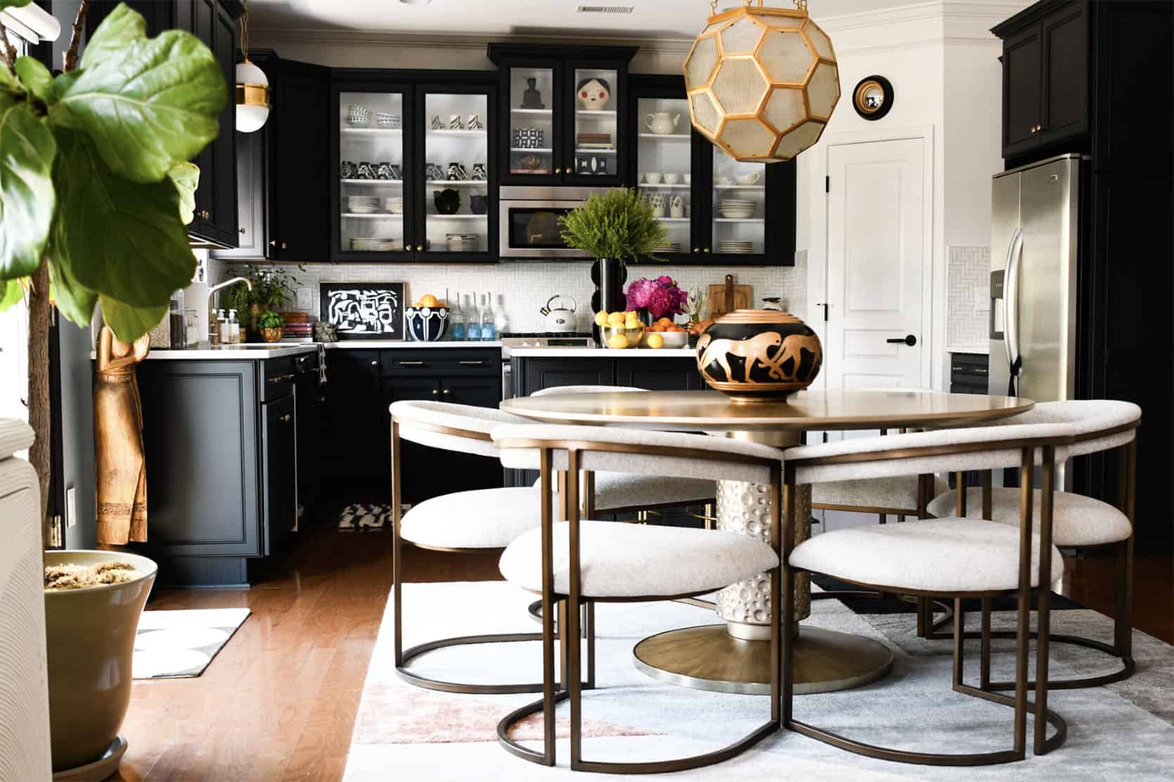
The neutral yet bold choice to go with black cabinets looks so pretty and expensive. But to avoid making it look too heavy, she gave one wall of cabinets glass inserts. Spoiler Alert! Those are the same fronts she had from before but had customized. I love that she was determined to use her original ones because that obviously cuts down on waste. Then with a new patterned backsplash and a new light (and less busy) countertop, Ariene’s kitchen looks completely brand new. But what is glam without a little sparkle even peppered throughout:) The beautiful pendants, chair, and table all add a high-end warmth that really makes the space sing. Here is her full post:)
Erin Zubot Design
Lesson: How To Create Special Traditional Details


Boy oh boy is this a CUTE kids’ bathroom! Erin’s tile choices are so simple yet special and are totally in the world of what Em was talking about in her last tile post. But then you have that awesome wall paneling, the modern wall color, the black toilet seat cover, and the HANDMADE shower curtain. Excuse me?? It’s all so good. I do have to say that my favorite detail is the hole design on the vanity doors. I know they are kinda hard to see but I guess that means you’ll have to go over to her site
Jordan And Barry Of The Brownstone Boys
Lesson: Don’t Be Beholden To One Style Throughout Your Home


Yes, those two photos are from the same ORC space! Ok, they are technically in different rooms but are both in their now awesome basement. I love them equally because they pull at two different design style heartstrings. I mean that stained glass window is SO BEAUTIFUL and the surrounding wood paneling detail (that’s also on the far right wall) makes the space feel more modern against that wonderful more traditional cabinetry. Classic with a hint of playfulness (also you have to see the wallpaper they used on the other side of the room because it’s a great and very fun optical illusion). But what is design if not REALLY FUN??? That laundry room makes me want to do laundry and was RuPaul’s Drag Race inspired. Just when I thought I couldn’t love it more:) So yes, don’t worry about every room being “cohesive” if you want to have an awesome, unexpected moment. Also, go now to their site because the full reveal is really special.
Haneen Of Haneen’s Haven
Lesson: Say Yes To Ornamental Beams (You Really Can DIY Them)


There are a million things to love about this bathroom (*cough* tub… *cough* tapestry and portrait). But one thing that I really love are those faux beams!! They add so much soul to an already beautifully designed space. I think it’s easy to get intimidated but the idea of installing faux beams but honestly they don’t seem tooooo hard. Look at this link! But aside from my love of those beams, this is definitely a special bathroom. You need to see the shower too! So head on over to check out the rest.
Benson Dwelling
Lesson: Using The Same Detail For Cohesive Dimension

Big Benson Dwelling DIY fan over here and this room only confirms it. The color palette is super happy but calm/chic and I love, love those sconces. However, what I want to focus on is the tubular motif. I think it was super clever of them to keep things interesting yet cohesive and to switch up the orientation, scale, materials in achieving this look. It’s a great reminder that you don’t have to make things super complicated to create something awesome and unique.

Fun Fact: That secret-looking cutout on the right is A WINDOW! It was their solution to not have the bed look too off-center. Again, super clever! Check out the rest of the room here.
Jewel Marlowe Of Jeweled Interiors
Lesson: Dare To Go Even Bolder


This is a masterclass in wallpaper installation. Aside from the tonal trim, that wallpaper is wrapped around everything and it looks so cool. Another laundry room I would happily prance to to wash my neverending amount of dirty clothes. Jewel was in need of a new washer and dryer so she took this opportunity to really go for it in the design/color department. Her original gold wallpaper was super pretty but the blue one is such a showstopper. Then you add in that perfect piece of art that brings in even more color and goes with the established floral theme, along with that killer light fixture and optimal counter for function…you have a perfect laundry room. This is another sign you should give into your colorful dreams and go for it in your laundry room! See more here.
Nile Johnson
Lesson: Accent Walls Done Right

To think these two photos are the same room is bananas. But that’s the magic of an incredible design, right?! So what you see below is actually a render (and a VERY good one because it took me a minute to realize). But it’s so good that I had to talk about it regardless. This bedroom is both totally luxe but also warm and welcoming. Sure, the mix of texture and pattern have a lot to do with that but I really think that accent wall is the secret sauce and the biggest reason.

Now, accent walls are a HUGE topic in design. Some say never, some say what’s the harm, and others are on board if it’s in an architectural feature. Arlyn talked all about it in this post. And from this angle, it looks like Nile enlisted the architectural feature version (which is our favorite). We can’t wait to see this fully completely in IRL! But for now, here is more info. How do y’all feel about accent walls??
Natalie Papier Of Home Ec.
Lesson: Ulitmate Pattern Play

Get ready for your eyeballs to explode! I mean I want to be in this bathroom IMMEDIATELY. I don’t think I can pick a favorite part. So let’s just go through all of the elements, shall we??
First, that yellow tile cabana stripe is so freaking awesome. We told you cabana stripes belong inside But seriously, it’s so simple but THE MOST visually impactful. Especially since it runs from the wall to the floor to the opposite wall. Also, yes to yellow! Then you have that floral wallpaper at a slightly smaller pattern scale…WOW. It’s happy and playful with tiny bits of yellow to bring in the stripes. I also want you to notice how much white (aka negative space) there is. That is such a huge factor in why these bold moments feel less overwhelming:)


I would also be remiss to not mention that strawberry side table. SO FUN AND SO UNEXPECTED. Another slightly unexpected and easy moment are the asymmetrical mirrors. And lastly, that natural wood vanity adds so much warmth. It’s kinda the perfect modern (but not too modern) bathroom. Head here for more photos and all of the details:)
Dominique Gebru
Lesson: An Impactful Facelift


Now, Dominique’s old kitchen was in her words, “fine” and we totally agree. But the facelift that this kitchen (and dining room and new archway) got made it SO GREAT. Like Ariene’s kitchen, we see how a few cans of paint, a new backsplash, and hardware can literally transform a space. And had she just done that it would have been awesome. However, that cabana striped roman shade and the now bigger and better IKEA hacked island (very in line with yesterday’s post) make it that much more elevated. But there’s one thing about this kitchen that’s my favorite…


Those custom floating shelves!! I think they bring a welcomed added warmth (wood almost always does) and look so good wrapped around that beam. You also see the tile so much better in this photo and I can’t get enough of the pink:)
Head to Dominique’s site to see the rest.
Kate Pearce Of Kate Pearce Vintage
Lesson: How To Visually Ground A Colorful Color Palette

Kate is a pro at colorful and eclectic design so the fact that this basement is totally inspired is no surprise! Side note, I love how many basement renos we have this year and how different they all are. But what I really appreciate about Kate’s is that her colorful color palette is grounded by the fact that her ceiling and floor are neutral. Had she chose a nonneutral color for the ceiling and/or the floor it still could have been awesome but there’s something about the dark charcoal she chose that gives it kind of a sexy vibe. It is a speakeasy after all:)

What also makes your eye happy is that there are dark neutrals throughout that keep it all balanced. But how great is the tile pattern, mixed with the larger scale diamond floor pattern and the super small scale gold grate pattern on the cabinet doors. Then you also have the contrasting curves of the two arches along with the back of the bar stools. It all just balances beautifully and truly feels like a speakeasy I want to be in right this moment (FYI this moment is at 5:14 pm;)). Head here for the rest.
Tiffany Of Pretty Real Blog
Lesson: White Isn’t Your Only Neutral Color Option


So happy that Tiffany knocked out another incredible ORC! Remember her office nook we featured last year? Anyway what I love about this space (aside from that amazing built-in), is her color palette. I think a lot of the time when we think of a neutral space, white is our immediate go-to. Well, it’s time for that to change because the colors that Tiffany chose add so much more large-scale depth and richness. I LOVE the color of the built-in (and notice how you hardly see the carpet…just a little call back to the first lesson). It also acts as an accent wall… architectural feature kind (another callback!). But then you have that light but rich brown on the walls which is immediately contrasted with white curtains and a light-toned sofa. It’s such a welcoming, cozy but extremely stylish space that you need to see the rest of it on her site. Enjoy!
Victoria Ford Of Prepford Wife
Lesson: How To Make Antique Furniture Incredibly Fresh


In my ORC research, I was introduced to Victoria and I am so happy! I love her modern traditional (with a heavier lean on the traditional) style. She took on not only a guest room but also the guest bathroom. NBD. Caitlin and I both loved her choice to use that stunning antique bed with that grid wallpaper and pops of bold colors. I wouldn’t have thought of putting that bed and pattern together but it’s so awesome. Any guest would be lucky to lay their head on those pillows:)


Then this bathroom! That tile combo is SO GOOD. I love how the colors in the floor pattern perfectly speak to the color palette of the rest of the room. Also, how great is that oversized gallery wall?? I’m obsessed with how it nearly touches the tile trim and the ceiling. All the art is very traditional but that layout makes it feel so modern. You are also going to need to head to her site to get a closer look at that beautiful vanity and vintage sink. Every time I look at this bathroom I keep seeing more things I love. For more of the bathroom head here and for the bedroom head here.
Sachi Lord
Lesson: When In Doubt Install A Skylight (Or Two!)


Y’all SKYLIGHTS! Another designer, that I am so happy to now know about truly made such a stunning transformation in her bathroom. First, that ceiling was just waiting to be exposed. If you are on the top floor and are looking for some more height, see if you are able to bust open your ceilings. Emily did that in the mountain house main bathroom and I can’t imagine it any other way. So aside from adding A TON of height, Sachi enlisted our favorite skylight company, Velux, to really make this bathroom an airy oasis. That beam likely made it impossible to just have one skylight, but I really love the look of the two.


Moving down, that simple but creative tile pattern adds a ton of extra movement. So impactful! And speaking of simple and impactful, look at those niches next to the vanity. The wood detail really warms up that wall and acts as frames for the wonderfully styled pieces in them. Who needs art?? It’s all so pretty. Here is the full reveal which includes her bedroom!
After a cool 3300 words, I hope you are as inspired as I am and maybe learned a thing or two from these incredibly talented designers. I know it’s impossible but do you have a favorite?? Are you ready to start on your next project (or pick one up that you got stuck on)? See you in the comments!
Love you, mean it.
Opening Image Credits: Design by Natalie Papier Of Home Ec. | Photo by Easterday Creative
The post The ORC Reveals That Blew Us Away And The Design Lesson From Each You Can Use In Your Home appeared first on Emily Henderson.
from Emily Henderson https://stylebyemilyhenderson.com/blog/favorite-spring-2021-orc-reveals


No comments:
Post a Comment