
A quick and timely anecdote, since the Olympics are kicking off this week – growing up, I was lucky enough to spend time living in the Olympic Training Center (the one in Lake Placid, if anyone else ever stayed there!). It was such a dream and I learned so much every year (about sports, sure, but also just in the general abstract way) but LET ME TELL YOU, there’s one thing I remember more than anything: the bedspreads. I don’t know if I’ll ever forget them – they were blue with a white tile check print mixed with a red, green, and yellow stripe topped with a black chevron print (I’ll post a picture in the comments). I know they were supposed to be spirited and festive and inspirational (Olympic colors and all), but all they really did was put me off of primary colors for 15 years.
So imagine my surprise when I started pinning THE SAME BEDROOM, over and over. Red and blue, ad nauseam. I can’t stop pinning them – the color combination feels simultaneously fresh while being pretty foolproof and classic. But I’m not talking about fire-engine reds and cobalt blues paired with stark whites – you know, the kinds of rooms you see in magazines that scream “AMERICA” and “this is a rarely-used room in the vacation home on the Cape where our family has summered for generations” – I’m talking about bedrooms on the other end of the spectrum. They’re layered, soulful, livable, and cozy with just the right amount of color and personality. Let me show you the two rooms that started this obsession for me…


Are you already seeing a pattern? Beata Heuman and Luke Edward Hall are my two favorite designers – if they’re on board, I am also on board. To steal from an age-old idiom: if they jumped off a bridge, I would ABSOLUTELY jump off the bridge immediately (just probably in a less impressive, less elegant way).
More than anything, I love that this is a formula that we can all take home. Paint a soft blue wall – dealer’s choice on the exact shade! – and then add a candy-striped bed, vintage nightstand, and personality-filled light fixture (the shape of Beata’s is so playful and charming; the shade on Luke’s is illustrated). Finish with simple bright white sheets with a final hit of green for a tailored room that’s soulful, bright, and clean without feeling too overpowering.


And in case y’all thought I was joking about this being a trend, I’d love to present these two rooms to you. Both lean a little harder into the red (check out those quilts!) but the bones are generally the same. I really like that these rooms feel elevated and decorated without feeling too stuffy or precious. Added bonus: check out those tiny curtains on the left (proof that rules are meant to be broken!) and the un-photoshopped outlet on the right. It’s nice to see some actual humanity in a room, right?
But I have a feeling that you’re not necessarily here to look at 20 more photos of striped beds (unless you are???), so I wanted to highlight how folks with a variety of styles interpreted this color palette and how you can make it work in your home, too. Let’s hop in to the tips with some more eye candy…
Desaturate
Orlando said it best, so I’m going to pull my all-time favorite nugget of wisdom from his book Get It Together: “Usually when people choose paint colors, they go for a color they love. Normally, that color is bright and vibrant and exciting. I’m telling you right now, YOU DON’T WANT THAT COLOR IN YOUR HOUSE. It seems like a good idea, but it’s going to look like Mickey’s Toontown and you are going to lose your mind in a matter of seconds. The key to creating a home that looks sophisticated enough for an actual grown-up to live in is to select your color, then look for a SUPER DESATURATED version of it. ‘Desaturated’ just means a lot subtler, more gray and neutral tones, less vibrant. I know this sounds boring, but putting full-on bright-ass colors in your house is a surefire way to make you projectile-vomit every time you look at your wall.”


How perfect is that dusty blue and aged-barn red in the kids’ room on the left? As someone who grew up with a chartreuse, hot pink, and orange striped bedroom, I think I’m especially partial to this shot – the wavy cut on the edge of the built-ins add a ton of whimsy and youthfulness and the family won’t have to, you know, use a ton of primer in an attempt to cover up two-decade-old neon paint when the kid grows up. (Not speaking from experience or anything here.) Timeless primary colors, fun shapes, and age-appropriate design that can grow with the family? WIN/WIN/WIN.
The room on the right is similarly sophisticated (except, you know, for adults). Check out the special moulding paint detail on top – I love the way it echoes the bedding! The bright whites really keep this space feeling light and fresh – it’s like walking into a hotel suite at home.


But we can desaturate even MORE, guys. Take a peek at these two spaces, which are rocking a deep slate (I know they look gray, but that room on the left is actual Farrow & Ball’s Light Blue!) alongside a super rusty, almost-orange red. This is an easy way to dip a toe in the color pool – plus, as you get more comfortable, you can start to re-introduce more saturated tones in the same family (like the lamp, coverlet, and pillow arrangement on the left).
So step one to achieving this look at home: desaturate, baby! Break out those muted tones. What’s next, you ask? Well, it’s time to layer on those patterns…
Stripes
In case those first four beds weren’t enough, I wanted to highlight two more favorites. Let’s kick it off with the room by Studio Giancarlo Valle, which you’ve actually already seen – this is the bed portion of the room with the sweet built-ins that we talked about earlier.

I *love* when a room is kind of subtle – this is the perfect example of a room that’s a little safari-themed without hitting you over the head with a monkey mural or a rug in the shape of a lion (she said, having recently designed a room with BOTH of those things). Like, sure, this is great for kids now…but don’t you also kind of want to crawl under that canopy, too? These stripes are timeless and in this space, they almost read as a neutral – they’re the perfect way to add movement and interest without overloading your eyes.
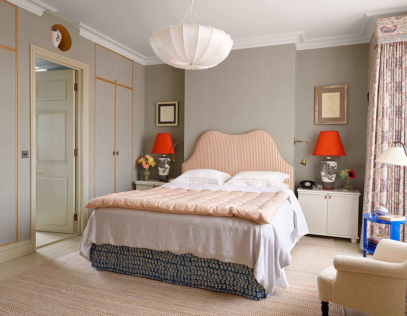
OK. I know what you’re saying. “HEY, DUMMY, THAT’S GRAY.” And you’re not necessarily wrong, but look at that blue bed skirt! And those fun paisley curtains! And MAN, get a load of that electric cobalt end table and those fiery red lampshades! (And while you’re at it, look at that circular cutout with the face on the right. And the light fixture! And the use of an overhead light AND sconces AND lamps AND a reading lamp. And that tiny quilted end-of-bed-blanket! There’s so much to discuss here!) In any case, I love this room because it’s filled with similarly-scaled patterns without FEELING too busy or dowdy.
But if stripes aren’t your cup of tea, never fear! There’s another route to explore.
Florals + Global Textiles

SWOON. This isn’t the first time I’ve shared this photo and I doubt it’ll be the last. Admittedly this is a little bit more difficult to achieve for most folks (unless you’re a master craftsman or a contractor owes you a favor) but my, what an impact! It’s incredible what a tiny bit of architecture, some drapery, a whole lot of intention, and a statement lumbar pillow. Minimalist AND maximalist. CHEF’S KISS. (PS. I met Sally right before quarantine and y’all would not BELIEVE how uncool and nerdy I got – I would love her to design my whole life, please.)


And now we jump to full-on maximalist territory. If blue and red are a little too intense for you, you can always temper it with a touch of pink! The home on the left actually belongs to Molly Mahon, who is an awesome textile artist – I love that her home really reflects who she is as a person. It’s a great feeling when someone walks into your place and is like, “ah, yes, I can tell that *YOU* live here.” She’s really taken this trend and put her own stamp on it (pun wasn’t originally intended but wow, I kinda nailed it, huh?)?
And then I am drooling over this luxe, glamorous version on the right. It’s from an NYC pied-a-terre which feels like the perfect place to play with bold patterns and rich textures. The shine of the lacquered chest and lamp alongside the hits of brass really speak to the wallpaper, bounce light around, and warm it up.

Does that fabric on the headboard ring a bell? If you’re a daily reader, it may – you probably spotted it in wallpaper form in this house tour. This is one of the more saturated rooms that we’re peeking at today, but it’s all anchored by that incredible House of Hackney floral print. I also love the decision to go with soft and textured linen sheets instead of a more formal velvet quilt at the foot of the bed – it reduces the formality of the space and makes it a bit more livable. Plus, how sweet are those tiny half-marble nightstands? 100% recommend taking a peek at all of the rooms in this hotel as each has its own custom headboard with different Hackney fabric and they’re all STUNNING.

To no one’s surprise, this may be my favorite room in this post…and I have a feeling that it may end up being yours, too. Sure, the room has blue and red, but it’s a lot less permanent than some of the other spaces I’ve shown you. Do me a favor and cover-up that blue runner beside the bed with your finger for a second – do you see what a huge difference that hit of color makes in the room? It feels really incomplete without it and the runner’s also a great modern balance to that sweet floral headboard. (Also, if anyone else wants to geek out about the blanket/pillows/lamp + lampshade, I’ll be in the comments.)


AHH. Two rooms for our world travelers! On the left, leaning into the blue and red color scheme really lets the Suzani on the bed shine. Plus, the restriction of color really leaves some room to play with styling – how interesting is the tiny art above the bed and that wall-mounted cabinet above the door? On the right, the wallpaper and linen on the headboard were inspired by antique textiles – fully recommend clicking through to House and Garden as you can really zoom in and admire how detailed each piece is. Both rooms are warm and happy and they give a lot of space for their special textiles to breathe and sing. Love, love, love.
Whimsy Shapes
Okay. We’ve desaturated and we’ve picked our metaphorical pattern poison. That brings us to the cherry on top…the fun 

How can you NOT love a scalloped chair? Y’all, the English are really on to something with this whole tastefully-done red, white, and blue thing. The only other thing I’d like to note here is the choice to bring in a hit of black through the lamp instead of through the framing – each piece in this room is actually framed in a light wood, which keeps the walls looking light and airy.


And I didn’t know I needed a Moroccan-inspired teardrop headboard until now…but WOW. We’ve seen a lot of whimsy shapes here today (see: canopies, wavy-edged built-ins, arches lined with florals, et. al) but playing with proportions and using unexpected shapes can really breathe new life into a classic color scheme. Do you remember that scene in Sex and the City where Charlotte is like, “NO, BUNNY, this is MY HOUSE and I’m going to decorate it” and she proceeds to basically do a modern take on Bunny’s style? That’s how I feel about this – we’re taking something super classic and giving it a little modern update.
Tiny Hits of Red
“BUT CAITLIN,” you say. “I WANT TO PARTICIPATE BUT THIS IS A LOT OF COMMITMENT.” I got you, boo!!! Let’s look at some simple ways to start spicing up your bedroom (the unintended puns keep coming, guys!!).


Break out that finger again and cover up the red blanket and the red pillow. WOAH, right? It’s wild how much they add to each room. Before committing to an all red-and-blue scheme, can you just test out a super-bold accent piece in your current room? It may even surprise you. (And again, Luke Edward Hall super fan here and am truly floored that a leopard carpet can be paired with that wallpaper, that lamp, and those pieces of art – INCREDIBLE.)


Ah, the little touches! Take a peek at those red lacquered legs on the table AND bench – what an impactful statement made by such a tiny piece! We spend so much time thinking about the tops of things – you know, how should we style the table? How should we upholster the bench? – that it’s a real treat to see folks putting focus on the bases. Super refreshing, super eye-catching, and pretty DIYable – please let me know if you decide to try this one out at home!
When In Doubt, Add Yellow
But wait – THERE’S A SECRET SAUCE. A no-fail addition. It’s come up a few times throughout this post – if you already clocked it, I’m impressed! – but let me show you some of my favorite examples!!!


If you’d ever told me that I’d be THIS into primary colors, I never would have believed you! But this formula is foolproof, y’all. Let’s peek at the room on the left and compare it to the first rooms I showed you. Soft blue wall? Check. Printed and upholstered bed with hits of red? Check. Black end table? Check. Exciting light fixture? Check. The goldenrod throw at the end of the bed is the perfect finishing touch – it ties in the printed shade and sham. LOVE.
And ah, what a breath of fresh air is this space on the right by House of Sui Sui? I’m usually a print loyalist (sign me up for stripes and leopard in every room, thanks) but I love how calm and serene this feels. It’s also fun to see it juxtaposed next to the space on the left – they’re similar but executed in SUCH different ways. I guess there really IS a red and blue room for everyone


There’s something so special about these bold, sunny hits of yellow next to these blues in particular – it’s almost like being outside, right? And the mixing of red and yellow on the left is MASTERFUL – I know that color combination, in particular, can be tough to attempt because of uh, certain brand connotations (hello, golden arches) but MY, it can really shine when balanced out by some vibrant textiles.

Last but not least, I wanted to leave you with this space as it’s such a treat for the eyes AND it encapsulates EVERY. LESSON. FROM. TODAY. Can you believe it? We’ve got a striped bed frame, some gorgeous textiles on the bed, a bright red rug and bold art, a cobalt lamp (with a leopard shade! For me!), and it’s all unified by a grounding swath of yellow drapery. This room has SO much color (basically the whole ROYGBIV spectrum is here!) and so many patterns (6 in this shot, if I’m counting correctly) but it just feels livable and curated and collected thanks to its main color palette of reds and blues.
Which brings us to the end of the post today. The moral of the story? Desaturate your colors! Add a stripe! Add a floral or a textile! If that’s too much, just try a tiny pop of red! And when all else fails, tie it all together with a fun hit of yellow. But now, my question for you: would you try this at home? And maybe more importantly…which one of these would you move into? (I’m calling dibs on Luke’s bedroom with leopard carpet, but I’m also willing to fight for the room with the canopy and for Beata’s room with that floral headboard and that big lamp…)
Opening Image Credits: Design by Luke Edward Hall | Photo by Benoi Linero
The post Blue & Red IN BED! Is This The Next Bedroom Color Trend? (+ The No-Fail Formula Used To Make It Work In 28 Different Rooms) appeared first on Emily Henderson.
from Emily Henderson https://stylebyemilyhenderson.com/blog/bedroom-color-trend


No comments:
Post a Comment