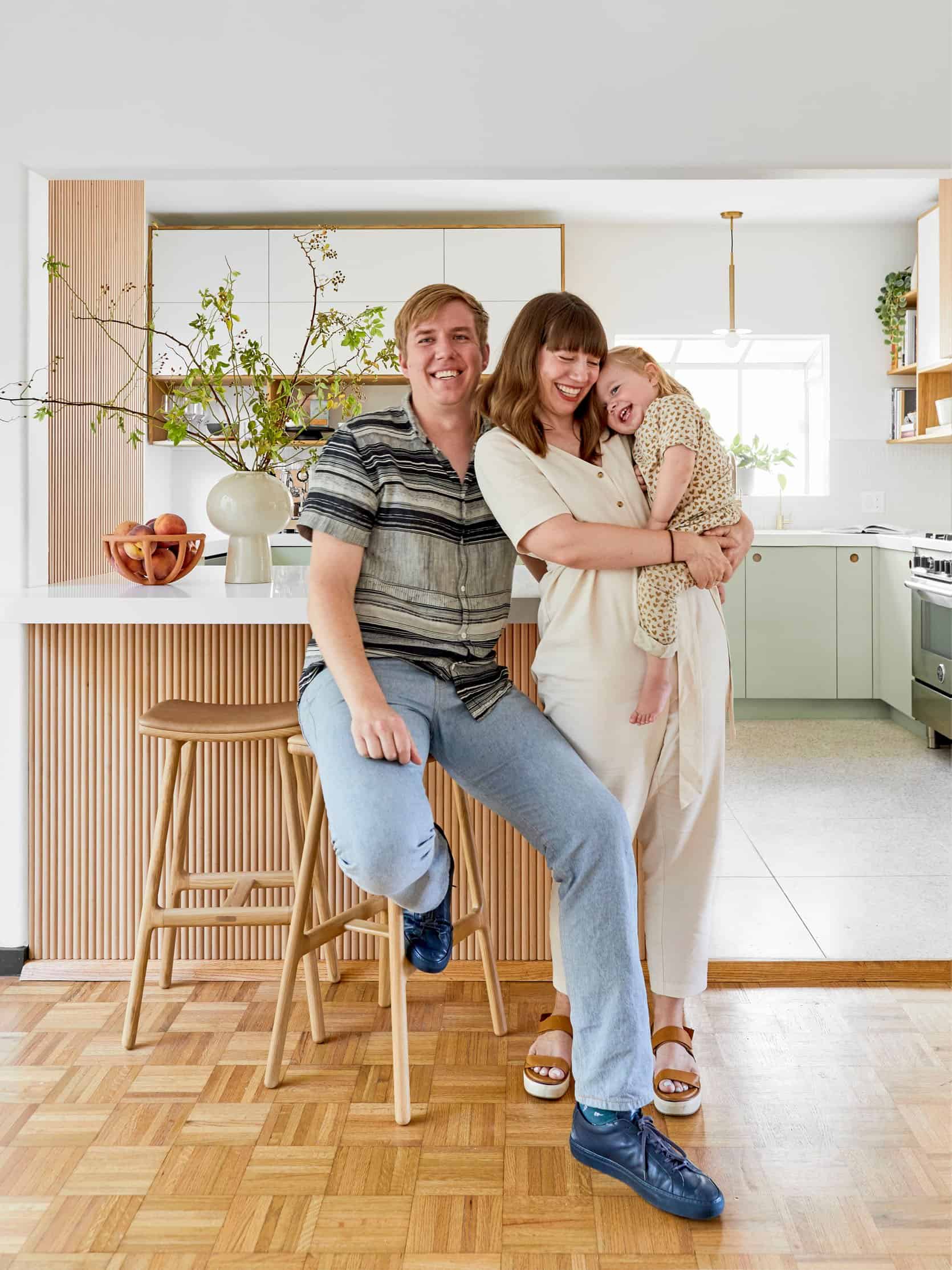

Hi EHD Friends! I’m back… strike that, we’re back (The EHD-Alum Team: Julie, Grace, and I in cohorts with Emily Bowser & Sara T) with a new, budget-conscious reveal… our very first project together as a new team so, pop the champagne!! (And send us some).
After stepping boldly into freelance (as only the naive do) in January 2020 (let’s all laugh-cry at the timing of that), I took on this project alone. In the (forced) isolation of my home office and the multiple nights that were sleepless as I juggled the load/every ⅛” detail of that design solo, I found myself craving the collaboration that was abundant on the EHD team-of-friends (It’s not just an act. We can’t seem to quit each other).
Then came a plot twist. Emily Henderson decided to move to Portland, meaning she no longer needed her dream-worthy Los Angeles-based design team. Dibs-dibs-dibs, mine-mine, stand-back, don’t-touch, I called it – No Take Backs!
And that’s how the new Velinda Hellen Design team (and E-Design team!) was formed.
Bringing more reason to celebrate, the absolute loveliest couple; Jeff (a composer) and Claire (Book Editor – LACMA) came to us for some creative solutions. In tow was their one-year-old. We couldn’t get the rights to her name/likeness as she’s a pretty big deal, so we’ll just call her ‘Trap Baby’ because she tricked even this ‘probably-no-kids-for-me’ design team into doubting their life decisions. But let’s not digress into future plans to steal a baby, the long and short of it; we couldn’t have asked for better clients for this first team collaboration!
Settling into their new role as homeowners, our artist clients needed help lifting their bungalow’s kitchen from a non-functional abyss that was, well, this….


Considering budget and, therefore, keeping the existing footprint for appliances and plumbing, we maximized functionality, space, and character through a simple design facelift. The goal was to create a kitchen that was warm, inviting, and undeniably ‘cool’… one that was true to the artists (and baby artist) that live here. Because this wasn’t quite doing it for them:

This was a bit more ‘them’:

Jeff, Claire, and Trap Baby wanted a user-friendly, easy to clean space that had scandi-minimal, mid-century, and coastal casual influences…. “Modern meets vintage”. Keen on cooking, they wanted space to store the many ‘unsightlies’ a cook uses but also hoped to display their collection of cookbooks. A coffee/beverage station was of key importance in this design too. In fact, it was through Jeff that I learned there’s a whole coffee scene for in-home coffee connoisseurs. I was personally converted from a Keurig-user to a fully-formed barista. But more on that later.

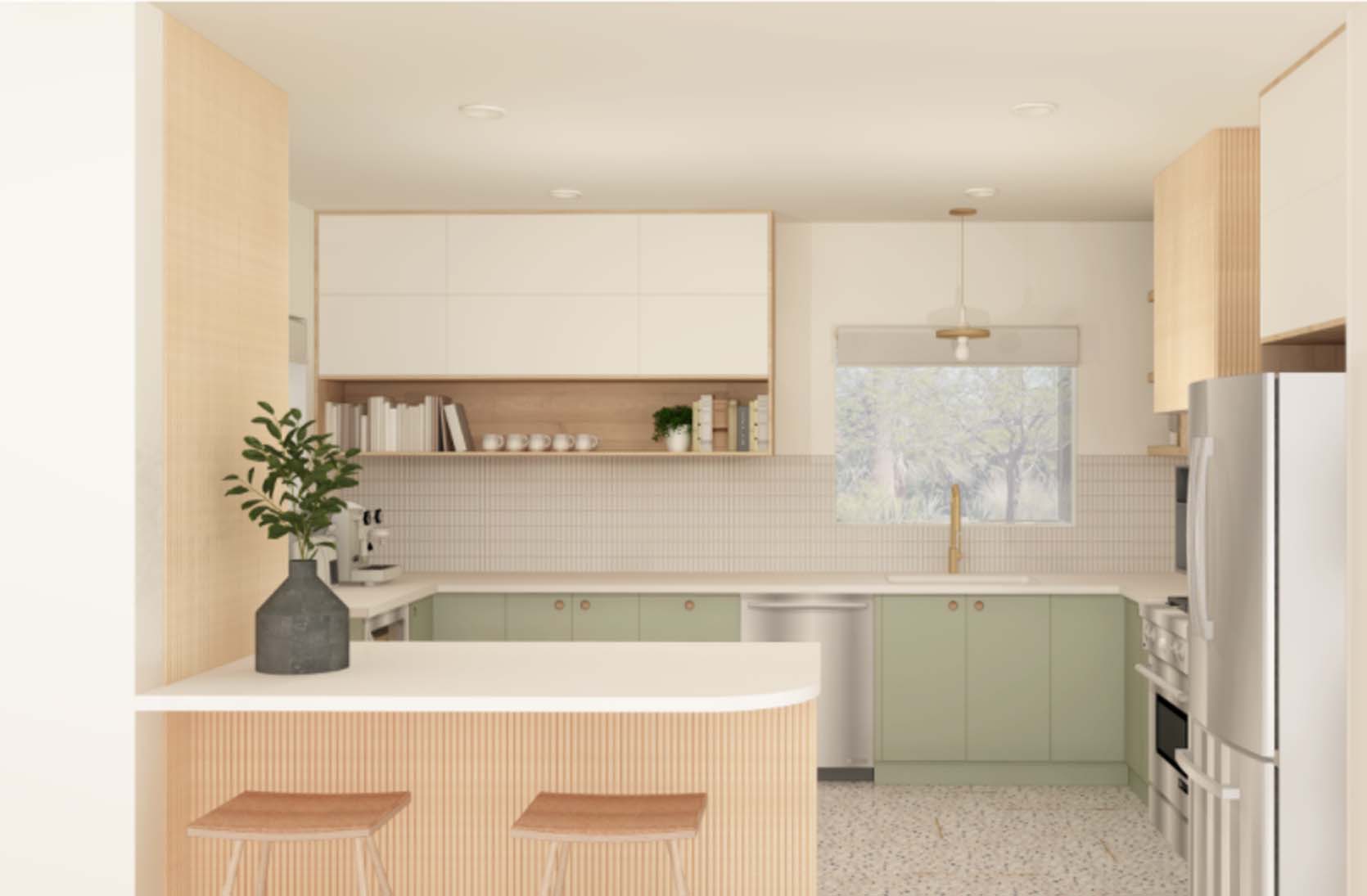
Considering our clients’ needs and attraction to ‘high-concept’ mid-century and a willingness to go bold, but a desire not to abandon simplicity, we got to brainstorming. The concept that evolved included blending clean woods, whites, and pops of color, revitalizing existing pieces, pulling in warmth, and a bit of ‘pizzazz’ through brass finishes. The concepts looked something like this:


Rendered Design Concept:

But the actual details and execution of the design broke down something like this:
MAXIMIZING THE BUDGET
Keeping What Worked (Or Worked Well Enough):

This was the biggest dollar-saving factor as it lobbed off labor expense (the biggest fee of this and many renos). Since the placement/functionality of the sink, range, fridge, and pantry/island worked, we left that alone. In fact, we left the major appliances, though we replaced the sink and faucet, sourcing all of our plumbing fixtures through Build Ferguson. It’s probably not a giant secret, but if you’re budget conscious and can avoid moving plumbing and gas lines, DO IT!

We also left the existing flooring throughout the house. And it’s parquet! Now, less-fearless clients would have probably replaced those for a ‘light-to-medium-tone’ hardwood. But because we knew the parquet could actually shine within the design update and because we wanted to save our client thousands and thousands of dollars, we all easily agreed the floors would stay! And now we all love them.
Mixing High & Low Materials:
A not-so-secret skill our team has not-so-secretly inherited from EHD is pulling in both ‘save’ and ‘splurge’ materials. A couple ‘saves’ on this project include the cabinet hardware (which we either didn’t need at all thanks to Reform’s cabinet face design (or we found the hardware on Etsy), the backsplash tile, a Wayfair find, was porcelain and sheeted vs handmade and harder-to-install. This meant saving a lot on install and cutting costs!

Embracing ‘Elevated’ IKEA
If we’re gonna talk about saving on materials, we’ve gotta talk IKEA ‘hacks’. Instead of going with custom, the outdated/not-ideally functioning kitchen cabinets were replaced with IKEA, but the door & drawer faces were a bit more sublime. Reform offered faces for IKEA that were not only reasonably priced, but had a style that actually completed the vintage-inspired look (and cut down the need/expense for hardware thanks to integration and push-to-open features!). We were obsessed with how the flat panels of their Basis design were anything but boring due to wood detailing and two-tone pulls. The linoleum vibes (and color options) were perfect for this design. The colors we selected were Pistachio for the base and white for the upper cabinets. Reform established the look of this kitchen… hiding the budget boxes below beautifully.
MAXIMIZING THE FUNCTIONALITY
Storage!: Open & Closed
Layers of closed storage extending to the ceiling maximized the vertical space of this small-ish kitchen and allowed for more-limited, open storage below. All of these boxes were IKEA/Reform except for the open cookbook shelving, which we had our carpenter custom make from Reform paneling to match the rest.

Zones!: Beverage Stations (Prep, Cook, Clean Zones)
Especially in a small space, you gotta ‘zone out’ a design by purpose. It may seem obvious, but thinking through (and maybe even circling out the areas on a floor plan drawing) what you intend to do within each stretch of space is vital for determining what types of drawers, doors, and cabinets you need.

The ‘cook, clean, and prep’ zones were pretty established already given we kept the range, sink, fridge, and peninsula placement. The zone we were able to focus on, then, was the beverage zone! The Whirlpool wine cooler and Whole Latte Love’s coffee solutions were the all-star players in these particular ‘in-zones’. This wine fridge holds a TON and the wood feature was an accidental (er… I mean… design-team-genius) detail that worked perfectly in the space.

Espresso Machine | Coffee Grinder
The wood detailing of the Pathfinder Heat Exchanger Espresso Machine was anything but accidental. How do you convert a Keurig-using designer into an avid barista? Let them CUSTOM DESIGN A COFFEE MAKER! This espresso machine shatters the average ‘stainless box look’ by letting you pick from a variety of shell and insert material design options and the grinder is by far the sexiest I’ve seen out there (and I’ve searched)! Jeff already loved this machine for all the ‘coffee-expert’ reasons, something about being quiet and then doing-something-something for yummy-something. I loved this machine… because it’s SO PRETTY! I got one.
Lighting & Layout Tweaks:

One detail that made the original design all-the-more… ummm Exceptional?… Was having only one light in the entire room! And a horribly-placed one at that. Since the dark space was also small, the ‘eat-in’ feature made no sense. So, we re-did the lighting plan, pulled in more natural light by swapping for a full-lite door and made minimal adjustments to the existing layout to ‘kill’ the banquette in order to maximize storage and worktop space. Speaking of worktops, the countertops used are super user-friendly and easy to clean. They’re engineered quartz in Pure White from Caesarstone, which has become a VHD go-to!
Kohler Plumbing Fixtures via Build Ferguson

Glass Cruet | Copenhagen Salt & Pepper Mills
MAXIMIZING THE CHARACTER
Inspired by ‘coastal meets mid-century-clean’ vibes, texture through material (terrazzo and tambour) and a bold ‘pistachio’ cabinet color elevated even the subtler design changes. Our personal favorite elements:

Terrazzo Floor Tiles:
Both classic and on-trend, the terrazzo floors were the star of the space. We were SO thrilled our clients wanted to do something special as we had been stalking Concrete Collaborative on Instagram for months! They offer both poured and tile terrazzo and aggregates can be custom selected for their poured options (the tile we used: Venice (Alabaster MCC Medium Colorful). Love, love this look. Love the clean-ability and the forgiving nature these tile provide (dirt, dust and other imperfections are less obvious against texture). Love the limited grout lines of the large-scale tile option. Overall, just love!
Wooden Texture:
Some of this came by luck (the original flooring) and some came through sourcing. The half-round/dowel look is simple ‘cladding’ (covering a surface). We used a sheeted ‘tambour’ to achieve this look. Our wood species: Alder!

Flush Mount Lights | Drawer Pulls

Color:
Keeping the small space ‘light’ by staying mostly white, wood, and clean/organic on the top half of the room, we anchored the space color pops subtly inspired by the 60s. The pistachio dominates delightfully, but the specks of pinks and yellows in the terrazzo complements (and sets the tone for the living spaces we’re designing for them next!).

Styling:
We cheated… and more than once!
The design would be flat without the details, but because we’re still designing their dining room, we ‘pretended’ it was ready by borrowing the dining room setup from a previous design. You sleuths may have already recognized Sara Tramp’s amazing vintage pieces from this project. The gorgeous leather stools in the room are Esse from Article and that amazing portrait is Ethan Caflisch / Tappan Collective.

Art by Ethan Caflisch via Tappan Collective
Cheating again, our clients had excellent taste and pieces to display. And then the ultimate cheat, bringing in Bowser who brought us alllll the beautiful stuff! Design is in the details so finishing a space with a final round of styling shouldn’t be overlooked!
Being a reunited team with stellar, creative clients may be a dream, but I’d be amiss not to share a couple hard-earned lessons/insights as a new design firm. 1. Covid is NO joke. Don’t expect to plan construction based on estimated delivery dates. Those seem to come with a bit of a *wink* these days. 2. Finding the right contractors, even as a design team, takes time. I talked to several designers about this and we weren’t so lucky on this project (despite beautiful results)… but that’d be a whole separate post.
But let’s focus on what reeeeaaalllly worked (and worked their bums off)… this NEW TEAM! I’m so grateful for Grace De Asis (the brain behind so many of these ideas), Julie Rose (the lead throughout this project), Marlene (our newest designer who just FITS), Sara Tramp, and Emily Bowser (who made these photos pretty) and our two stellar freelancers: Brittany and Trina.
Quick note: our lil’ team works all over the world! We offer E-Design and Virtual Consultations, so please reach out… wherever you are!

We’re all grateful for Jeff, Claire, and Trap Baby who are now stuck hosting dinners for us forever… don’t tell them, we’re breaking in the idea gently. And we’re thrilled because we NOW have a stellar contractor aboard for future projects… Dibs-dibs-dibs, mine-mine, stand-back, don’t-touch, I called it – No Take Backs!
THE END!! Roll Credits:
*Photos by Sara Ligorria-Tramp
**Design by Velinda Hellen Design
***Lead Designers: Grace De Asis & Julie Rose
****Styled by Emily Edith Bowser
The post The 3 Best Ways To SAVE $$$ On Your Kitchen Reno (+ Our EHD Alumns’ First Reveal As a New Boutique Team) appeared first on Emily Henderson.
from Emily Henderson https://stylebyemilyhenderson.com/blog/a-trend-forward-kitchen-on-a-budget


No comments:
Post a Comment