
Things can get tricky when you add an addition to a home. I think Emily can attest to that with the farmhouse. The added space is awesome but you need to make sure that it doesn’t feel too “new build” so that it looks like it still belongs with the original structure. Well, that’s exactly what designer Rosy Alexander did for her clients with this kitchen/living room addition.
As is the case with most desired kitchens, this one needed to be practical for their large and frequent family gatherings but also have it look really well designed (I mean why else hire a talented designer like Rosy?). So they decided on an airy, Scandinavian-inspired design and that’s exactly what they got. Oh, and just wait until you see the island table extension:)
Pendants | Blue Cabinets (in Night Sky) | Limewash Wall Color | Tile (in Weathered White) | Countertop | Faucet | Skylights
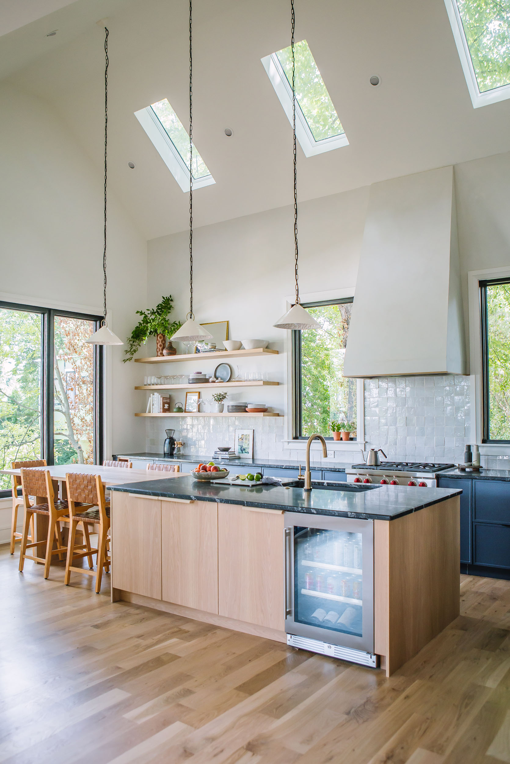
Since we are BIG skylight people let’s talk about that first. We are of the opinion that if you can put in skylights, DO IT! I love how high the ceilings are in the addition and those skylights somehow make them feel even taller in the best way. Nothing compares to natural light and especially if you want an airy, Scandinavian feel to your space. These ones are from Velux which Emily used in her mountain house bedroom and is using A LOT of them in the farmhouse.


How cool are these process shots?
But let’s get back to how Rosy made sure this addition didn’t feel too “new”. First off, look at the window mouldings. While they aren’t super decorative, they still feel a bit more traditional (likely speaking to the original structure) and keep it from feeling too modern. They easily could have leaned hard into the Scandinavian look like Emily did with their windows the mountain house which only have a light wood interior frame. That same look would have completely worked with this room but probably doesn’t work with the rest of the home’s original design.
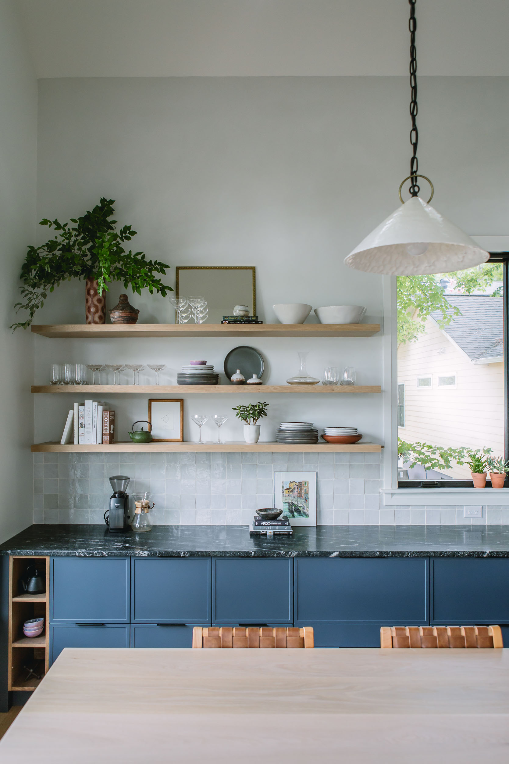
HOWEVER, look at the perfect distribution of the light wood accents. You can’t tell as easily in this photo above but those floating shelves help to keep the overall design feeling light and they visually balance and complement the dark blue cabinets on the other side. Plus according to Rosy, it was the perfect place for her client’s collectibles and everyday essentials (AKA a great place to show some extra personality). Now please notice that little white oak cubby nook on the far lower left. THEN notice that sweet white oak trim on the top of the tile and around the bottom of the hood (those you can see better in the photo below). There’s more but we’ll talk about that in a sec.

Now onto some other details like the wall paint and tile choices. I know it’s a little tough to see in these photos but that is limewash on the walls in just a pretty warm white tone. I don’t know if you’ve ever been in a room with that wall treatment but it’s pretty spectacular. It’s this secret texture that doesn’t necessarily scream out at you at first but once you realize it’s there, you kind of can’t take your eyes off of it. I’m sure that’s what it feels like when you are in this room.
Then of course you have that stunning handmade zellige tile (these are the same as the one’s in Emily’s LA kitchen). If something is handmade it is nearly guaranteed that it will only add warmth and texture to your space which is exactly what this tile does and did to this kitchen. Would a classic white subway tile have been pretty? Absolutely. But would it have evoked the same visual texture? No. It just depends on the look and feel you want.
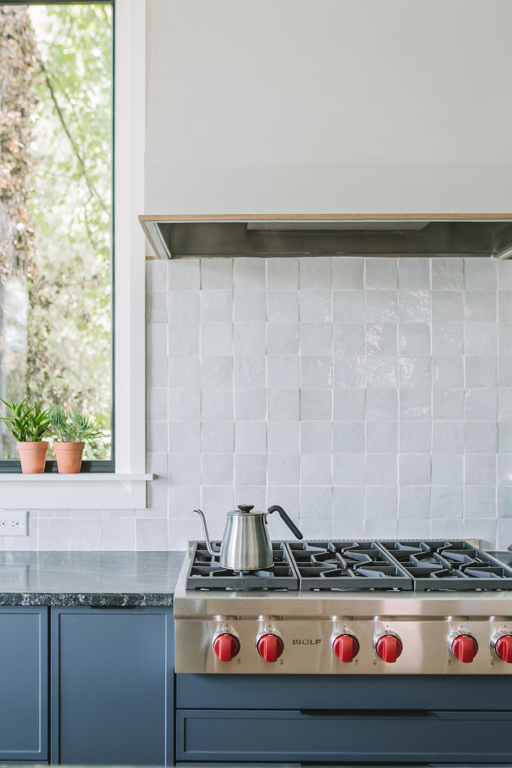

Range | Fridge | Wall Ovens | Drawer Pulls | Cabinet Knobs
See that hood white oak trim detail??
When I asked about the choice to go with a stovetop and separate wall ovens, Rosy said “The clients host and cook a lot, so they wanted versatility and multiple cook stations.” As NOT a cook myself, I’m always curious about the appliance choices people make and why. How do you all feel about this combo instead of a full range? Em did talk a bit about it in our 2022 kitchen appliance trends post if you’re curious.
I also figured they were big entertainers because of their wine fridge
Ok, I think it’s finally time to get into this kitchen table island extension…

This table is my favorite part of the kitchen. The joinery!! It is a custom piece so naturally, I asked if they had any inspiration shots and this kitchen island above was their jumping-off point. I also asked why they decided on doing an extension in the first place:
“The tabletop was created out of necessity. My clients love to gather around the table and the kitchen. In Indian culture, family gatherings are very much about sharing food together, and the clients want their family and friends to have spaces to gather while they’re cooking. We commissioned Jacob Wolfe of Daswolfe from Charlotte, NC to create the table extension, and he exceeded our expectation with the island fronts and tabletop.”
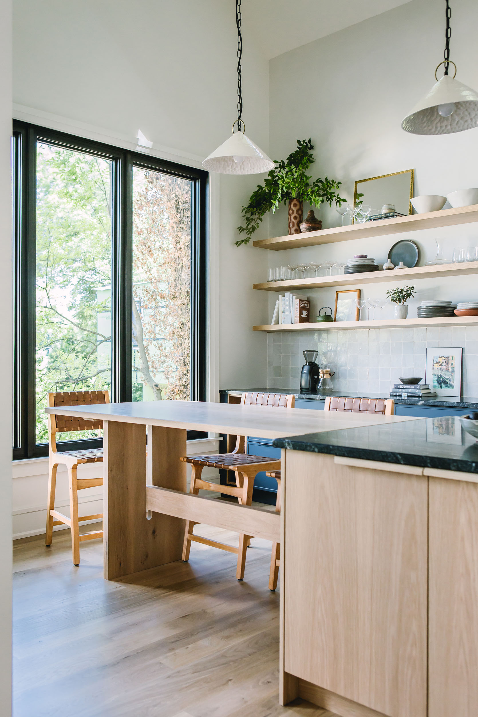
While I love the Amber Interior’s Island (and everything they design), I adore what Jacob came up with. Simple but oh so special. EHD’s favorite descriptors;) That cutout and beam really have my heart fluttering. I also love that it’s the same height as the counter (the multi-level island has been popping up more on my feeds) and that it’s narrower. This way there’s room for stools without it overwhelming the space and it feeling super crowded when family is around it.
Actually, the entire island is custom which is something they were able to afford since they used Semihandmade cabinet fronts. It made their budget a bit more flexible to splurge on these custom elements.

Ah, I haven’t even talked about the cabinets yet! Well, I love that giant wall filled with different-sized compartments. I think it makes it look a bit more interesting than the simpler floor-to-ceiling single panels. They also almost went with a black color instead of this blue. Black would have been pretty but the midnight blue is so inviting. However, they still get that color drama with those beautiful black-honed countertops and black hardware.
Wanna see the other side?


I loved that she took the details of the island and put them in the cabinetry on the other side of the room. I love the subtle patterns of textures of the textiles. HOP TIP: For a large space don’t be afraid to layer rugs! Jute rugs are usually much more affordable so you can use that as your “BIG rug” and then layer a smaller (and softer) rug you love on top.
Also, I love that chair almost too much. The contrast to all the other lighter and softer tones helps to ground and have a slight edge to the space, plus balances all the dark tones in the kitchen.
So there you have it! Some addition and texture tips, beautiful kitchen island inspo, and a chair that is likely knocking your freaking socks off. Happy Tuesday!
Love you, mean it.
*Design and Photos by Rosy Alexander
The post How To Add An Addition To Your House Without It Feeling TOO New (+ A Classic Yet Trend Forward Kitchen Island Extension You Need To See) appeared first on Emily Henderson.
from Emily Henderson https://stylebyemilyhenderson.com/blog/new-kitchen-island-ideas


No comments:
Post a Comment