
Deeply saturated moody walls, vintage portraits galore, and a secret passageway are just a few of the elements in this former church turned Airbnb that make it endlessly exciting to gaze at. This is a “home” tour like you’ve never seen before but before we get deep into it, a quick note from Emily:
We shot so many amazing houses for the book, and today we are launching a new series where we do features on the designers and homes, one at a time – with all their photos in one place. We are starting with likely the most jaw-dropping of all of the spaces, which doesn’t imply that it’s better than the others – just one that surprised us over and over. Sara Ruffin Costello is a total style maverick. This “house” is a former church in New Orleans and isn’t a home, but an Airbnb which allowed Sara to probably push boundaries further. It’s just incredible. I’ve known Sara since I was an assistant stylist 18 years ago in New York. She was one of the founding editors of Domino when it launched, the creative director, and I looked up to her so much in my 20s. She had this beautiful West Village brownstone, with sweet kids and was so lovely and down to earth. I was in my early 20s and I remember thinking that seemed like a pretty great life to aspire to. She since moved to Louisiana and when I saw this space on her Instagram, I immediately begged to shoot it for the book. It far surpassed our expectations. Sara Tramp, Velinda, and Erik really killed it on the photography and styling. So go follow Sara now. She continues to inspire with all of her projects and I was so lucky to have been near her while learning my way through this style industry. Thanks, Sara. xx

The first room of the tour reflects a vibrancy that rivals the very city it is housed in. A New Orleans transplant herself, Sara Ruffin Costello once wrote that “part of the allure, of course, is that even post-Katrina, New Orleans is like a movie set.” Indeed, those who have ever visited can attest that the city has a charm and appeal that is almost dreamlike. Considering her deep admiration for the city, it should come as no surprise that the same goes for this Airbnb she designed. It feels like a dream because it has all the things one hopes to find in interior design: unlimited charm, a mix of old and new, daring choices, vibrant colors, exciting patterns, and unbelievable art, all packaged together to create a warm, inviting feel.

In this first bedroom, dark blue walls create the backdrop for a dramatic four-poster bed and a golden, decadent tapestry. Immediately you are enveloped by the moody blue color which is emphasized even more so with the matching blue bedding. The bedding adds a ton of texture which contrasts the smoothness of the walls, and the low brass sconces add warmth along with the tapestry. As you’ll continue to see throughout the home tour, it’s these small details that make a good design GREAT.

Connected to the bedroom is this bathroom that is decorated with floor-to-ceiling dark subway tile. It’s hard to tell from this angle if this is a full bathroom so I wonder, is it possible this is a single shower closet? If so, that explains the daring spirit of Sara Ruffin Costello’s designs to a T.

If you ever thought moody and saturated were contradicting adjectives, think again. The inky blue wall color is both rich and dark, adding so much depth to the room automatically.

It is worth noting that a four-poster bed draws the eye up, so the vaulted exposed wood ceiling is a treat for the eyes. As your eye is drawn up you’ll also see the jute roman shades, which complement the wood ceiling, and both work together to add an airy warmth to the space.

To contrast the dramatic wall color, SRC plays with patterns to brighten the space. The old-world Mediterranean style tile flooring is paired beautifully with a similar color Persian rug, creating a ton of pattern and texture. The rug adds a layer of coziness but has rich colors that complement the Victorian style of the room. Speaking of color, I really adore the subtle choice to paint the grid of the window panels a warm tone which adds to the red accents throughout the room.
Oh, and did anyone notice the painted-over electrical outlet? It’s such a good trick to “hide” it in plain sight.

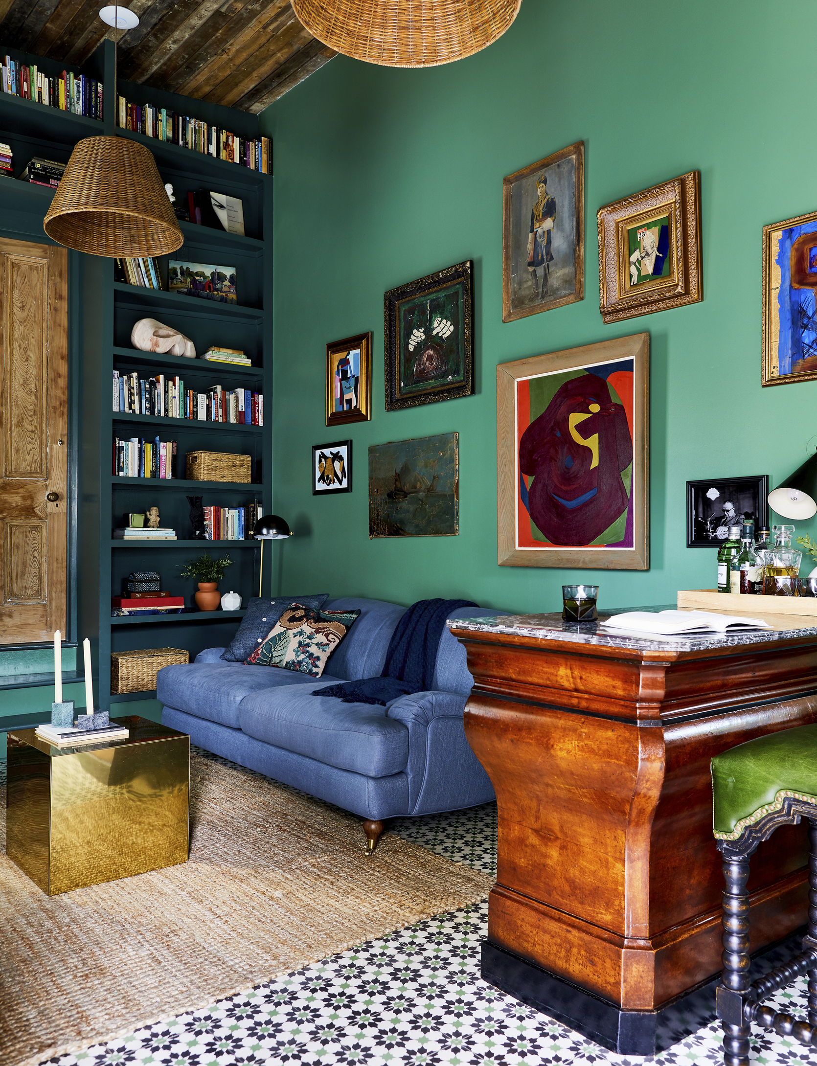
As you’ll see, all the pieces of art throughout this entire Airbnb are striking and bring a vintage collected vibe into every room. In this mini gallery wall, she plays with scale but keeps the color palette and style consistent so the gallery feels cohesive. I also can’t help but love that mini soldier bust.

Moving on to the next room, the adjoining hidden door is a really unexpected and playful choice. Continuing the pink wall color and golden yellow baseboard across the door makes the door disappear seamlessly into the room. When closed completely, the tiny brass door knob and brass lock are noticeable and add a sweet and whimsical touch. To starkly contrast the pastel pink wall color, another awesome vintage portrait breaks up the wall color with a black ornate frame.

It’s nearly impossible to choose a favorite room from this tour, but this living room is hard to compete with. The mixing of styles (rustic meets glam meets Victorian charm comes to mind) makes it such an exciting room to behold. Immediately, SRC knows how to grab your attention and bring the eye up with that regal candle chandelier. Then as your eye bounces around trying to capture all of the decor elements once, it becomes clear that she is a master at combining textures. The plush cushions, velvet throw pillows, rustic wood ceiling, and mismatched vintage frames create so much depth. To round it out, the small-scale patterned cafe curtains add a perfect dose of southern charm.

The softness of the pastels coupled with dark moody and comically serious oil portraits creates a really fun and unexpected juxtaposition. The brass tables also add a warm metallic tone that blends into the room nicely.

Since this is an Airbnb and is meant for overnight guests and not permanent residents, the layout and function are a little different, making the design even more playful. On the opposite side of the living room/sitting area, is this vanity cabinet with a built-in sink. No matter what the function may be, it definitely is a surprising choice making the room feel even more refreshing.
I must mention that one of my favorite decor tricks that SRC executes a lot is low art placement. The abstract piece above the cabinet could have been hung higher to be centered on the wall, but the low placement intentionally adds visual interest.


A wood sliding door with a gorgeous medium finish and dramatic grain separates the living room and powder bathroom. She switched up the tile in the bathroom but I love how the bathroom tile is a larger and simpler version of the living room tile and has the same color. It creates cohesiveness without being too predictable.

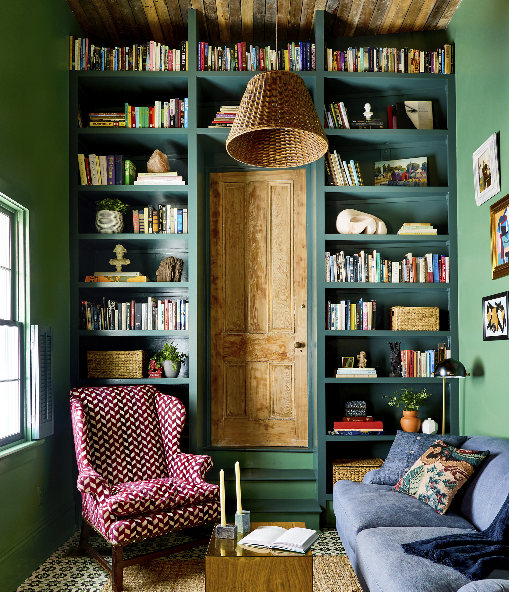
Listen, I’ve never met a built-in bookcase that I didn’t like, but this one will likely live in the built-in bookcase hall of fame. The narrow, light wood door separating the two sides feels very playful and gives this sitting room an enclosed hidden library feel. It’s just SO good.

While there’s so much to admire about this room, I couldn’t help but notice how the jute rug and wicker accents add a layer of warmth that helps create that lived-in, inviting feel. With so many dark tones, this room could come across a bit cold but the light decor pieces keep that from happening. And again, the brass accents add a warm metallic contrast to the space.

File this shot under Photos That Have Been Seared Into My Brain. I can’t get over that wingback chair with the modern pattern against the deep green shelves. Oh, and I love how the window shutters add charm and an endearing architectural feature instantly.

On the opposite side of the room, the tile flooring continues seamlessly into the next bedroom which is just as moody and dramatic as you’d expect…

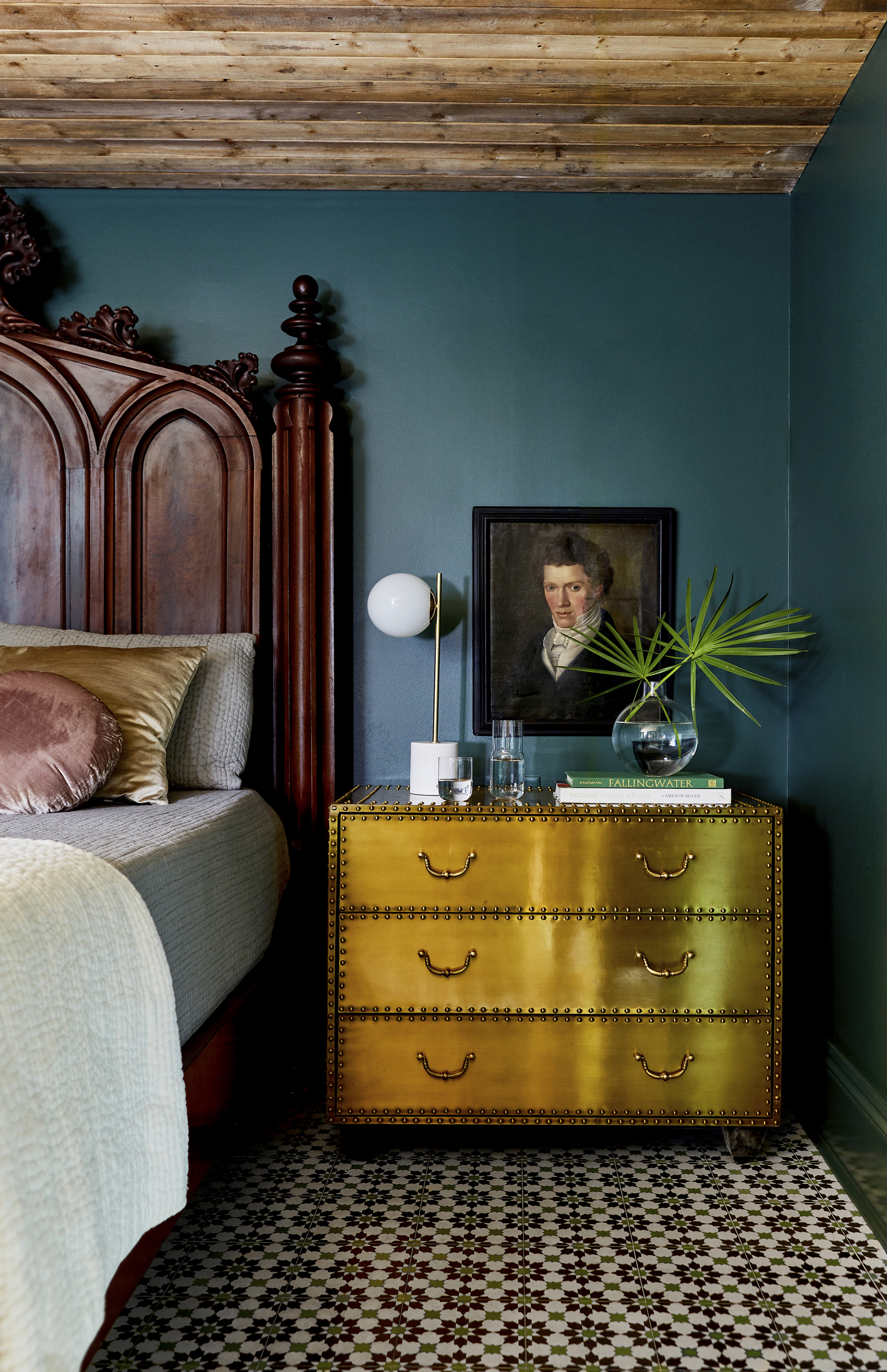
Another low art placement makes an appearance (I seriously can’t get enough of this trick) but holy smokes this brass chest of drawers is so dramatic and fun. The metallic gold shade pops against the inky blue walls so nicely.

When the whole EHD team shared our obsession with this room, Emily immediately noted the deep mahogany bed in particular. It’s certainly a statement piece and one that was a bit of a risk but ended up really paying off. But bed aside, the armoire is impossible to ignore. If you remember this room from Emily’s book, you know that the regal size and dark wood finish of the piece are not the only noteworthy things about it…

That’s right folks, that is an antique armoire turned secret door that leads into the bathroom suite. Pardon this next phrase but, I CAN’T EVEN. It will be hard to talk about anything but this for the next several months, but it’s also worth noting that this room in general is a prime example of dark wood done right. I think it helps that the bedframe and armoire have similar wood tones and they really pop against this particular shade of dark blue paint.

As if an antique armoire turned secret door isn’t cool enough, the inside of the door reveals a strip of bright botanical wallpaper. I do wonder if that was original to the armoire or added later but in any case, SRC never misses a surprising pattern moment.

In the bathroom, green large-scale tile covers the floor and most of the walls creating a bright and happy atmosphere. It’s a surprising switch from the bedroom, making the tile color choice feel even more exciting.

HOT TIP: An easy way to add character and pattern to any bathroom is by opting for a vintage Persian rug instead of a bath mat. I love that she went with a bright pink rug to really contrast with the light green tile.

This tile wall has a soft gradient which makes the color change and reflects light differently, and white shutters add some sweet vintage charm to this otherwise modern bathroom.

It feels fitting to end with this bedroom, which is so different than the rooms we witnessed above, yet carries a familiar mood and dream-like state. Although it is the only neutral room in this home tour, there is no shortage of drama or elegance.
For starters, the curtains added to the four-poster bed make the bed feel like its own separate room within a room. So romantic and Victorian.

Now that we are nearing the end of this home tour, I can confidently say that SRC is a master of low art placement. I love how she hung the art almost directly above the cabinet/side table and placed the sconce directly over that. It makes this little corner feel like its own special design moment.

Just as I began contemplating a shift away from hanging tapestries, this room proves me dead wrong. The tapestry brings in so much color, whimsy, and movement to the room all while bringing in even more warmth because of the woven texture. It’s too good.

I’ll leave you with this dreamy bedroom shot as it feels most apropos to the reoccurring themes of this home: dramatic, collected, dream-like, and inviting to name a few. Now, I’d love to hear your favorite part(s) of this space so please drop a line down below. Thanks for reading and happy Wednesday. xx
*Design by Sara Ruffin Costello
**Styled by Velinda Hellen & Erik Kenneth Staalberg
***Photo by Sara Ligorria-Tramp for “The New Design Rules”
The post This New Orleans Home Has A Secret Passageway That You Have To See To Believe appeared first on Emily Henderson.
from Emily Henderson https://stylebyemilyhenderson.com/blog/secret-door-ideas

No comments:
Post a Comment