
Ross Alan Reclaimed is an LA-based reclaimed lumber company run by husband-and-wife team Ross and Georgie, and if you read this blog, you are likely already familiar with this duo. Emily worked with them exclusively in the mountain house, where she used their reclaimed wood for all the floors, ceilings, kitchen cabinets, and that beautiful dining table. The work they do is stunning–as evidenced by each room in the mountain house. It’s not often we get to see the homes of the makers we work with and today, we have the pleasure of sharing Ross and Georgie’s newly renovated home that is warm, inviting, and of course, clad with different variations of their gorgeous reclaimed wood. It’s a home tour that will have you appreciating, if not coveting, reclaimed wood and all the warmth and texture it can bring to a space.
BEFORE


The home originally had good bones but lacked warmth, and some elements could definitely use a modern update. But what was supposed to be a “simple” renovation, turned into much more than that due to unforeseen issues. I am sure all of you renovators out there can relate (and are perhaps rolling your eyes at me referring to any renovation being ‘simple’ :)).
According to Georgie, “There were a lot of things out of code that we had to replace and make right which cost us a lot more money than we planned. The staircase had to be redone because the original had no stringers (framework that’s load-bearing) in them, all the electrical was old and out of code, joists in ceilings had to be redone to code because there were several missing (which was very weird), and due to our pipes bursting in the bathrooms, we had to redo all of the plumbing and pipes in the house.” So to remedy all of these problems, the project turned into a full gut renovation that spanned over 3 years. They ended up doing the renovation in three phases which is why it took as long as it did, but the result is a beautiful, organic home that is as inviting as the people who live there.

Dining Table | Black Dining Chairs | Armchair | Light Fixture
The after is almost unrecognizable from the before, which is a testament to their style and expertise. Immediately, you can sense how the home feels more open and bright which is in part due to all of the large windows that let in so much beautiful natural light. The other source of warmth comes from all of the wood tones peppered throughout the home. The floors and ceiling are the most obvious and show-stopping, but as we move through this home tour you will notice that they also mix and match wood tones through furniture, decor, and built-in shelves. These aspects all work together to create a cozy and lived-in feel.
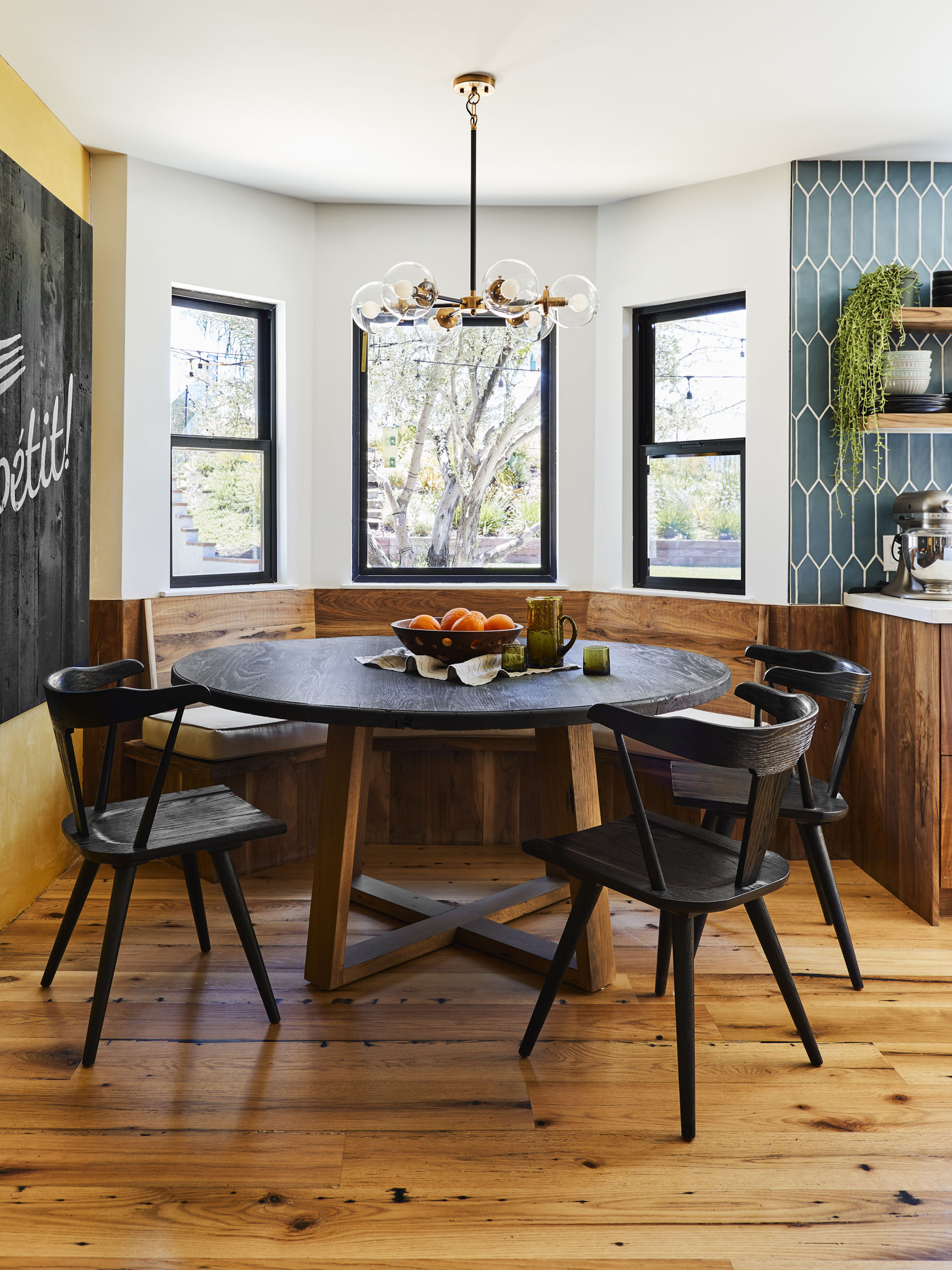
Side note: The dining table is from their new made-to-order furniture line, and features reclaimed barn wood and brass table legs. It’s SO good. I love how they gave a farmhouse-style table a modern flair with those awesome wishbone-shaped table legs.

On the opposite side of the dining area, large glass doors bring in an abundance of natural light, creating an extremely open and airy vibe. The space itself is also very open with minimal furniture, so the wood floors really stand out. Since reclaimed wood is such a big part of their lives, I asked Georgie what type of wood they used for the flooring and why. She explained, “We chose to use the oak mixture for the floors because of its durability and shelf life. We have three kids, animals, and a big family so our floors get a lot of heavy use. Oak is just super solid and has already stood the test of time in our house.” Not only is it solid and durable, but it has a beautiful finish that provides a quiet rustic vibe to the home.

In the kitchen, the blue picket pattern tile backsplash creates movement and a hint of Midcentury modern flair. If you remember from the before photos above, the kitchen was very beige and bland, and this kitchen is clearly the opposite of that. The tile is bold and bright and contrasts beautifully with the wood cabinets and shelves. I also love that they went with a white countertop to match the white walls and make the space feel dynamic yet pulled together. Also, how cute is the box on the top shelf that has little succulents popping out?? ADORABLE.

Dining Table | Black Dining Chairs
The dining nook, nestled between the tile wall and the yellow accent wall, is a perfect example of mixing wood tones. The dining nook bench is made with Black Walnut wood from a barn in Ohio, as are the kitchen cabinets. The way the cabinets flow seamlessly into the bench creates a cohesive look and I love how the movement of the grain brings in so much texture. I mean, seriously, that grain is STUNNING. Then there is the dining table with a black finish on top and a natural wood bottom which creates a nice contrast that is accentuated with more black wood dining chairs.

Sofa | Coffee Table | Rug
The living room sits opposite of the dining area and is extremely cozy due to the variation of colors and textures. Multiple wood tones, velvet cushions, organic shapes, and a tufted rug all work together to create a cozy, lived-in feel. The yellow sofa is custom-made by Clad Home and as you can see it was made to fit in this space perfectly, creating its own zone to separate the living room from the dining area. In an open-concept floor plan like theirs, it is so important to lay out furniture in a way that distinguishes the different spaces.

On the other side of the living room, the ceiling is clad with white oak and as you can see it is slightly lighter than the floors. This mixing of wood tones was intentional to keep the home from feeling too monochromatic but is also a result of their brand ethos: “We don’t like to waste materials” says Georgie, “and when ordering this batch of white oak from barn wood, there is a lot of red oak that sneaks its way in. You can’t always tell what species of wood it is from just the outside of the board which in our case was about 20%. Also, we loved the contrast that the red oak added to our floors which really gave us room to tie in all the other wood tones to the project like the walnut kitchen.” So with 80% White Oak and 20% Red Oak, the floors have a darker, richer tone that adds even more depth to their home.

Sofa | Coffee Table | Side Table | Arm Chair
Much like the downstairs living room, the family room is rich with texture. The use of so much texture allows the color palette to remain simple, and even with a small amount of color the room still feels so dynamic. One way they achieved this is by painting the ceiling black, which is unexpected but such a cool design choice. It highlights the other black accents in the room to create a cohesive, balanced look. And again, different wood tones are sprinkled throughout so this room has no shortage of natural, rustic warmth.


Wall Cladding | Arm Chair | Coffee Table | Side Table
The original primary bedroom had an option for a vaulted ceiling which they discovered one day while up in the attic space, so they decided to blow out the ceiling to reveal the vaulted ceiling. It automatically opened up the room and created a more grand feel. Once they vaulted the ceiling, they cladded it with their Coyote wall cladding, which has a diverse mixture of gray and brown tones. I love how there is so much variation in color and texture which brings an added layer of warmth to the space.

I love that they went with a light wood tone for the built-in bathroom vanity so it really pops against the moody gray tile. Also, continuing the floor tiles up the walls is an exciting choice that makes you feel completely enveloped by the color. It creates a spa-like vibe that is uber-relaxing and inviting.

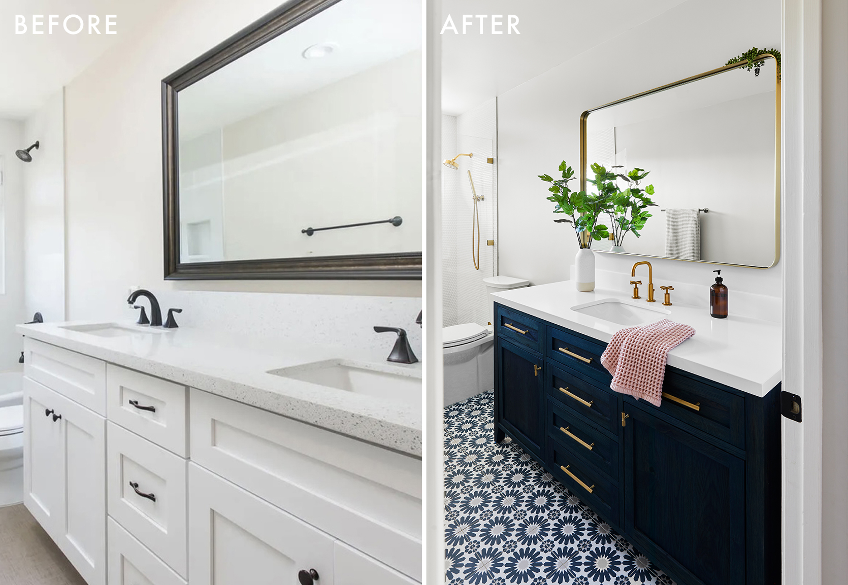
In the kid’s bathroom, the tile pattern is playful and modern and is balanced with the blue-stained vanity. Seeing that the vanity is clearly made from wood, I asked Georgie if it was another piece made by them with their reclaimed wood. It of course is and shows just how much range reclaimed wood has. “We had so much fun using all of our wood to create these standout pieces in our home that are all unique in their own way,” says Georgie, “The vanity in our kid’s bathroom, as well as the guest bathroom, were done and stained using Rubio. It was fun to play with colors instead of the natural tone of the wood and the end result just gave it that extra ‘wow’ statement.”

Huge thank you to Ross and Georgie for sharing their lovely home and design process with us. Now I must leave you but not without sharing the remarkable before and afters:


*Design by Ross and Georgie Kidder
**Styling by Lori Manthei
***Photo by Sara Ligorria-Tramp
The post This 80s Estate Home Was Completely Transformed Into A Modern, Organic Home For A Family Of Five appeared first on Emily Henderson.
from Emily Henderson https://stylebyemilyhenderson.com/blog/modern-organic-home-reclaimed-wood

No comments:
Post a Comment