
Welcome to the coziest room in the house, and while it’s far from finished it checks a lot of the boxes that we needed – an extremely comfortable and large-scale sectional, big enough for all of us + our pups (don’t judge, we let our dogs on our sofa with us), a big ole Frame TV, and a cozy fireplace for the darker colder months. But stylistically it has a long way to go before we will be done with it. I’m stuck in here, TBH, and I’ve GOT to start making some headway. We aren’t shooting some of these final rooms until May but we all know that time flies these days and lead times are long. I hate rushing, but I also do want to be forced to make some decisions. So today it’s all things family room.
But first, where we came from…

This room was part of the 1960s addition to the original farmhouse. It might be hard to see where it is in the house so here are the floorplans of how it was when we bought the house, and where we are now.


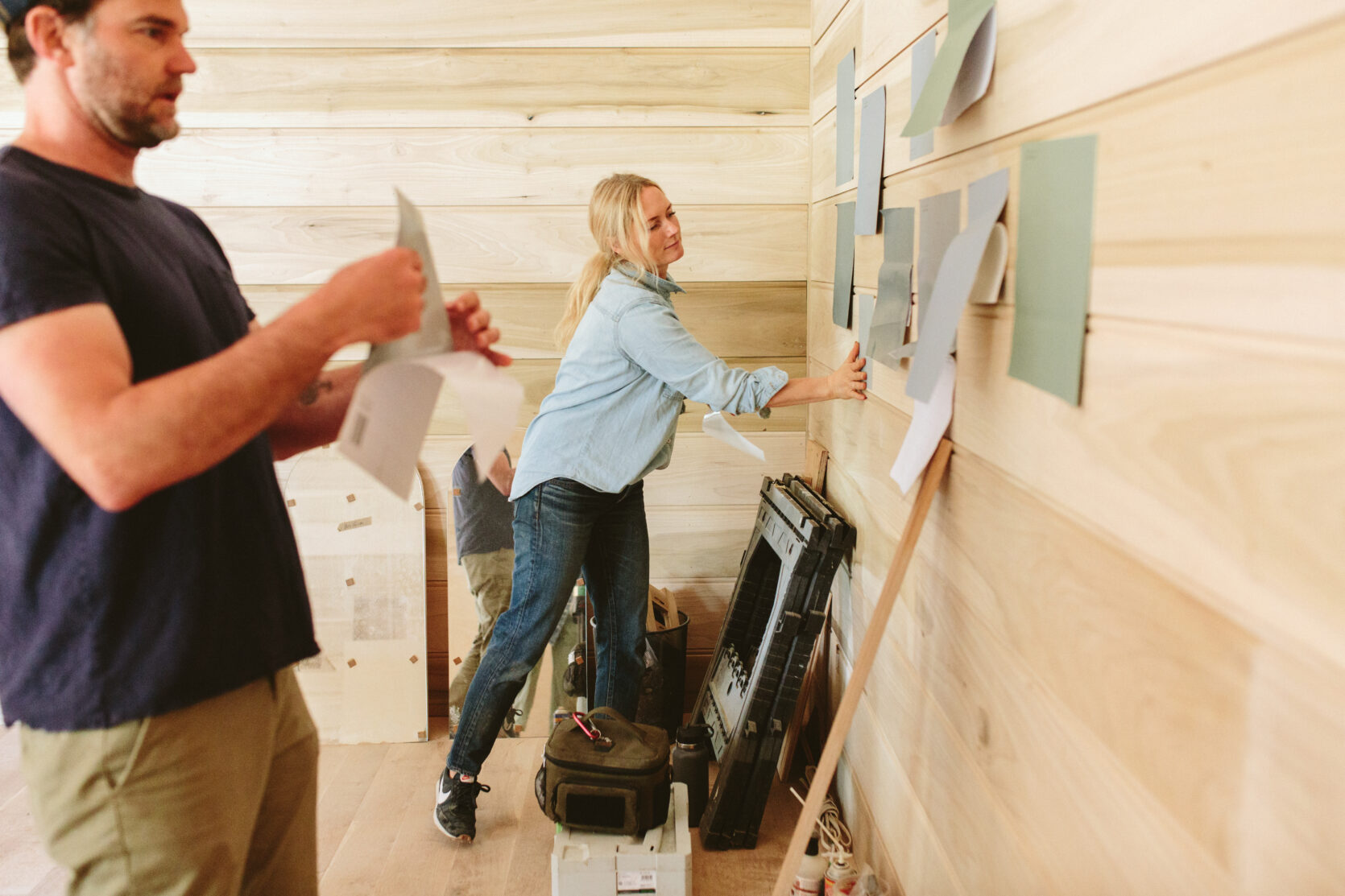
Process – Choosing The Paint Color

We paneled this room with a 12″ custom run bead board that ARCIFORM expertly designed and installed. Sorry if I’m a broken record here, but we always wanted to paint it (we thought) so it was installed in poplar which is not a good stain-grade wood and if I could go back in time right now I might have done it in white oak so we could just have stained wood walls – which would have cost a lot more and might not have been worth it. But now it’s painted so it is what it is.

There was a lot of indecision at the end in the paint color, which isn’t where I thrive TBH. Green! Blue! Rose! I still don’t know!!!


We thought we wanted Privileged Green SW 6193 (a really good dark green) but at the last minute, I was worried it would be too dark and changed the color to Ponder SW 7079 which I felt pretty strongly about at the time. It’s a really, really pretty soft and warm gray that definitely brings cozy vibes. I wrote a whole post about choosing a moody paint color for this room, and while I love the color I’m not convinced it was the right choice for this room with this sectional. Some days we really like it and are like, “let’s make this work” and other days I wish I could snap my fingers and try all these different colors to see if just changing the color would help the design a lot. Somedays it’s gray and cozy and other days it looks really purple. I’m super frustrated with myself right now and generally feeling full of self-doubt (which might be in conjunction with SAD, I’m realizing) so thus being “stuck.”

The Family Room Today

So here we are today and before you judge too hard there is a lot still to be done, obviously, so I’ll walk you through it.
- We added the bench/hearth to add storage and keep the fireplace and the TV near the same height. We hired Nate from Dinihanian Design Build to customize it and he did an excellent job. We kept it simple with a little bead around the drawers for some decorative detail then added large Rejuvenation Massey Pulls. Originally we were going to add a piece of stone on top since the fireplace is sitting on it, but then realized that we didn’t need to. Since it’s gas, it’s fine to be on wood. We were honestly done spending money and adding the stone top would have cost about $2k – in materials, but mostly fabrication and installation. We had already donated the leftover soapstone to The Rebuilding Center and it wasn’t going to be long enough anyway (there would be a big seam which I was ok with). But now, I kinda wish we had done the stone. I’ve thought about doing a cushion but we just don’t need it and the kids use that surface to play. We can still do the stone but it means they have to take off the fireplace, redo the flu design, install the stone, and then re-install the fireplace. That doesn’t sound worth it to me right now.
- The fireplace is this little gas stove from Vermont Castings, the Stardance Direct Vent Gas Stove and it’s pretty awesome. We just started using it last week for some extra warmth and ambiance, and I think it’s helping my mood on the rainier days.
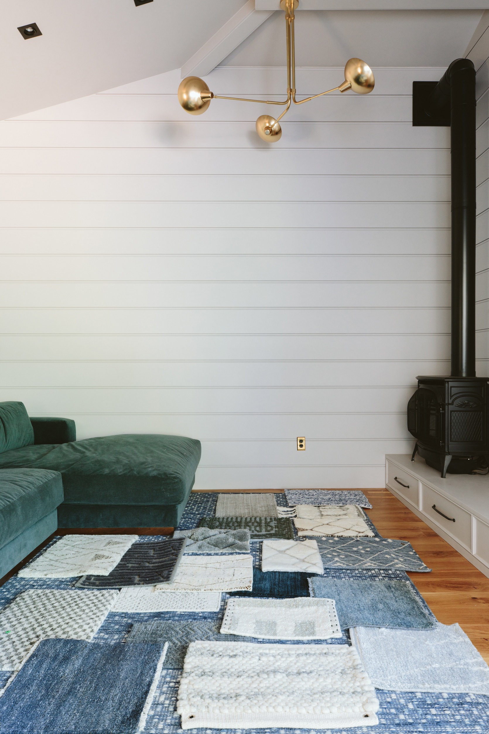
- The ceiling light is from Rejuvenation and we faced the bulbs upward which creates a little nice ambiance. The orange glow of the bulbs with the gold inside sometimes makes the wall color look really purple (which we knew would happen but definitely more than we thought).
- The wall color is beautiful, and the sofa color is awesome, but the rug is absolutely wrong with both. I’m not totally convinced that I like the sofa color with the wall color but keep reeling about how I’m going to proceed.

The sectional is from Rejuvenation and it’s extremely comfortable and cozy. The fabric is a performance velvet and that last chaise seat is big enough for me and both kids (see below for scale – I’m so tiny in it!). The coffee table I’ve had forever (from Anthropologie and sadly out of stock again) and it might end up living in the living room but it works well in here. I think something visually lighter would be better (maybe some round nesting tables?). It’s just very big and bulky in here, but not big enough for the living room so we’ll see. The rug is from the kids shared bedroom in LA (sadly unavailable) and really doesn’t work in here with the sofa and the wall color. It’s a great rug though and EXTREMELY forgiving because of the small organic pattern with a lot of color variation (dogs barfed on it the other day and after we spot-cleaned it we couldn’t find the spot at all). It’s not crazy cozy (as it’s woven not pulled) so we have our thick memory foam rug pad underneath it which makes it super cushy. But all in all, the color is just off for in here.
Time To Choose A Rug?? Will It Tie The Room Together?
This is why I always like to choose paint color LAST, but when you are remodeling all at once (a blessing and a curse) you don’t get to live in it before you paint. Sometimes I wish I had just had them prime the whole house and then we paint room by room, but they spent weeks prepping the walls, screening everything off with plastic, taping off every window and trim piece – so it would be such a waste of prep time to have them do that twice. In a perfect world, we would lock down the fabric and rug colors first because Sherwin-Williams has infinite paint colors. So we are working a bit backward now and that’s okay, but it’s just harder.

So the game plan as of this very second is to see if the right rug and art can tie together the pretty paint color and the pretty sofa color. Repainting this room is a whole thing since it’s all wood paneling including the ceiling and the fireplace hearth/bench. It would likely cost $2,500 (at least) and take 2-3 days and we can’t be in here when it’s done (and it’s a pass-through room which makes it hard to tape off and live with). And since we love the color itself we are going to try to work with it first, knowing that if it doesn’t work we’ll give ourselves permission to repaint it in a couple of years. But what that means is that we have to choose a rug that A. works with the sofa and wall color right now and B. A rug we love with the sofa regardless should we decide to change the wall color. We don’t want to box ourselves in even further – so this rug needs to allow flexibility.
We started collecting samples – some of these are companies who reached out wanting to partner on this room, and others we reached out to or bought samples. There are a million more we could choose from obviously, but laying these all out is super helpful to start comparing and seeing what works.

Here’s what is important to us:
- Comfy and cozy, but doesn’t need to be crazy plush (and we fear that popcorn and small legos would get stuck in it and be annoying to clean). So some of the deeper piles are gorgeous but might not work in here.
- We need it to be “forgiving” without being too bold and busy. That means enough color or texture variation to hide symptoms of our lifestyle – i.e. dirt from dog paws, general kid/life traffic, dog hair, Cheeto fingers, etc. Some of the lighter ones could work – I’ve had the Masinissa and the checkered one from Dash & Albert before and are so forgiving, but yes a darker rug will be more forgiving and likely work better for our lifestyle (the mud in the winter is a thing, at least until the landscaping gets done…but still).

We ordered samples from Ashley Stark Home (they are so gorgeous but might be too high a pile for a family room), Enkay (which are where two of the top choices are from right now), and Dash & Albert (a long-time great resource). Not all companies have samples which makes it a bit harder to decide remotely, but I might order more from Rejuvenation, Serena and Lily, Loloi Rugs, and Lulu and Georgia. Also, I could go for a pattern if it’s dark tones or go for a woven one if the colors are so perfect (thus foregoing the coziness of a pulled plush rug).

A. Raksha Rug | B. Desi Rug | C. Aziza Rug (Ice) | D. Sukri Rug | E. Aziza Rug (Fog)
These are the top 5 rugs we like. I like the tonal ones with the rug, but Brian is less into that look and he might be right. I also love the lighter one on the right as it has both the sofa and the wall tones in it – but I worry that it’s too light. I haven’t dived into the vintage Persian rug world yet either (or the new styles of them) as that wasn’t originally the art direction that I wanted for this house (remember when I was all “Shaker!” haha). I know that a vintage Tabriz could look amazing in here or the right worn-in Persian, which maybe I’ll start looking for.
What Is Happening On The Back Wall?

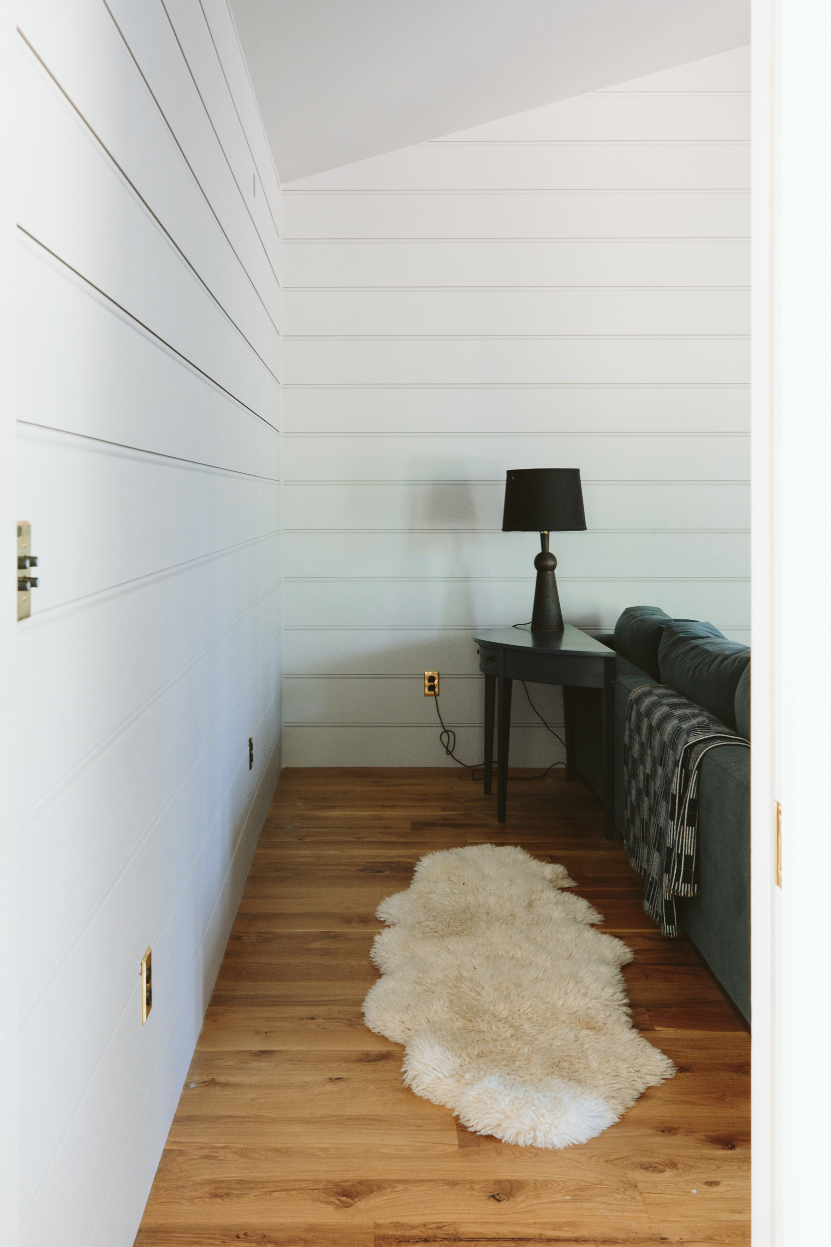
I don’t really know what we need on that wall. Sure I can put a gallery wall (which I might) but we could also use some (but not a ton) of storage in here. From this angle, it seems obvious to do built-in bookshelves along the back wall and perhaps integrate the sconces into it. We put those sconces in the lighting plan like a year ago and now that they are cut out of the paneling we have to stick to them. This is all fine, but if we wanted to do a tall bookshelf we’d have to do some troubleshooting. So I recently installed two Imbrie Articulating sconces there and have thought about doing a long sofa table/bookshelf along the back of the sofa, and then hanging an epic gallery wall on that wall, with the blimp being on the wall to the right. The biggest drawback of doing a big built-in on the back wall is that it really affects the sightline from the living room – so you’d basically immediately be blocked visually by a protruding piece of furniture. It doesn’t so much affect flow as you’d take a right to get into the room anyway, but visually it’s not my favorite. Also, we switched out the sconce on the left to be an art picture light (The Clyde, from Rejuvenation) because that one felt too glam and small. Sometimes I want to switch the gold chandelier to black but we chose gold as to not compete with the fireplace.

So instead of where the table is right now (which is a placeholder), picture a long low bookshelf (with closed backs and sides) for books/games and to put lamps on. Also right now we have nowhere to put a snack or drink or the remote (once you are leaning back, all lounging on the sofa, the coffee table feels pretty far away).
So there you go – a good old-fashioned process post showing you where we are stuck and what we are thinking about. Being that I feel a bit stumped I’d love to know any of your thoughts re the rug and the wall color… Maybe we’ll do a post where we photoshop all the paint colors we are now considering, but the truth is I think that we’ll think one of those is great and I really want to give these two colors together a shot before I let myself just change it, and who knows maybe a creative challenge like this is just what I need:)
Family Room Resources:
Sectional: Rejuvenation
Chandelier: Rejuvenation
Fireplace: Vermont Castings
Current Rug: Serena and Lily (unavailable)
Flooring: Oregon White Oak by Zena Forest Products
Wall Color: Ponder by Sherwin-Williams
**Photos by Kaitlin Green
The post The Current State Of The Farmhouse Family/TV Room – What We Are Troubleshooting, Confused By, And Debating… appeared first on Emily Henderson.
from Emily Henderson https://stylebyemilyhenderson.com/blog/choosing-the-right-rug-for-the-family-room

No comments:
Post a Comment