
I recently had the opportunity to style a beautiful home located in the Macalester-Groveland neighborhood of St. Paul, Minnesota and it was one of those projects that I just knew I wanted to be a part of and experience for myself. It felt like a great opportunity to ‘play’ in such a beautiful, character-filled home and write about it here. I couldn’t think of a better place or audience to share this gem with. I knew you all would appreciate how this family updated and modernized their home for their family as well as their decision to add a two-story addition onto a 1924 beauty without compromising the exterior aesthetics. I won’t keep you in anticipation any longer, let’s dive right in!

Upon entering this home you are instantly greeted by this gorgeous, original staircase. The homeowners previously resided in a new high-rise condo located across the river in Minneapolis so moving into this home was quite a change as you can imagine. After researching and selecting to work with the design, build, and remodeling team at JKath, the homeowners tell me it all just clicked! That statement got me thinking about how important it is to really know your team and feel all the feels because you’re going to go through some real (and sometimes tough) feels during the process. It’s so valuable to trust the process and allow yourself and everyone involved some grace because things happen no matter how many years of experience or how carefully a project is planned. As long as you have the right team, you can roll with the punches and proceed accordingly. That’s what happened with this 1924 home but we’ll get into that later. First, are you ready for a little before of this entryway?

Not bad right? But I do love how they updated it and gave it new life with just a few cosmetic changes. It’s evidence that paint really does go a long way!
Now, before I take you into the kitchen can we just take another moment and check out this powder bath?

It’s tiny but so full of personality! One nugget of design advice I have is to splurge on your powder bath, since they’re typically a smaller space you don’t need as many materials, thus keeping costs down, and because there isn’t any shower or bath to create steam and moisture you can get more creative and bring in personality through wallpaper and art, as these homeowners did.

Moving into the kitchen, the homeowners always knew they wanted to update it because the previous layout was really tricky and small, and it didn’t fit the family’s aesthetic and function. So they went back and forth on how to transform their kitchen within the original footprint which proved to be equally challenging. That’s when things changed and the scope of the project evolved into a new plan. Fully trusting in Jkath, the homeowners decided to add onto their historic all-brick home. The decision was not taken lightly as it was very important to them that it looked like the addition was always part of the original house. In order to do so, they installed brick on the entire outside of the new addition to blend with the home’s existing brick as well as continued the clay tile roof in order to preserve the home’s historic exterior. Inside, this new addition allowed them the space for a larger kitchen and mudroom and converted their previously small second-floor bedroom into a primary suite with a dedicated bathroom, walk-in closet, and vaulted ceiling.
Ready to see their newly remodeled kitchen?

Wall & Cabinet Color | Countertop | Wall Sconces | Backsplash | Faucet | Flooring
The homeowners really wanted an all-white kitchen and again trusting in the design team, they ultimately chose a softer perimeter color with this contrasting rich, alder wood island with beautiful kerf panel detail. When I walked in, I instantly fell in love with the softer white they chose along with the gorgeous wood on the island and the custom framed and plastered vent-hood.


I love the added detail of the alder wood cabinet interiors and how they contrast with the creamy cabinetry color along with the doors that slide back and out of the way in the pantry area. It is proof details really do matter, especially when you’re making such a large decision and investment.

Sink | Shelf Brackets | Cabinet Pulls | Cabinet Knobs
When I first walked in, I felt like I was being embraced by a warm hug (maybe even literally because the in-floor heating system warmed my feet as I walked across these gorgeous limestone pavers). Fun fact: these pavers are outdoor pavers, which JKath expertly researched for indoor use while reinforcing the floor for the weight of the stone.

Island Utility Rail | Ceiling Fixture
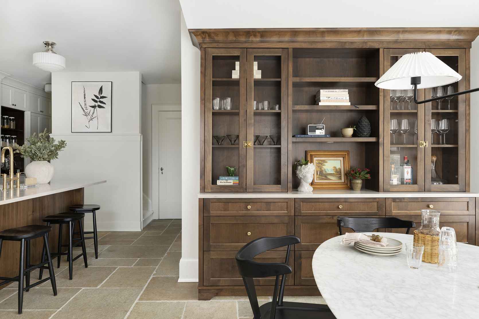
I love and respect how they mixed the unlacquered brass with the polished nickel hardware on the perimeter cabinets and light fixtures. And if this kitchen couldn’t get any better, I love that they chose to restore and reuse the existing cabinetry hardware. They were able to repurpose it on the island and the custom-built hutch in their dining room.


Light Fixture | Wall Color | Dining Chairs
In the dining room, the homeowners went back and forth a bit between deciding to add a drink fridge or a coffee bar but ultimately they chose to create a special piece of custom furniture instead. I’m so happy they did and more importantly, they are SO happy they did. It truly warms up the space and looks so special as it echoes the island and cabinetry interiors.
Like I said before, with the new addition here they were able to gain a full-sized mud room! In the before you’ll see this door previously led outside and there was a small closet next to the kitchen area:


Wall Trim and Cabinet Color | Faucet | Pull | Knobs | Countertop
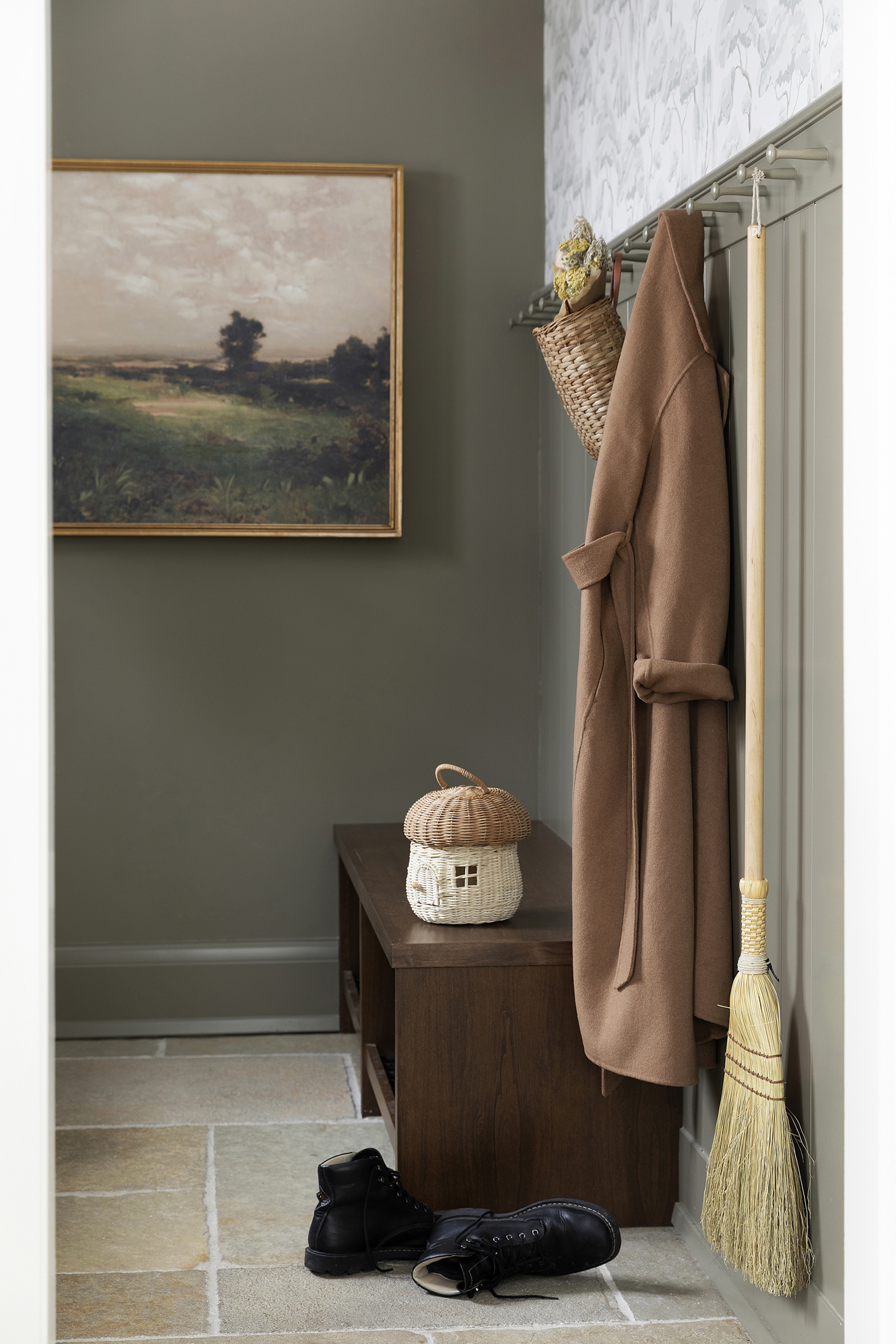
Tada! Their new mudroom is now the perfect place to store coats and shoes and all the gear and things. I especially love the Larder cabinet air vents. It is such a special detail and one that pays homage to the home’s time period. It’s also a trend that EHD called out in their kitchen trends post this year:)

The bench is custom-built by JKath in Alder with a custom finish that echoes the wood tones in the kitchen.

I equally love that they decided to tuck a beverage fridge in here versus the previous idea of installing one in the dining room area.

The moody green walls and cabinetry paired with the gorgeous wallpaper give this hardworking space so much life! Oh, and never underestimate the utility of a simple and functional peg rail. I DIY’d one (well, my brother-in-law DIY’d one) in my bathroom and I love it. So naturally I think this is a great design choice and proof that utilitarian spaces such as this needn’t go without a good dose of personality.

Heading upstairs, the addition of the primary suite felt so seamless, I felt like it was truly hard to differentiate which parts of their home were original and what was new and ultimately that was the goal for JKath which they executed perfectly.
Previously the homeowner’s primary bedroom was small but with the addition, they were able to gain more space in their bedroom as well as vault the ceiling which visually makes the room feel larger as well as fit in a full walk-in closet and primary bath. (Side note: With this remodel, the homeowners also had budgeted into the project plan to remove the radiators and install central heating and cooling which also created more space).

Ceiling and Trim Color | Wall Color | Ceiling Fixture | Wall Sconce
The choice to use a soft but contrasting trim and ceiling color really helps to create instant coziness, making it feel less “new build”. Just a simple but impactful detail.


Faucets | Knobs | Wall Sconces | Mirrors | Towel Ring | Countertop
Can we just talk about the details of their custom bathroom vanity? My jaw dropped at the scalloped detail and the beveled profile. JKath’s custom in-house cabinetry team showed up and showed out! The homeowners say it makes their primary bath feel so special and luxurious. I mean…


Again, they mixed metals and finishes and I’m here for it! Also, notice that beautifully curved backsplash. Swoon!

Shower Tile | Floor Tile | Wall Color | Trim Color
This tile color choice was perfect given that it calls to the stone color of the trim. It’s cohesive but still visually interesting since there’s a lot of color variation in the tiles.
At the end of the day, I asked the homeowners what their home means to them: “Our home is the ultimate safe space for our family. It’s a place for us to be together or enjoy a moment of time alone, it’s a place to play and rest. It’s a place where we love to invite friends and family to enjoy meals and where they hopefully feel welcome and comfortable!”
I think they achieved all of that and more and have the perfect home for their family for many, many years to come.
*Design, Cabinetry, and Remodel by: JKath
**Styled by: Lea Johnson at Creekwoodhill
***Photography by: Spacecrafting
The post This Is How You Add An Addition To A Historic Home The Right Way (Warning: Beautiful Photos Ahead) appeared first on Emily Henderson.
from Emily Henderson https://stylebyemilyhenderson.com/blog/historic-home-additions

No comments:
Post a Comment