
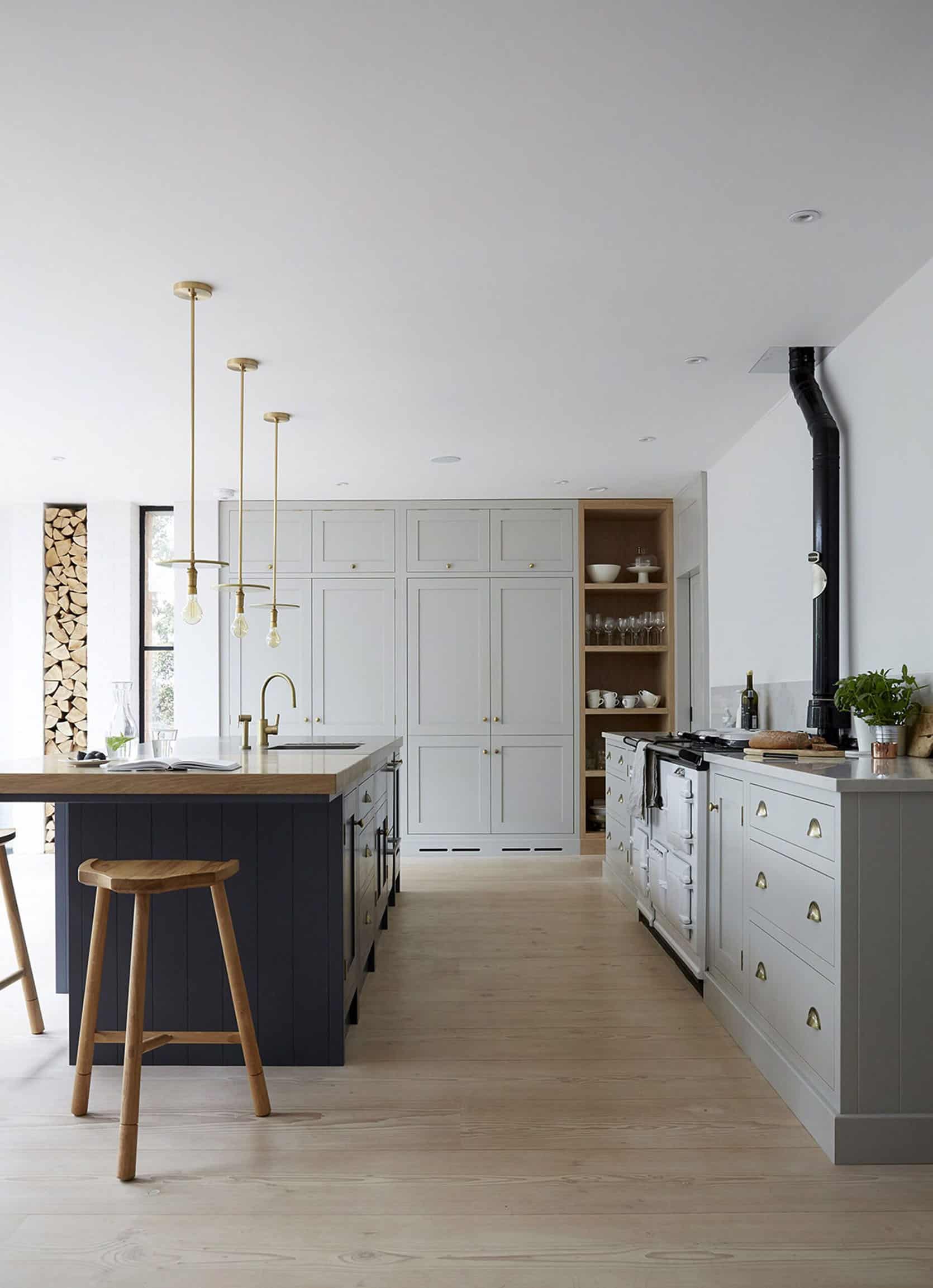
I know I’m not alone here. So many of us want our homes to be interesting, colorful, and, full of personality. But when the doors are shut and we’ve stopped scrolling through Instagram we are actually drawn to living/cooking/bathing in rooms that are more neutral, relaxing, and just easy both visually and practically. I’m not talking furniture/art, I’m talking hard, permanent finishes that are the hard, permanent decisions. I want to stay at a Kelly Wearstler hotel where I have no idea what I’m going to see at every corner, but “exciting” isn’t the adjective I use for my main bathroom. Beautiful, interesting, relaxing, bright, airy, full of intentional detail – those are the words I want to use.
Furthermore, last week after a friend professed her love of bold colors in her home, I thought to myself with a sigh, “Ah yes… I once did, too“. This friend was 29 which made me wonder, is this an age thing? Around 7 years ago my tolerance for bold color and lots of pattern in my home started decreasing. Why? Originally I placed the blame on children, naturally, with a backup suspect of “living in a chaotic-to-me city”. But after further investigation, I believe the shift started happening when I started having to make permanent non-styling renovation decisions that involved color and pattern. The year I had Charlie was the year that we remodeled our first home. Perhaps it’s not age, it’s the grownup necessity to make timeless choices that are meant to be PERMANENT. That’s the real horror word in renovation… P.E.R.M.A.N.E.N.T.


You’ve seen my style and color evolution up to this point – I never predicted I would love living in this neutral house so much. But what is next? Will I stay this neutral at the farm? Am I ready for more color and pattern? The kids are now 5 and 7 – they produce so much less mess, are so much easier to take care of, I’m so much less exhausted, and living outside of the city is just innately less chaotic. All those culprits are gone. Perhaps, for this renovation, I’m finally starting to feel experienced in this process, like I really know what I’m doing and I’m ready and willing to take some risks in more calculated ways for long-term color/pattern success.
**This is just the strategy for ME, if you are a maximalist and love an explosion of color, PLEASE embrace that and know that I will be double-tapping your photos for life because I LOVE how bold you can be with patterns and colors. You do you, and I’ll do this. 
I’ll Put Bold Patterns And Colors On The Floor – Not In Eye-Line


It’s simple science, ask any optometrist. Your eyeballs don’t “SEE” the floor as much as you do a wall that is in your exact eye-line. Therefore you’ll tire of a pattern on the floor much less. I came up with this theory and I’m the only one to blame if I’m wrong about this. But I have proof. The tile on our patio in LA is in that high contrast blue and white and is rather busy (if not totally classic), but I’ve never gotten sick of it, EVER. In fact, I myself pinning it over and over again for the farm. You only see it when you turn the corner to go outside and it’s a burst of welcoming joy. You see it when you go to sit down in the living room, and you just get a hint of it and again, the joy. I don’t know why this was so genius to me, and maybe this is short-lived advice, but when I’m considering patterned tile in our house I’m leaning towards going more colorful on the floor with less happening on the walls.

That is not to say that I won’t put colored tile or patterned wallpaper anywhere, I LOVE our wallpaper in our old main bathroom because it’s so soothing and neutral (and hand-painted, light and special – I love Farrow & Ball so much), I’m just going to leave the more bold moments on the floor.
Use “Safe” (Classic) Tile Applied In Unexpected Ways

While I wouldn’t do floor-to-ceiling penny tile, I love the idea of taking an element you’ve seen a million times and doing a more unexpected version of it.

This is a GREAT example of that – that penny on the ceiling is ridiculously good. It’s a tile setter’s total nightmare, but how beautiful is that bathroom???


We are also considering doing a custom hex or penny tile mosaic on the floor (or wall?) and while it might be simpler than these ones about, I love a border or a “rug” around a field tile.

That is a GENIUS example of how to take a simple herringbone mosaic tile and do something interesting with it. I wish I had thought of it myself. But I think you get the point – how can you be creative with classic materials???? This is a great challenge.
Staggering Different Sizes Of The Same Classic Tile


I also love the idea of taking a classic subway tile like these above and installing them in different lengths. You almost barely notice it at first and then you look harder and can see what they’ve done. I’m not sure if it’s random, or likely 3-4 varied lengths. But we agree that this is a great way to add interest and personality in a quiet way.
Floor To Ceiling And Wall To Wall Of ONE Tile

It’s becoming an increasing trend that we are pretty darn into, but can be a budget buster, too. Granted these tiles are STUNNING, but even a simple subway tile on all the walls would look so pretty (if not clinical). I know that this isn’t a ton of color, but again it’s about impact and personality in a “hard to feel dated” way.

The sheer volume of tile on that bathroom above adds so much impact. Floor to ceiling, and wall to wall – if we can afford it.
I’ll Stay Within My “Color Comfort Zone”

I for one know what tones I’m extremely comfortable in, and since this is my home (especially for the main spaces) I will not be intentionally pushing myself into a discomfort zone just to try out a new color or prove that I can use an orange tile. Now, that being said, if Arciform can help me bring in some colors outside my comfort zone I’m listening. I’m not totally shut off, but I can’t imagine that I’ll be opting for a hot pink penny tile – while nothing is WRONG with it. Not sure you know this, but I like blue. It makes me happy. I passed that love down to both kids (mostly through flashcards, hypnotism, associative techniques, etc). The kid’s rooms will be different as I want to give them a lot of autonomy over it (which will be hard as a designer but so fun as a mom).
Here are some more photos to really drive my love of blues, greens, and soft whites home:)


All those colors make me feel so soothed, soft and happy. I can’t wait to show you where they are going to go…
So that’s where my head is at currently as I’m staring at one million tiles, paint chips, and pinning patterns all day every day. I’m currently putting together all the room by room mood boards (which is SO FUN) and we are this close to finalizing the floor plan to show you (hopefully coming soon).
Opening Image Credits: Design by The Spaceologists | Photo by Paul Massey | via Living Etc
The post My Strategy To Bring Color, Pattern, And Personality Into The Farmhouse Bathrooms And Kitchen (Without It Feeling Dated In 15 Years) appeared first on Emily Henderson.
from Emily Henderson https://stylebyemilyhenderson.com/blog/neutral-color-and-pattern-ideas


No comments:
Post a Comment