

Velinda back (so soon) because I couldn’t leave you wallowing in grief for too long. THIS IS A DESIGN blog. And despite it all, we’ve been designing! But not in a way we’re used to… well not EXACTLY.
Before we lose those of you who read one paragraph and skip to the photos (yes, I see you), I want to give a big accolade to my E-Team, led by fellow EHD alumn, Grace De Asis. And we owe a GIANT thank you to our impressive, first E-clients who not only executed all of these designs themselves, but also filled in as photo-stylist AND photographer. There wasn’t a pro on-site… like, ever. We never made a site visit. Still, these ‘amateurs’ have made us so happily-impressed and today, they’re boldly sharing their reveals. We’ve met them via Zoom. They’ve uploaded questionnaires, ‘Pinned’ inspiration, communicated measurements, and hopped along for the ride as we discovered this whole E-Design thing. We’re forever grateful.
So about this unique (errr… crazy?) way of working. Covid has had us all adapting and we feel incredibly fortunate to be able to work from the safety of home. Still, I opted to start a business in January of 2020… Cool. As a ‘2020’ startup/first-time business venture, there’s nothing like adapting a process that doesn’t even exist yet to new, global pandemic restrictions. Goodbye, familiar design process.

But wait! As I started to break down a lot of our familiar, Emily-led processes, I realized the EHD design team was actually QUITE trained in working from afar. Afterall, for The Portland Project we spent a ton of time drawing up concepts for a project that was located in…. well, you guess. The Mountain House; we could check in more frequently, but it was still a couple of hours away, so a lot of those details were dreamed up remotely. When we did Target shoots, we worked with unreleased inventory that we couldn’t see, touch, or feel until the product was on-site, yet we successfully formed designs based on color, imagery, and dimensions. And for flash makeovers, in order to pull off the ‘surprise’, we could only sneak in to grab measurements ONCE. The rest of the design took place from afar.
So, while I don’t believe designers should think in terms of 2D and while so much can be said for ‘feeling’ a space IRL… Our training through Emily, serendipitously, prepared us to design our way through a pandemic. And magically, has led us to the coolest, down-to-earth clients all around the world. (Our first E-client was located in the Netherlands!)

This is a reveal post, so I want to skip to the fun part! But so you aren’t totally lost on how we get to these end results, the basics of our process is set up to mimic our process of working with ‘Full Service’ clients; the cliff notes of which are:
- Intake: Questionnaire, Photos/Measurements, Client Inspiration Imagery
- Design Prep: Concepts & Moodboards, Internal Inspiration imagery, 3D Modeling/Drawing
- Presentations: Zoom-based check-ins on Concepts & Floor Plan Options
- Sourcing: The fun part. We shop. Clients hold the power to ‘approve’
- Final Design: We reign it all into a cohesive design and pull together renderings to assure a successful, client-led, design-execution. We also throw in tips, important dimensions, design alternatives, etc.
And if you’re one to need more than the cliff notes, you can find out all of the below here:
- Budget expectations
- How to know if E-Design is right for you
- What E-Design is & isn’t
- How we’ve made it ‘digestible’ (our Menu)
And now, onto the fun!
Reveal One: A Cozy, Eclectic Family Nest with British Pub Vibes
First up, our client Marian in Portland… who may just be my soulmate. Marian is a writer who describes herself as ‘Villainelle’ (Killing Eve) if she lived in the holiday cottage from ‘The Holiday’. She dances with her three-year-old daughter around and ON furniture and is married to a man I approve of (though have never even ‘Zoom’-met) because he bestowed an ‘It’ll pass’ (Fleabag) pin upon her in response to her blossoming love.
When asked how she wanted her finished space to feel: “Cozy AF. I have never been more excited for a gas fireplace in my life. Airy and uncluttered, but still eclectic and representative of us as a family – well-traveled, well-read, but unfussy. I’m obsessed with old libraries, cozy cafes, cabins, and English pubs”. Now, even she would admit her newly-purchased home didn’t reflect an ounce of that at all:

So, we started with her where we start with all spaces; honing in on a concept. Based on her intake questionnaire, photos of the room and ‘Pinspirations’, we took off in a direction, which looked something like this:

Okay, that’s just one page of multiple from our ‘Mood Board Presentation’, which is step one. But let’s skip straight to a page from our final presentation (again, for the sake of getting to the fun… life is short, folks). Skipping the floor planning, sourcing, and final design brainstorming phases, I present to you the ‘final design’ in a rendered concept:

We ended up changing our mind on the tile concept in the end, but you get the idea. And so did Marian! Her beautiful execution:

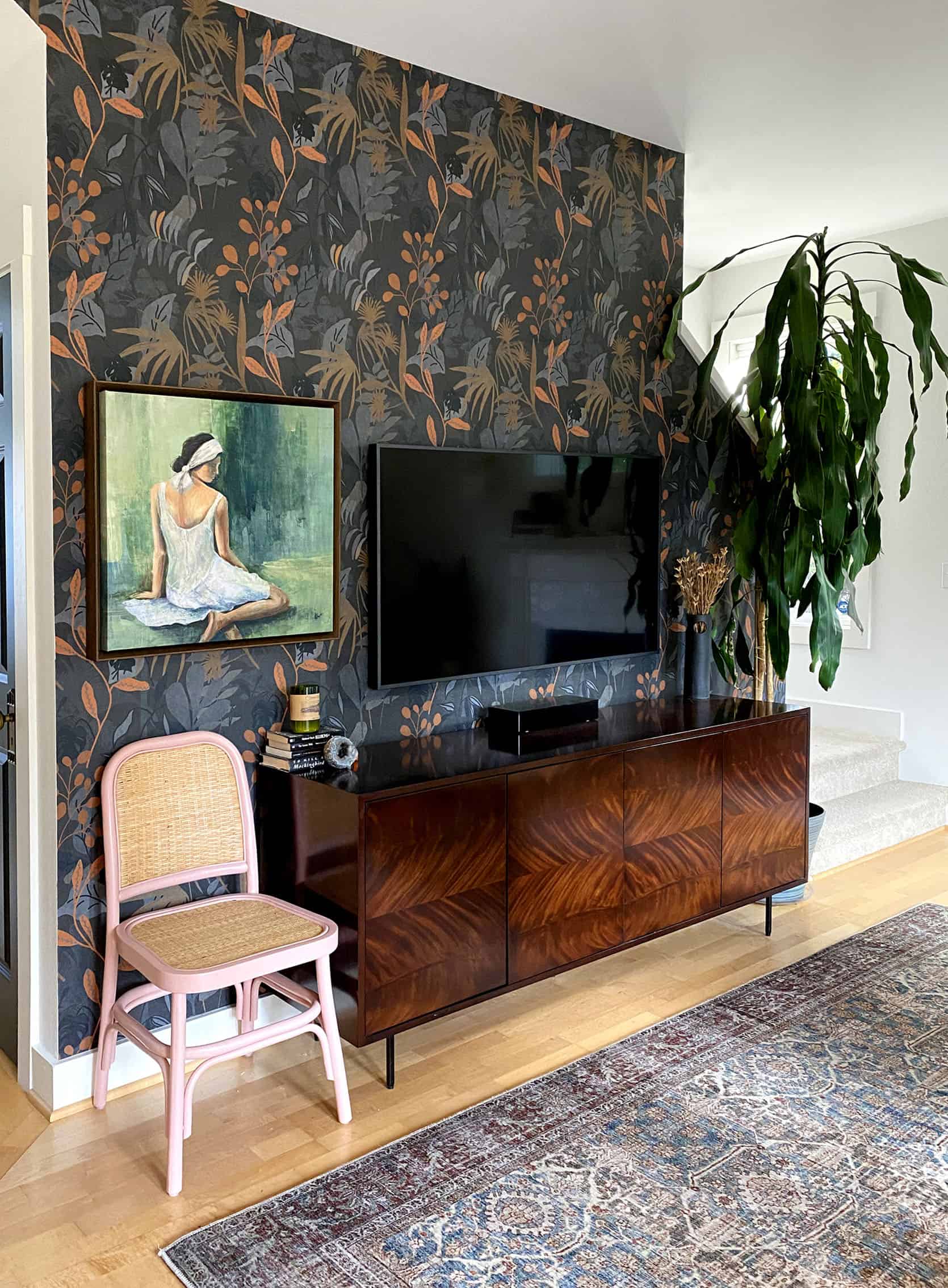
Are we excited to see this space in-person when the world opens up and we can travel to Portland again? 1000%. Is it our FAVORITE in her house now? Nope. Project 2, which Marian brought our way just after this living room project wrapped, is where we plan to spend all of our time when we ‘share a pint’ eventually. Welcome to Marian’s dining room transformation!

She described the existing space as having a ‘secondhand table and chairs, that were ugly and uncomfortable and a light fixture that came with the house and MUST GO.” Behind her bifold doors were laundry machines and she not only needed room to access those within her limited space, but also a better surface for piles of clothing to land to be folded. A reader who loves cozying up with a coffee, she expressed loving the idea of a built-in banquette nook… though she wasn’t sure if it could work in her space. We loved the idea too! Where we were inspired:

We were also inspired by the adjacent living room, which was already complete. Whatever we did on this second project needed to not only ‘speak’ to the world of the house that we were creating, but it needed to work within the same visual eye line…. which meant considering competing scales and complementary/cohesive color palettes. We won’t cheat this time. Let’s take a look at the ‘less fun’ phase of the floor plan (unless you’re a designer who loves the ‘puzzle’ of said planning. Shout out to you dimension-geeks out there! You’re going to love this)…

And since it was determined the desired banquette not only checked her box, but proved to be a perfect way to keep the necessary clearance for her laundry ‘room’ doors, we got to do a custom build!

The final design concept turned out something like, well, exactly like this:
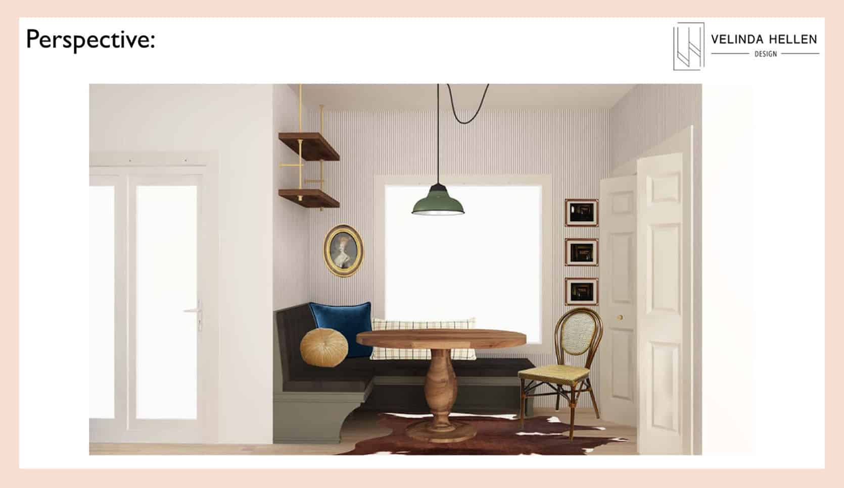
And what follows is another successful execution from our Portland friend. We were seriously impressed. This execution involved finding/hiring a carpenter and upholster for the banquette… installing the wallpaper and DIY-ing the shelf build. Not to mention the beautiful knot they made to ‘swag’ that pendant to make their existing J Box work, as proposed. The rug is still stuck in the land of Covid-delays, but we don’t hold that against our ‘Villainelle’ at all. Major, major kudos!
I’m not kidding when I say I plan to sit in this corner one day and enjoy their amazing picture window. In the meantime, we’re so happy knowing this is where Marian & fam now enjoy their morning meditations, piping-hot cups of tea with a biscotti, long conversations about literature, and every other romantic, life-scenario. We’re certain, despite having a 3-year-old, no cheerios or tantrums are ever thrown in a room like this. But if those things WERE taking place (and of course, they’re not) no heads would be split thanks to rounded corners and no stains would be made thanks to cleanable upholstery. Cheers to your successful project, Portland friends! We’ll see you when the world opens back up.
Let’s see those before and afters:


Reveal Two: Modern, Versatile Outdoor Entertaining Space with an Ode to Wes Anderson
Next up, we have not only one of the most-fun design aesthetics, but also one of the better E-design challenges so far. Only neighborhoods away, Allison found us at the peak of Covid, when we weren’t venturing out to measure. One of our earliest clients, Allison was the client that had me first realizing our E-Design clients were SO fun to work with. A family who crafts outdoors, entertains a lot (in theory… we all know why), and loves Wes Anderson films, they were ready to rip out their old fence/non-working fireplace and put in a kitchen & kid space.
She had me at Wes Anderson.
The Before… Not great-looking, but great job communicating measurements!

I have to prelude this reveal with the fact I desperately want to show you the Wes Anderson-inspired kids tent that is taking shape behind their kitchen currently, but alas, a major renovation like this takes time and I am NOTHING but impressed with their execution so far. Here’s our concept:

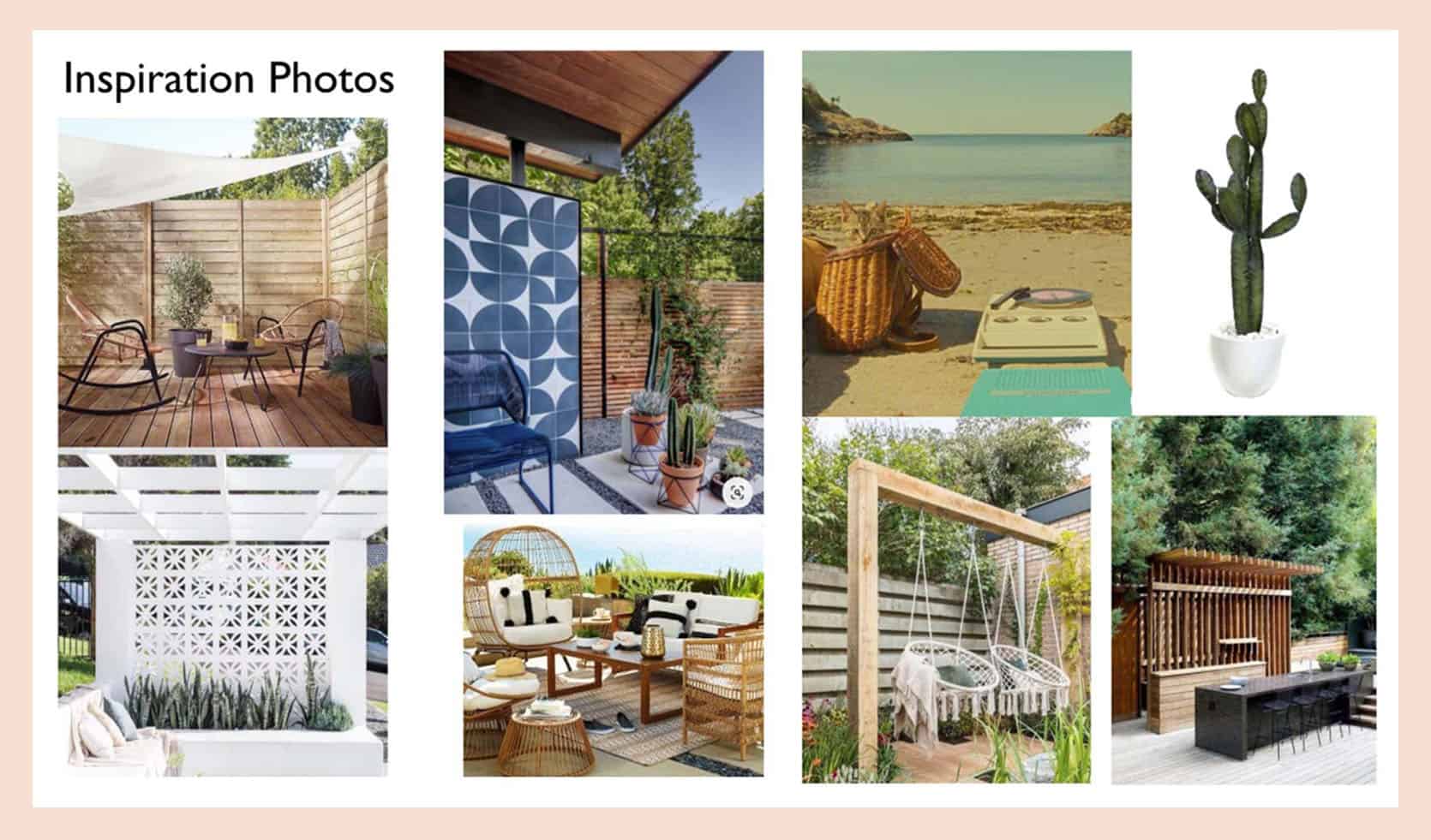
As we explored the models (thanks to the very careful measurements our lovely client provided), we honed in on what ‘fit’ the space and how to make use of multiple levels given the addition of the decking:

When we draw, we’re using SketchUp, both for floor planning and renders. For the sake of sparing time (E-Designing is about efficiency!), we’ll often incorporate photoshop as well to avoid time spent modeling out one-off pieces of furniture. So, we aim to get the point across as effectively as possible without being ‘picture perfect’. And clearly, the point came across just fine! Let’s compare:

And here’s the reveal!


I can’t tell you how fun it was to hand off this design, not hear from our client after for a few months and then get to witness the successful path they’re on! I MAY have teared up. When they reached out again, they included some shots of their kids enjoying the new ‘kid’s space’ which is behind this lovely new outdoor kitchen. The bones of said space are there, but it wasn’t quite pulled together in time for this post, so instead, you get a hint and a chance to imagine:

Colorful, “Moonlight Kingdom” vibes along with lots of creative play are in store, we trust!

Reveal Three: Elevated, Worldly Desert meets Coastal
Wrapping us up for today, we aren’t shy about our absolute love for Ruth (it’s not a secret she’s just our favorite… and not just because she’s a healthcare working-hero!). We’re wrapping our third project together this week (a sneak peek of that one below!). With her, our job is an easy joy. She’s SO capable and brings so much fun-flare. Having worked with a designer previously (and thanks to her natural great taste), she came in with a project that was already pretty close to finished, making her a great ‘Entree’ client (check out our menu on our site). Overall, what she needed for her first two spaces was styling and a couple of key pieces.
She was relatively happy with her room design, but felt she was missing a touch of ‘her’ (bright, sophisticated, and well-traveled). Her launching point was not. bad. at. all:

And by now, you know where we start! Honing in on some ‘Ruth vibes’, we came up with this starting point:

And once again, our impressive client made it possible to model a room we never visited thanks to her careful use of a measuring tape. Here we explored the best scale and placement of art, considering the height of her existing headboard and ceiling:

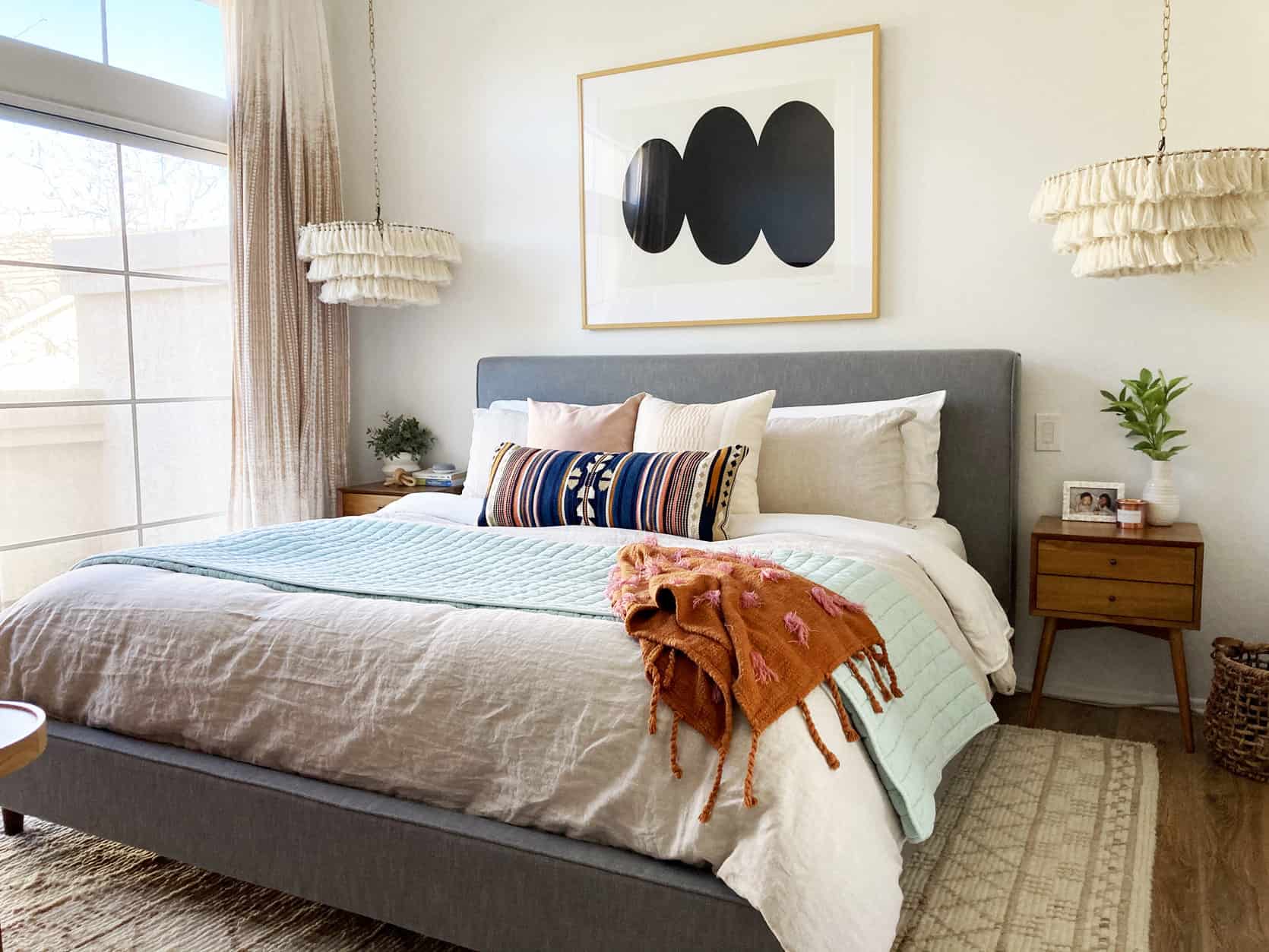
Which ultimately looked something like, okay… exactly like this, in concept:

Which Ruth translated so beautifully into this, in reality:

We were so happy when she quickly returned with more remote puzzles to solve! Once again proving to have some great major pieces to start with, Ruth wanted more help filling in the details for her living/dining space.

Once we’ve worked with a client, it’s quite easy to pull together the color palette, inspiration photos, key elements, design direction, and design concepts that make up our Mood Board presentation since we already know the ‘world’ of our client’s home. Which for Ruth’s living space looked something like this (again, not boring you with EVERY page of that presentation):

Fast-forwarding again, we ultimately landed here:

One thing that makes Ruth SO successful at pulling off our design concepts (as proven below) is the fact she acts FAST. A risk we run when designing is that items can quickly go out of stock (especially during a pandemic, apparently?). When we hand Ruth a design, she is ON IT. We may just have to hire her to do the shopping for all future clients. Ruth… is healthcare really that important these days? Just consider it.


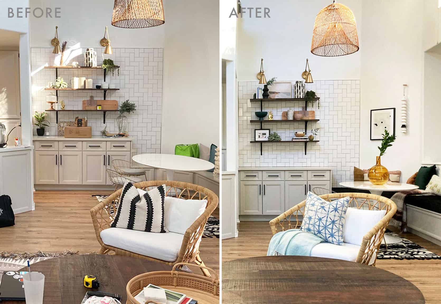
Now let’s visit her dining space before:

When we hand off our ‘To Go Box’ (final design), we make sure each sourced item is easy to shop, which means visuals and source-able tear sheets.

But of course, most importantly, we want to communicate exactly HOW to execute the vision. One of the slightly more time-consuming parts of this digital process is in the styling. Unlike ‘playing’ in-person where we can bring in a bunch of props and mix and match until it ‘works’, we have to draw/measure each item so we know how to place it. As a result, we are working both visually (thanks to photoshop/Google Slide and technically (thanks to SketchUP renderings).

Which, unsurprisingly, Ruth did, earning an ‘A+ Gold Star’:
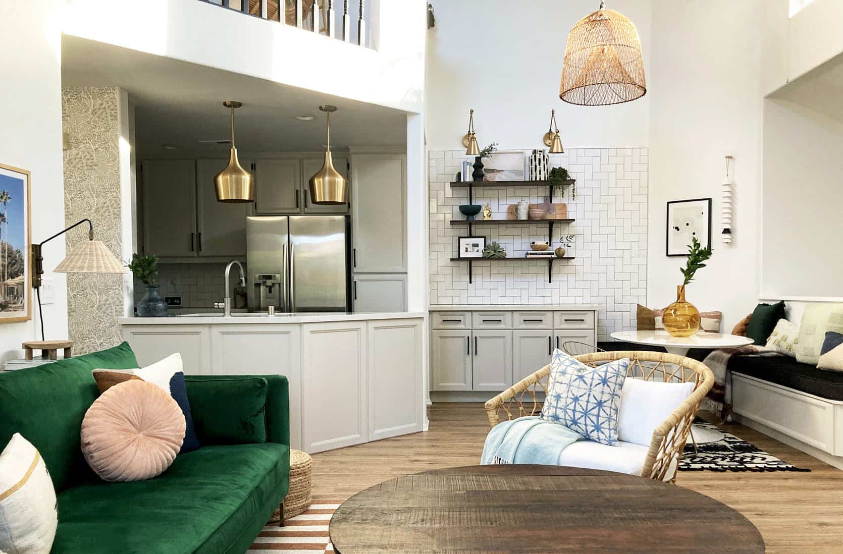

She already had several great styling pieces going in, so we were really just filling in around the edges and helping her blend pattern, color and scale:

Ruth, the following photo may just put Sara Tramp and Veronica Crawford out of jobs. What CAN’T you do? #RuthPhotographyandMedicine

As promised, here’s a sneak peek at our 3rd project with Ruth, which we just wrapped. It’s a multifunctional guest/office suite with all her vibrant, effortlessly cool vibes and a custom build!!! (you may have picked up on the fact we love doing these given all the exclamations) The challenge here was to hide an existing murphy-bed-in-a-box. My team is UP FOR A CHALLENGE. Grace, Julie, Marlene, Courtney, and Brittany (and sometimes Bowser)…. thank you for your brilliance!

The most observant of you might notice we are using the rug that had previously existed in her living room. One of the fun challenges of the E-Design puzzle is incorporating client’s favorite pieces along with as many existing elements as possible. We just need photos and measurements to consider items on-site in the design. Of course, we’re always upfront if something just doesn’t work… but as seen here, it can always work elsewhere!

Can we all comment on how impressive our clients are with their executions!? We’ve been so blown away. We’ve also been so, SO grateful for so much trust and support through our first (almost) full year of E-Design. Is this way of working a fit for everyone? NOPE. Of our 40-ish 2020 projects, we discovered 3 clients that didn’t seem to find what they needed from this remote service. And that’s okay. There’s some soul-searching involved…. you have to ask yourself some deep questions such as, ‘Do I trust myself with a tape measure?’… ‘Do I understand the process of uploading to a Google Drive?’…. ‘Do I know what a Zoom call is?’ (Who doesn’t at this point… and sorry if ‘Zoom’ is a trigger word. SAME. #2020). To help guide people through these ‘most important questions in life’, we’ve created a guide to the soul-search here.
If you want to bring us a ‘puzzle’ to solve and hope to work with us, we want to work with you too (unless you’re a jerk). We are a small team, so we have to limit our project load each month, but we keep a waitlist of anyone interested (you can join that list on our site) and we re-open project sign-ups each month, with start dates the following month (ie. we opened our project sign up in February for projects we plan to start in March). You can be anywhere… You just have to be awesome… because somehow so far, that’s been our entire clientele! And thanks to them, our opportunity to work from home during a global pandemic, and our amazingly-collaborative team (of coworkers-turned friends-turned coworkers again) it’s all gratitude, gratitude, GRATITUDE over here. Thank you for the love this first year. And thank you to those who read beyond the first paragraph. I see you 
Opening Image Credits: Photo by Sara Ligorria-Tramp | From: Velinda’s First Freelance Client Reveal: Molding The ‘Builder-Grade Budget’ + Where They Saved & Splurged
The post How Does E-Design Even Work?? Velinda Shows Off Three Client Reveals She Never Saw In-Person appeared first on Emily Henderson.
from Emily Henderson https://stylebyemilyhenderson.com/blog/how-does-e-design-work


No comments:
Post a Comment