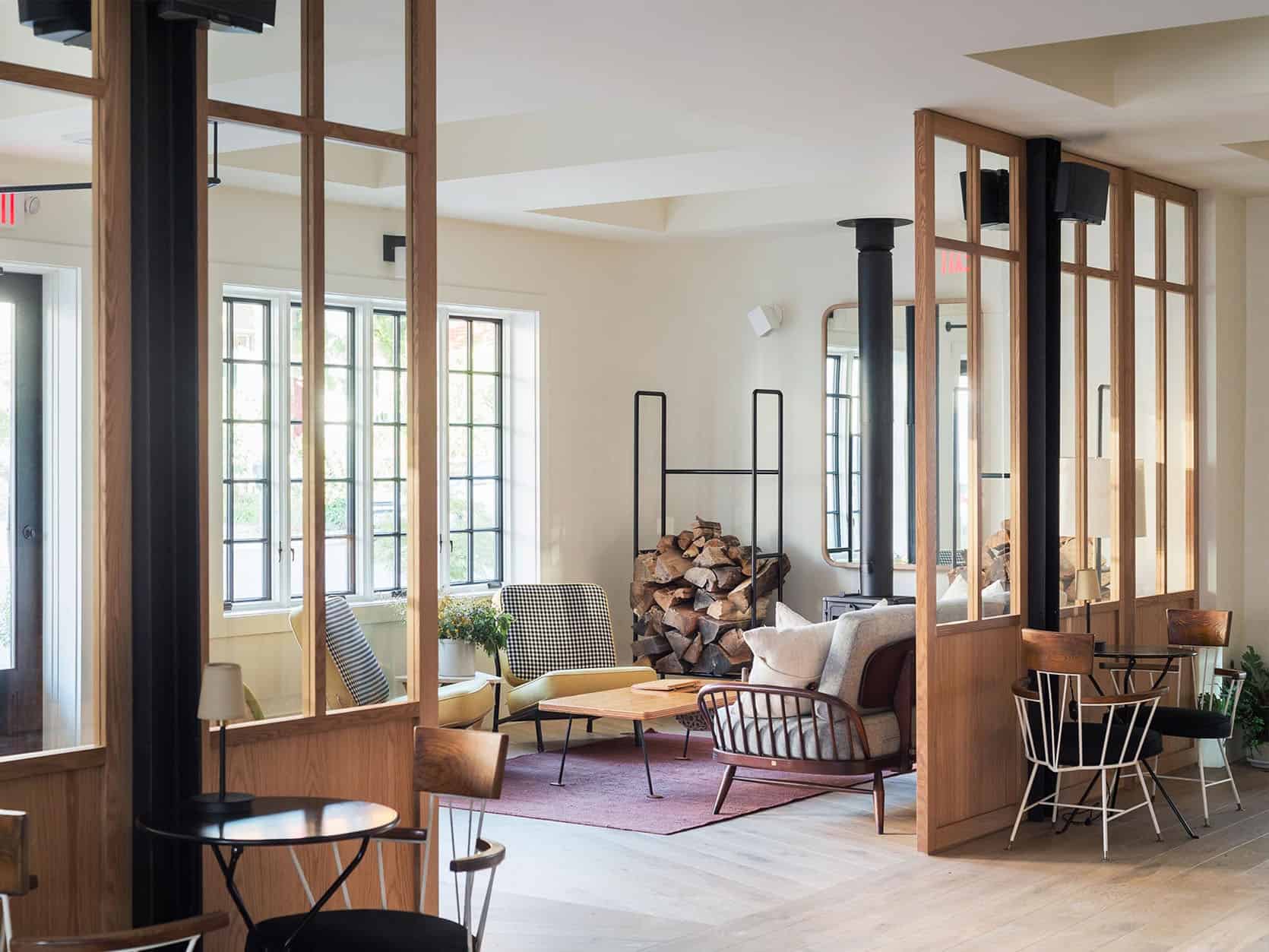

I follow a billion designers and love so many things about so many of them. Some create spaces that I want to live in (practical and beautiful but more quiet), and some create spaces I want to stay for the weekend and stare at every detail. Today I’m sharing the latter, the “thumbstoppers”, that are inspiring the design of the farmhouse – HARD. I’m often full of reverence for how these designers are able to still do something so fresh, in the traditional home space. Now often these spaces just aren’t practical for a young family or maybe my brain can’t handle the amount of color, pattern to live in on an everyday basis. Or maybe we’d never be able to afford one thing in the room anyway BUT they are design greats that I’m getting so inspired by and studying hard for this shaker meets victorian farmhouse. Let’s give some respect and break down why they are so genius…. here we go.
Studio Shamshiri

I wouldn’t typically put this team of geniuses in the “traditional” style camp – in fact, they are hard to pinpoint because every project is so different and unexpected and they nail them all (thus the severe respect and admiration). This California Chalet stopped me because there is a lot to take in and dissect. This isn’t the vibe we are going for, but again so many little nuggets of inspiration that can be gleaned.
Things to notice:
1. The cabinet detail on the fronts by the sink echo’d on the wood shelves. SO GOOD
2. Tiny little semi-flushmount light fixtures.
3. The triangle piece brace holding up the island. I would have overthought that and they just did the simple version that works.
4. The wood paneling, obviously.
5. How they incorporated the likely load-bearing post at the right of the range that made the design of it off-center. Hello, quirk. Nice to meet you.

Their work is always so cozy and feels rich yet casual. I feel they believe in comfort as much as I do and boy can they execute it in a non-generic way. Of course, every piece of furniture in here is tens of thousands of dollars, but I’m still so inspired by it all.
What to notice:
1. Is the paneling not lined up? I can’t tell if it’s perspective or not on that back wall. Also is that the hidden TV?
2. A totally unexpected (if not super impractical) light that reminds you that yes, we are in a cabin, but I went to Italy and found this light and I don’t give a shit if it’s supposed to be in a cabin.
3. Tiny red sconce shades – it’s like a little wink that says, “Hey girl, hey. We were little proper sconces a la the live-action beauty and the beast but sold at the french market and now living here, brightening up this epic space with our tiny light”.

When I first saw this shot in a magazine I was like what. how. why??
1. That color combo is SICK. This is actually more inspiration for the barn or carriage house where we want to take more design risks (of course I can in our home, but I know myself and what kind of spaces we like to be in a lot, and it’s fresh but not busy).
2. That curtain – such a sweet little detail on the window and dutch door. It takes balls to be so delicate. Feel free to put that on my gravestone.
Again all of their projects are so different – head over and check them out here.
Jessica Helgerson

We shot one of Jessica’s projects for Styled – I believe an old firehouse turned residence and it was just incredible. Being in that space first hand I was like “oh this is what brave interior designers do”. When I saw this NW Johnson home it blew my mind and I pin it over and over.
Here’s what I love:
1. That custom-painted tile mosaic tile is unbelievable (on the fridge, too. shut up).
2. The wood countertops make me wonder why I’ve been stressing over stone forever (and yes I know that wood has to be treated nicely and isn’t as seemingly low maintenance, but you know what – ME. SAME.)

3. The most epic “traditional” banister I’ve ever seen. See how the balusters are sculpted differently and yet in a pattern? And they go straight into the floor, not on a plate, with that gorgeous ergonomic wood on top.
4. And yes to those skylights making that space just sing.

This picture gave me so much inspiration for the farm as the windows are similar. While I don’t know if we have a place for such an epic sectional I think we can say collectively that no one in the world would not want to sit/nap here. It’s unequivocally desirable.

Jessica (and her team) designed this wonder of an island to explore life as we know it and remind us it can be better. Also, that cord sculpture with the pendants is epic.
See more of her work here, including a new family shelter solution-building that took my breath away.
Beata Heuman

If you haven’t heard of Beata yet you’ve seen her work. Oh, the reverence I have for her irreverent designs. You can stare at her work for a long time while trying to understand how and why it’s so great. It’s definitely more color and pattern than I can live with on a daily basis, but oh would I pay real dough to stay in one of her houses to be able to experience her work in person.

I’m not saying she invented the scallop, but she sure is responsible for bringing that detail to life in so many amazing pieces. How genius is that radiator cover? Insane. Looking at it unlocked some ideas for our cabinetry and our custom dining bench.

Is it true that the inside of the cabinetry on the far left is painted red? And note the flanking drawers next to the range – curving back and making it look so cool. I also love how they jumped down to a lower cabinet I’m assuming to keep the windows where they were – but it’s a nice quirky detail. She has her first book out now that I can’t believe I haven’t ordered but must NOW.

I mean. That window. Those sconces. And that incredible toilet with red brackets (look up). She’s blowing up right now just as she should be.
She more of her truly incredibly inspiring work here.
WORKSTEAD

I was able to stay in a Workstead hotel in Hudson valley a few years ago and it was inspiring. They certainly have some restraint, and yet every detail is magnificently executed. They do a ton of custom furniture/lighting and woodworking and employ a lot of vintage.


Gah. Have you ever seen such a beautiful knob? The simplicity of that woodwork will never date, and the quality is insane.

The balance of lines and curves. THAT WALL MURAL. The built-in storage (closed, semi closed, and open). It’s all incredible.

You absolutely should go check out the rest of their work (and their stunning lighting) here.
Commune Design

I’ve been a massive fan of Commune forever. But I pretty much freaked out when I saw this project. The wrap-around peg rail with hanging lantern. The off-center stone fireplace. The plaid sofa.

I’ve been pitching a plaid sofa to Brian for years but have never done one or even seen the right one done (plaid fabric is hard to find without it going super ’80s) until this one. But it’s also more of a daybed.
Look how they used (and likely redid) the knob and tube electrical with the lighting. We have this in our victorian (I think it works, but no bulbs) and are going to keep it. You can see it in the background with the outlet. And the woodwork is just so stunning.

This kitchen is breathtaking. The joinery on the drawer, the quilted skirt, the paneling. I have no idea how well that wood holds up in a working kitchen but it’s just stunning.

I have such dreams of a floral sofa in this house, but if you google “floral sofa” you’ll be horrified. I’m not saying it’s this one, but it shows you how well it can be done. The right risks equal a great reward.
Check out the rest of their work here.
Heidi Caillier

Massive fan of Heidi who really specializes in the eclectic, unexpected twist on warm traditional spaces (although she can do anything). I poured over that cabin she did up there. Notice the copper hinges on the shelving, the plaid chairs – SEE??? BRIAN HENDERSON IT CAN BE DONE. So warm and cozy yet unexpected.

She’s clearly not down with the project yet, but I wanted to show you because between the tile wall and the scallop backsplash it’s going to be incredible.

This won’t be the last time you see this bathroom on this blog, because I think it’s just so well executed and simple, but with a lot of impact and special details.

When I saw that sectional I gasped. It’s SO RIGHT. Notice how it matches the lampshade.

A slightly rounded-edge vanity shouldn’t blow your mind and yet it does. I know that the tiny drawer at the top isn’t functional and yet Heidi put it in anyway. One of my best friend’s sisters just hired Heidi for her house in Seattle and I can’t WAIT to see how it turns out. Go follow her on Instagram NOW.
Leanne Ford

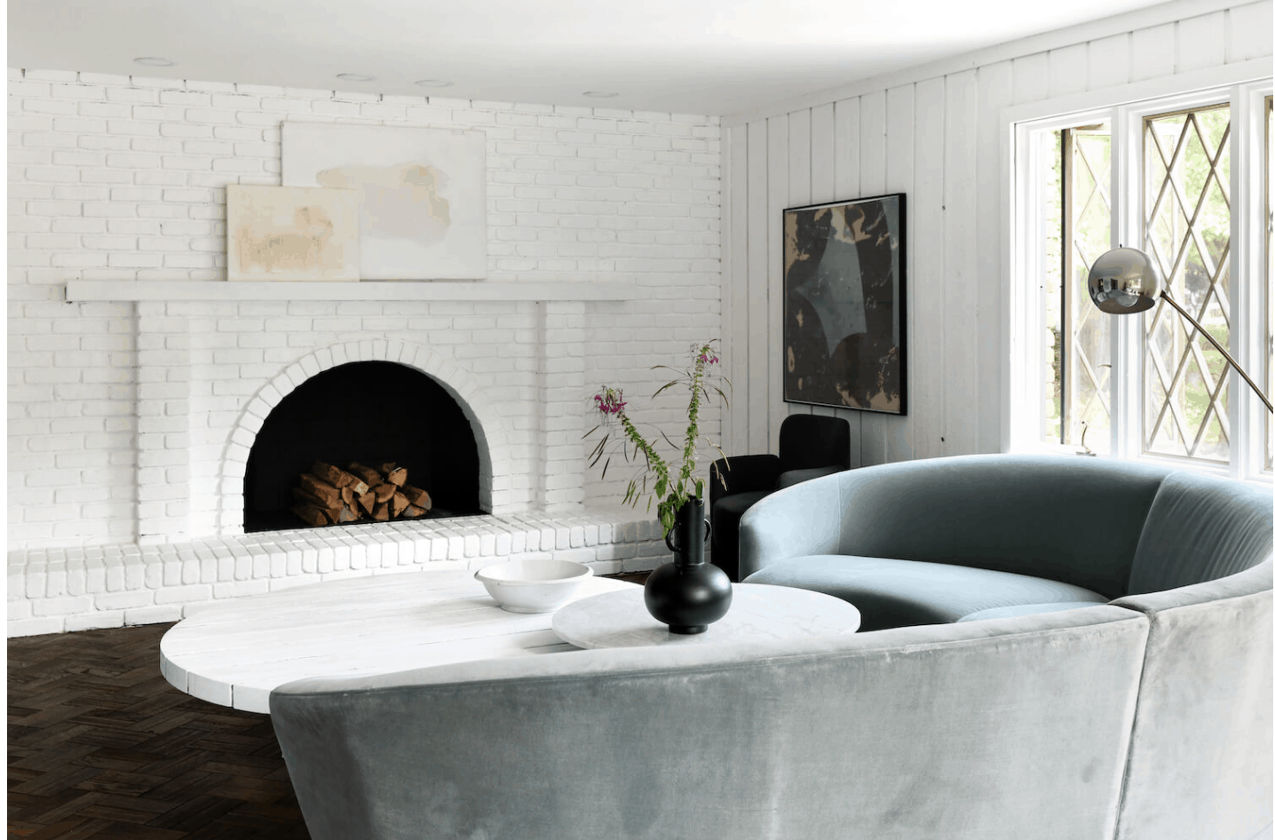
My friend Leanne cares not about rules. She used coffee to stain her walls in her kitchen intentionally. I love following her work and while I tend towards more practical designs, I’m incredibly inspired by what she does. I’m not sure if that brick fireplace was original or if she installed it, but it’s beautiful, warm, simple, and classic. Not sure if you can put a gas insert in that arch, but I want to badly.

Girlfriend doesn’t care if the sink takes up all the chopping space, if she finds an old awesome farm sink and will use it. I love it so much.

She’s also excellent at embracing “awkward” spaces and making them architecturally more interesting. Please notice that the trough sink on the right has a floor mount faucet. So good.
Head here to see more!
Reath Design

Reath Design is another excellent follow for those wanting to watch some rule-breaking. Above we have one asymmetrically placed sconce on the left, a wood vanity and backsplash (again I’d love to know how to make this hold up with water!), and a pill-shaped mirror that looks “melted”.

I’ve been hoarding vintage quilts for a while with dreams of upholstering at least a bench in them (and how appropriate it would be for a farmhouse). So well done in a modern space as they did above.
See more of their awesome work here.
It’s hard to be a risk-taker in any creative field but especially in interior design because so much is so permanent and needs to be so hyper-functional for living (as opposed to say graphic design or art). So when interior designers do it, and it is so fresh and yet classic, I can’t help but bow down. Who else am I missing? (obviously love Amber Lewis and Joanna Gaines :))
Any follows that really get your creative juices flowing when you are needing some inspo?? xx
Opening Image Credits: Design by Studio Shamshiri | Photo by Stephen Kent Johnson | via Architectural Digest
The post The Design Risk-Takers I Deep Dive Into When I’m Looking For Inspiration And New Ideas appeared first on Emily Henderson.
from Emily Henderson https://stylebyemilyhenderson.com/blog/favorite-farmhouse-design-instagram-accounts

No comments:
Post a Comment